


Always wanted to learn how to paint digitally, but don’t know how to get started? In the below video Tayler Olivas, a concept artist and teacher, shows beginners how to set up their workspace, discusses which digital tools he believes could be useful, shares shortcuts for how to access them, and gives tips on how to practice non-destructive editing, using texture brushes to get unique looks in digital painting, and how to combine those elements into a finished painting.
By the end of this lesson, beginners will have a solid understanding of how to use digital tools to turn simple forms into complex paintings! Watch the video below or read on for a summary. Interested in more tutorials like these from Proko? Check out the end of this post for more resources and links to their tutorials and classes!
Introduction/Overview
Coming from a traditional background, I’ve had to make adjustments in my workflow when it comes to creating evocative images in a digital format. I’ve found several shortcuts that I use in my workflow.
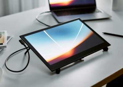
In this tutorial, I’ll show you how to think simply with basic forms, then compound that to create a convincing image. And I’ll be showing you how to do all that on the new Wacom One pen display. Wacom’s tablets have always been a favourite of mine, and the Wacom One is great for someone who’s just starting their digital game or wants to make art on the go. Now, I think it’s important to consider that the tool will only work as well as the person using it. In summary, having good fundamental skills should allow you to thrive regardless of the medium or tool you choose.
Workspace setup
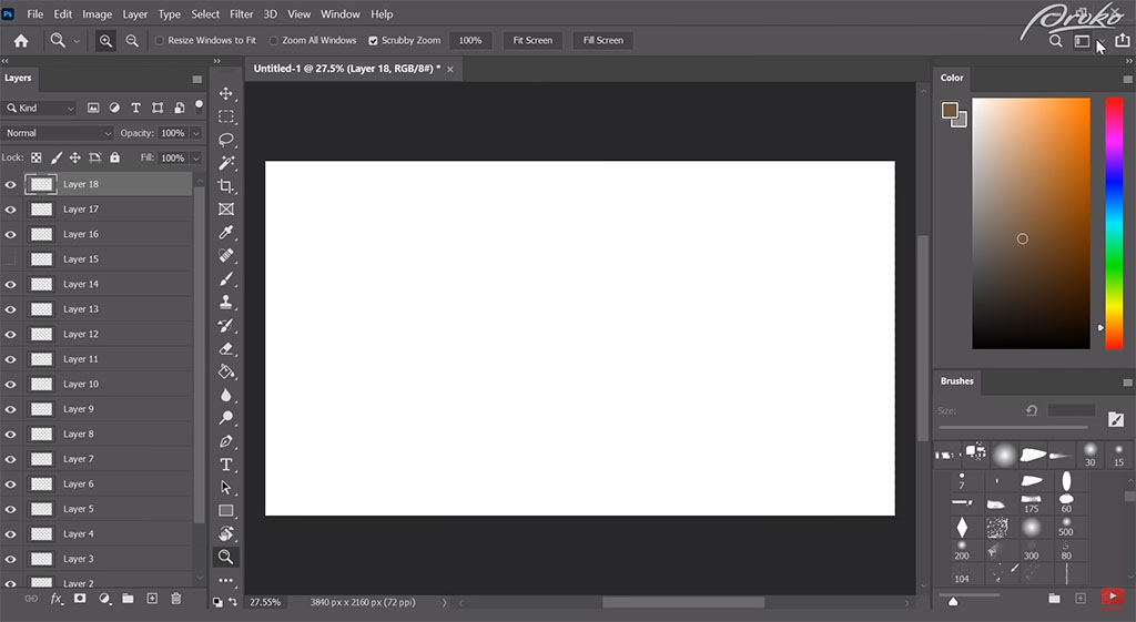
For this tutorial I’ll be using Adobe Photoshop. Personally, I hate dealing with tons of menus in my workspace because ultimately, these are just going to impede my ability to create. If you’re completely new to Adobe Photoshop and you’re using the Wacom One, your user interface will likely be the Essentials workspace, which is going to give us all these different panels that we’re probably never ever going to use.
When I paint, I only navigate through certain panels, so I’ll show you how I set up mine. What you’re going to want to do is just create a new workspace here and rename it, hit “Save”. From here, I’m going to drag out my colour cube and I’ll delete all these other panels. I like to have Layer, Colour, and Brush windows visible. Remember that you can always switch between different workspaces if you need to.
Tools
Now that we’ve got a workspace that’s comfortable for us to work in, I’ll give an overview of some of the tools that I use. A lot of my process revolves around me finding ways to create strong graphic shapes from the very start. One of the fastest ways I’ve found to do that is by not actually painting in the shapes with a brush but using different selection tools inside of Photoshop.
Those are mainly going to be my Lasso tool (regular one), the Polygonal Lasso tool, the Rectangular Marquee tool, and the Elliptical Marquee tool. To quickly switch between all of these, stack your keyboard commands on top of each other.
I have A set to my Marquee tool, and T set to my Polygonal Lasso tool. The reason why I have these set to T and A is because they’re very close to where my hand rests on the keyboard. If you can have all these keyboard shortcuts closer to your hand, then it’s going to be a lot easier for you to access them.
Another tool I use a lot is Move Canvas (space bar), so I can move the canvas around super easy. For example if you have multiple layers, and you’re trying to select these different layers, you can use Auto Select. What that means is when you click on those pixels, it’ll take you to that layer with those respective pixels on them. This is a lot easier to move around certain elements in your painting if you really need to.
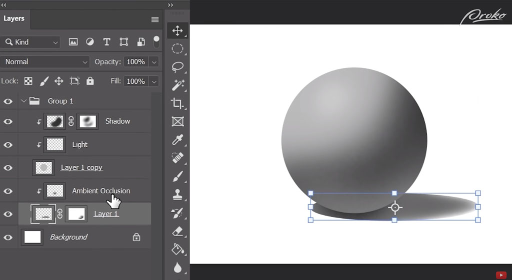
Now, there’s also transform tools inside of Photoshop that I use pretty frequently as well, eg if we wanted to create a sphere shape but we wanted to manipulate it a little bit. I have my transform tools on right now and I can use Alt to change these shapes. You can also use Ctrl to change one of these vertices to skew your object or use a combination of both.
I won’t go in-depth, but I would suggest that you guys experiment with this and see what type of results you can get. This is really good when you need to create patterns and overlay them on certain planes or if you need to skew them later on.
Since this might be a new process for some of you, I’m going to show how we can just combine some of our shortcuts together to create a convincing sphere. To get a good sense of how I use these tools on a project, make sure to check out the video above.
There are many ways you can describe different types of forms, especially once you get into textures. I think it’s fun to look at some of the old masters and see how a lot of them use texture and edge to create different types of forms.
Eventually, you’ll get to a point where you’re using textural brushes to create like a shorthand for some types of objects that exist in nature.
Textures
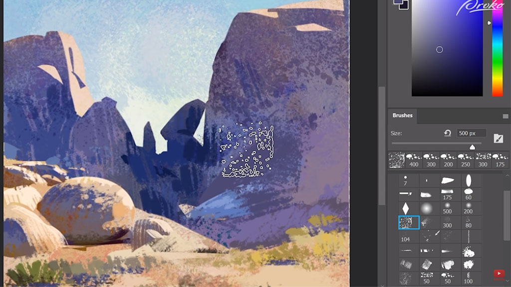
I’m using some of my own brushes that I’ve been experimenting with. A lot of them come from actual traditional scans from my own paintings and give me a bunch of chaos to kind of work in. If you think about happy accidents, this is kind of where this starts to occur.
In the back of my mind, I’m thinking – how can I use these types of textures to describe different things in nature. This could be: rocks, clouds, skin, freckles, etc. I’m thinking about different ways of using these brushes in the future. I’m going to show a little bit about how these brushes can be applied.
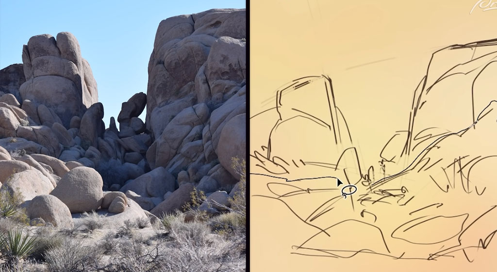
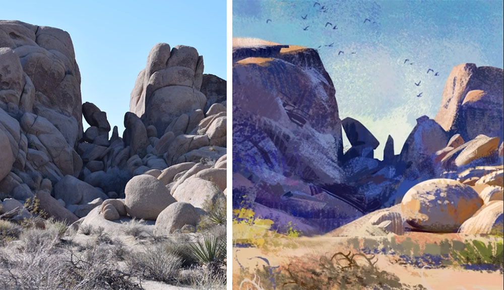
Now we can apply some of what we learned with just creating a basic sphere in Photoshop into an actual environment painting. I’ll be using a reference I took myself.
Sketching
The point of this is to create something that’s a little bit more exaggerated — maybe I can find the essence of being there at that place, at that certain time. Hopefully I can infuse something from that moment of time into this piece that the photograph just didn’t capture.
I’m starting off with just some very gestural movements. I like to think about just abstract composition, ie how we can create an image that is somewhat balanced but also simple. And then I dive into a little bit more of a complex sketch to give myself a road map – where do I go, where are my shapes going to be – and you can see there, I’m using some of my crop tools to create a sense of perspective there.
I’m creating big masses of shape at this point and I’m making sure that I have a silhouette that’s good and convincing. Just studying some of the negative shape relationships, how things are spaced apart from one another, is just something that you might want to look at, observe and then apply. That’s the next step — working with value.
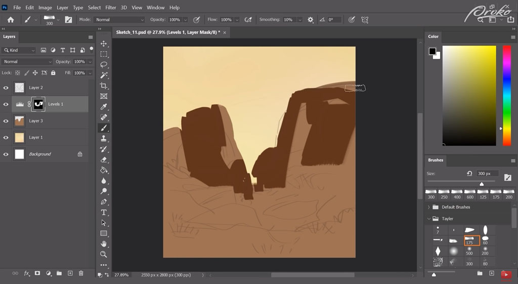
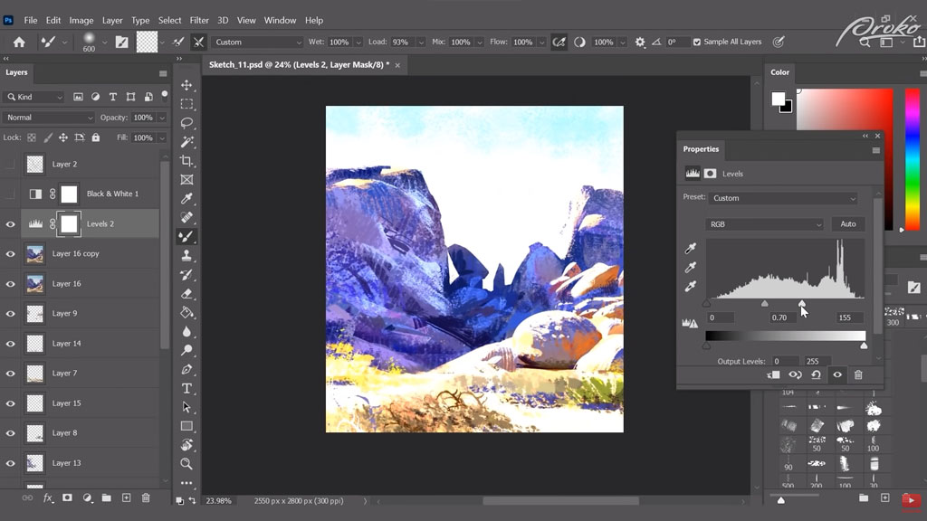
Levels & Values
I’m using a Levels adjustment right now and what this is doing is working on top of the values I have underneath and this is just creating a different value key. It’s pretty much shifting the tones and the values underneath. It’s working in tandem with the mask to make sure that I can come back and forth if I want to. I can use that mask to paint on top of instead of having to paint directly on top.
Overall, I’m getting a decent read on where I have a light and a dark relationship going on right now and my light’s coming from the back; it’s like a backlit scene right now.
Those planes on the top really aren’t getting too much light. There’s just a small hint of that light that’s going to be kind of casting over the form. And you can see even the boulders in the foreground that I’m establishing right now kind of have that same relationship. I’m creating larger shapes in the foreground and I’m making sure that they get a little bit smaller as they go back in the distance. Those overlapping shapes of light and dark help to give a sense of perspective, too.
I like to think about massing like lights and darks together as some sort of tapestry. If you can think about how fabric is held together, it’s woven together and if you maintain your lights and darks in the same way, then your composition is going to be a little bit stronger. Things are going to hold together a little bit more, the fabric of your overall composition is going to hold.
James Gurney actually describes it really well too; he talks about it as being “shape welding”, and it’s really interesting because you can create strong compositions if you make sure that all your shapes are meshing together, especially if the relationships of light and dark are working well.
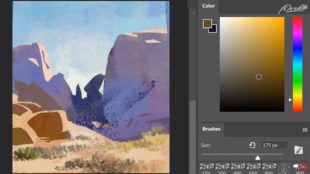
Colour
Now that I’ve got all my lights and darks in place in my composition, at least a simple composition is working from a thumbnail point of view, I’m just throwing in some colour, trying to establish a little bit of cool atmosphere for the sky and throwing in some warms for these rocks too, trying to establish some sort of light colour for those, and I’ll work back into those shadows too.
I’m using the selection of the mask I used for the levels and creating another shadow layer on top of that, but directly painting on top of it making sure to use all of the different selections I’ve created in Photoshop, going back and forth and reusing things. I’m using complementary colours of like purples and yellows.
Within that, I’m getting a bit more nuanced, like colour break up. I’m just playing around with some of the greys that exist within those colour groupings and that’s giving me a little bit of interest. Now, even though I’ve introduced a lot of colour at this point, you can see that my overall light and dark composition hasn’t really changed.
My values haven’t changed in terms of their overall structure. That’s one thing to keep in mind. You want to make sure that your thumbnails are similar to your final painting and the shapes are somewhat consistent.
You always have a bit of room to play around and mesh objects together or break things apart, but for the most part, you want to stay true to that initial statement that you made in the very beginning.
Painting
This is where things start to get a little bit more chaotic where I’m directly painting over some of these layers and breaking away from that non-destructive method of working. But I’m still thinking about what each layer is doing for me, and knowing that I can go back and affect these layers is going to be super helpful.
As with that sphere from earlier, I’m now using those textural elements to create a sense of material for these rocks. You can see where the terminator exists, I have a lot of texture between light and dark; that’s helping to convey that that’s a rock. By creating more overlap, it’s helping to reinforce that perspective a little bit more, too.
With those rocks in the background getting hit with light, it’s helping to show that things are going off in the distance, they get smaller. This tricks our eye into believing that we have a lot more structural perspective than we do. This is a very impressionistic approach to digital painting.
At this point, I’m really experimenting with my brushes. I’m trying to find different ways of using them. I’m even rotating my canvas upside down to help me get that angle where the brush is actually gradiating the way I want it to. I’m at a point in the painting where I’m still trying to figure out the main decisions that I’m going to be making, eg what are the biggest strokes that I should be making at this point, and should I have most of the detail in my shadows or should I have most of the detail in my lights.
One thing to consider too is our eye usually focuses on darks or on lights, and if we can prioritise one of those, then that’s going to make our paintings a little bit more effective and believable.
There are a couple of areas in this painting where I’ll go back, especially where the lights meet the darks, I’ll create a little bit more contrast in the darks. That will exaggerate that form as the core shadow and the terminators by moving the light across into the shadows. Again, just playing around with some of these brushes, I really treat these like little experiments. This is where you’re just going to be making mistakes and kind of pushing around the paint, seeing what happens.
Refining
I’m getting to the point where I feel ok about my composition. So I’ll refine some of those areas that push that believability a little bit, that representationalism where we get a little bit more nuance in our core shadows and insider shadows making sure that we have some reflected light, our core shadows are working properly and some of the smaller shapes are being accounted for too.
Ever since getting a Wacom pen display — like the Wacom One — it’s actually been so much easier to create these lasso selections and be more precise with them. That’s one thing I’ve noticed about using a pen display, is it feels more organic using these brush strokes; you feel like you have a direct response towards your painting. You get direct feedback. When you use a pen tablet like the Wacom Intuos, which I’ve used for a long time and has been nice — but you get this weird disconnect because your hand is down and your eyes are up.
I feel like I could use a little bit more movement with some lighter shapes that were kind of leading us through the painting, so we have some sort of rhythm with the silhouettes, shapes of the rocks in the background with the rocks in the foreground coming into the light. And I want us to come into the foreground and then go into the background, I want that to be a part of the gestural impact of the image.
I’m using a couple of other layer adjustments here, a black and white and also levels, to overexpose some of these areas, maybe push some of the brights a little bit more. Now that this sketch is somewhat complete, I’m going back and just retouching some areas and also adding in a couple of birds. It helps to have a little bit of ambient wildlife in the background of your painting to give it a sense of life, to show that there are things that live here it’s not just a barren wasteland.
Conclusion
I hope that you enjoyed my process, and seeing how I’m not super critical of the drawing I have, that I’m kind of just vibing with the shapes I’ve got and the reference that I’m using, and definitely relying on some of my past experience with plain air painting. I used my visual vocabulary to draw up some of those colours I’ve seen in the past and in real life. I really hope this gives you a new perspective on digital painting and how you can approach it a little bit more freely.
Want to learn more?

To check out Tayler’s work and get in touch, you can find him on Instagram or Art Station.
If you’re interested in a more comprehensive class on digital painting, Proko has a Digital Painting Fundamentals class that will get you off and running with digital art. They also have a variety of other classes to take your digital art to the next level!


