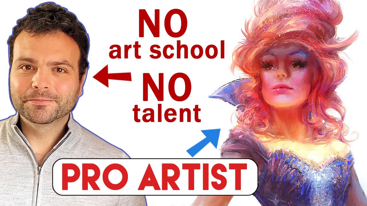
Salvador Dali once said, “A true artist is not one who is inspired, but one who inspires others.” Marco Bucci is the embodiment of an artist that Dali would celebrate, as Marco has generously been sharing his art, advice, and creative inspiration on his popular YouTube channel since 2007.
In the video below, Marco reveals how he became a professional artist despite not attending formal art school, and gives you some tips on how you can pursue your own creative passions even if art school is not in your future plans. By showing several of his early creations, Marco demonstrates from personal experience that drawing well is a skill you can master if you work hard, and you don’t need inherent talent to succeed.
Here’s Marco’s advice for those who want to pursue art as a career, without enrolling in art school.
1. Find alternate methods of getting art instruction
Marco took lessons at a local Toronto life drawing studio, owned by Nick Kilislian. In his first session, nude model posing, Marco attempted to draw the finished contours of the body right off the bat, the same way many beginner artists lay down their first lines. It soon became apparent that his way of drawing wasn’t producing optimal results.
“After seeing some of Nick’s 3- to 5-minute life drawings, it became clear that my approach to drawing had to fundamentally change,” said Marco. And here are some things he learned along the way…
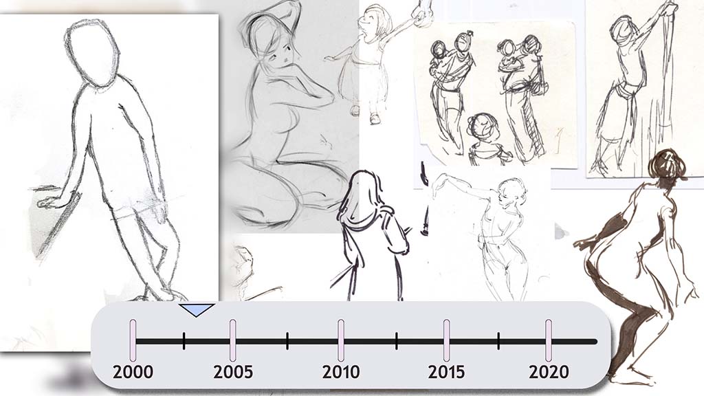
2. Learn gesture drawing
Nick showed Marco how his teacher, Glenn Vilppu, would draw something called “gestures.” A gesture drawing isn’t supposed to look finished or pretty; it’s a method of drawing designed to quickly capture the feel of a pose and can very quickly indicate things like weight, balance, and movement. “There are no rules to drawing a gesture, but one piece of advice I do have when you draw a gesture is to be ‘gestural.‘ Doing this will help you find the larger relationships within a pose,” advises Marco.
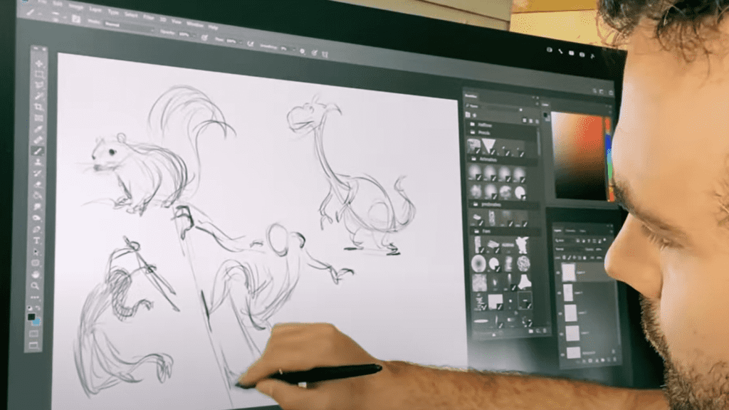
3. Understand the rhythm of a gesture
Rhythm is an abstract through-line that gracefully connects all the parts of a pose and helps ensure that together they add up to something. The rhythm of a figure can be thought of as the ‘movement’ through its forms. The middle line of a figure defines the general movement of the pose, and thus its rhythm.
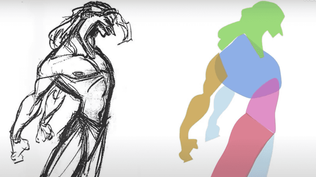
4. Break down the figure into basic forms
The next lesson that Marco learned from Nick was how to break down a figure into its basic forms. Marco and Nick started by putting a piece of tracing paper over a photograph of a figure and would reconstruct it with boxes, ellipses, and cylinders. Breaking down complex figures into simple shapes helps you to see the dimensions, geometry, and volumes of the figures. Nick also taught him to square off the cylinders — for example, on the arms — to get a better sense of both the roundness and the planes of the arm. Marco also learned to draw through the geometry, and by adding ghost ellipses, cylinders, and boxes would get a sense of their position in space so he got a better feel for creating three-dimensional figures.
It was during these lessons with Nick in 2003 when Marco bought his first Wacom tablet.
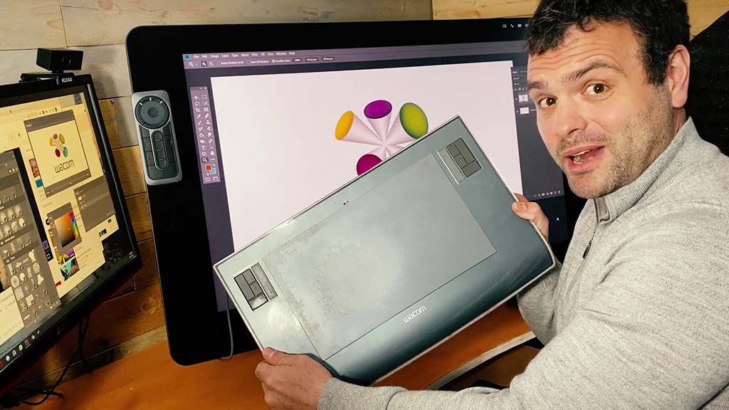
“I was convinced that I could become a professional artist and it was a huge moment for me, so I went out and bought a tablet. I chose Wacom because, hey! it’s the industry standard, and trust me, I’ve tried them all.”
5. Understand shapes
Shape is a fundamental component that packages all the information and delivers it to the viewer in a digestible way. A figure can be completely worked out in a gesture, but the addition of the shapes lends a level of sophistication to the drawing. Here’s a simple exercise that Marco suggests for enhancing your understanding of shapes: draw a basic shape (like a square) and then redraw it a bit askew, almost like a force has been applied to it. Draw it again, but add a curve to one of the sides. To add dimension, try adding cross contours going over the form.
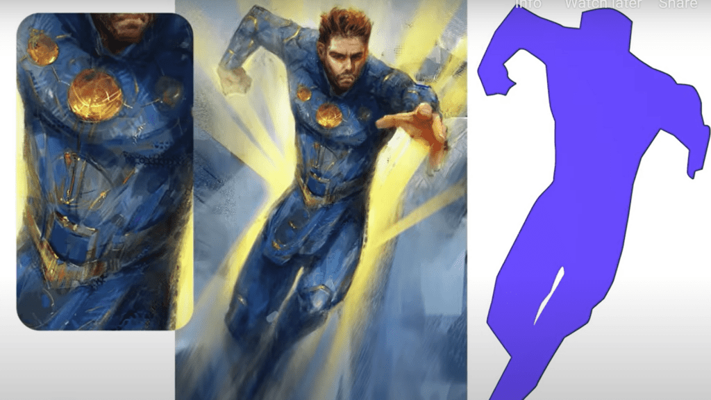
6. Keep the silhouette clear
A clear silhouette gives you a lot of freedom in creating the interior lines of a character. If you can fill in a drawing so all you see is the shape, and the figure is still readable and understandable, then you have drawn a good silhouette.
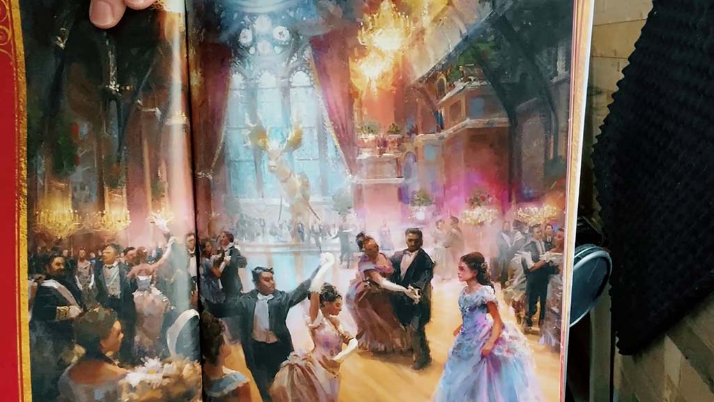
7. Experiment with using shapes thematically
Sometimes basing your shapes on a theme can help you arrive at a good design, but warping or distorting the shapes and varying the sizes will help minimize repetition. Marco gives an example from 2002 when Chris Sanders brought his signature round shapes to the animated film, Lilo and Stitch. He points out that it was a stylistic choice, but one that’s derived from life’s visual lessons.
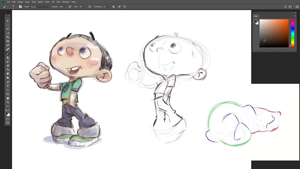
8. Avoid repetitive symmetry
Marco cautions against repetitive symmetry, which is almost never seen in nature. Instead, he suggests you try what he terms “offset symmetry.” Marco gives us the following example:
He traces the curves of the calf muscle, plots the apex points, and draws a line through them. The symmetry happens on the diagonal. “In the Lilo and Stitch style guide there’s a warning against obvious symmetry. There are two solutions: offset the symmetry, or put two totally different lines up against each other.”
He continues: “The eye just likes variety, and every artist I’ve ever studied has the curve versus straight thing in their visual vocabulary, but it’s not the curve or the straight that’s important. It’s the ‘something versus something’ dynamic and how they match up against one another.”

About Marco Bucci
Marco is a professional Canadian artist with 15 years of experience in the film, TV, game, and print industries – primarily as a concept artist and illustrator who recently upgraded to a Wacom Cintiq Pro 32 and ergo stand. He strongly believes that it is the duty of experienced artists to pass on what they’ve learned, and it’s for this reason that he’s a passionate teacher at CGMA. His clients now include Disney, Marvel, MtG, Hasbro, Lego, Lucasfilm, and more! Check him out on YouTube, Patreon, his website, or Instagram.

