
What makes a good poster design? I would say a good color palette, masterful composition, and conveying the message as quickly as possible.
Not all poster designs include illustrations, either; there can also be many examples that present fusion of different techniques, such as photography, using handmade details, or typography. However in this article, I will be focusing only on digitally illustrated poster designs, since it is one of the most commonly used techniques.
Without further ado, I will start presenting you with some examples and then discuss what makes them worth so inspiring and worth spending some time considering.
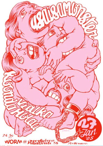
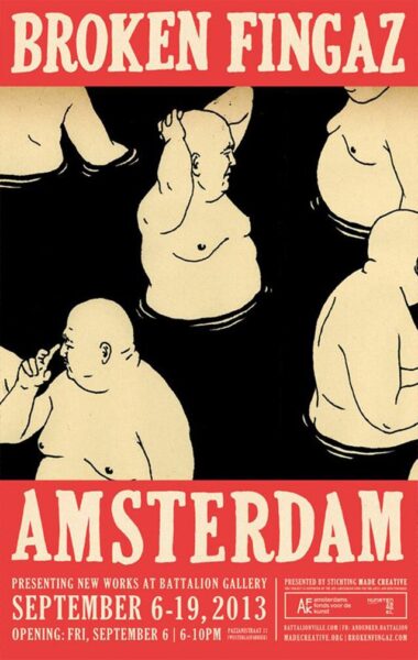
I can’t help but think: “How can a design from 2005 still be so relevant?” This piece is definitely a classic, and the artist made sure to design it in a way that could speak to generations to come.
The best thing that makes this poster stand out to me is how Zeloot used all of the space and drew the characters that look like they are squeezed tightly in the frame of the poster, but still managed to leave some negative space and used a bright color combination so that it’s eye-pleasing. The comedic characters help with the light-hearted feeling of the poster, and the combination of fun and grunge helps with the cool vibe that this poster has.


These examples are great to show how sometimes crowded designs can make good posters. When the poster is being designed for a party or for an event, it is good to show some motion, and many characters and details with popping colors and abstract compositions.
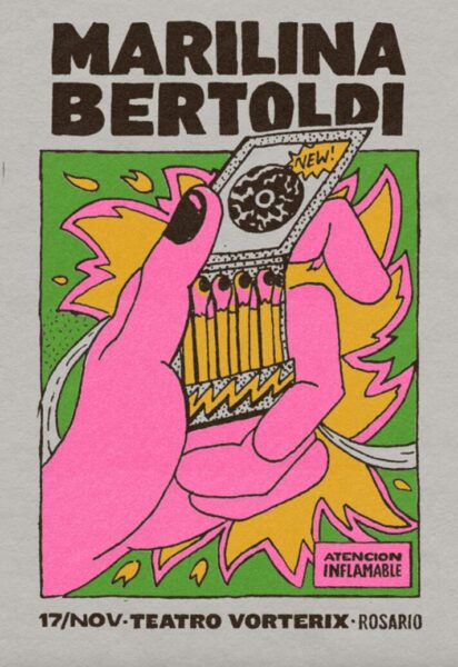
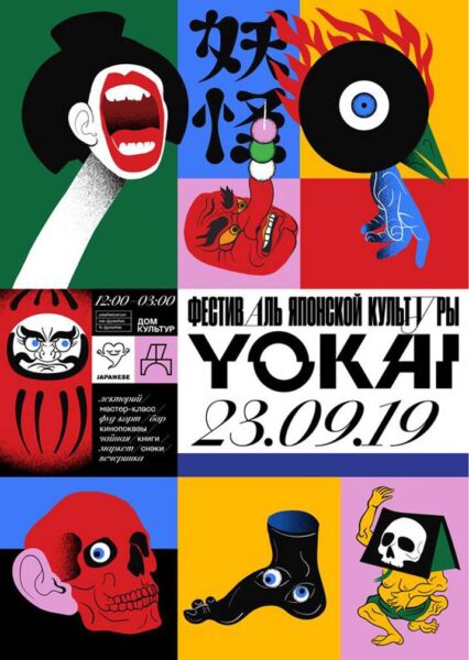
This example shows that even when the illustration is simple, when used with vibrant colors and easy-to-read typography that goes in harmony with the overall feeling, the design can be striking.
When designing a poster for an event, the most important thing is to make the image eye-catching. Imagine where you see event posters — usually on the streets in a place the city allows ads to be put up. And there are often just so many of them, one next to each other. If you want your event to be seen among all the others, good color combination and attention grabbing design should be your way to go.
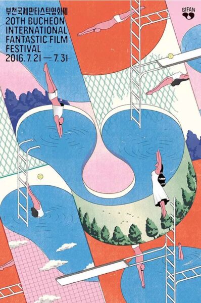
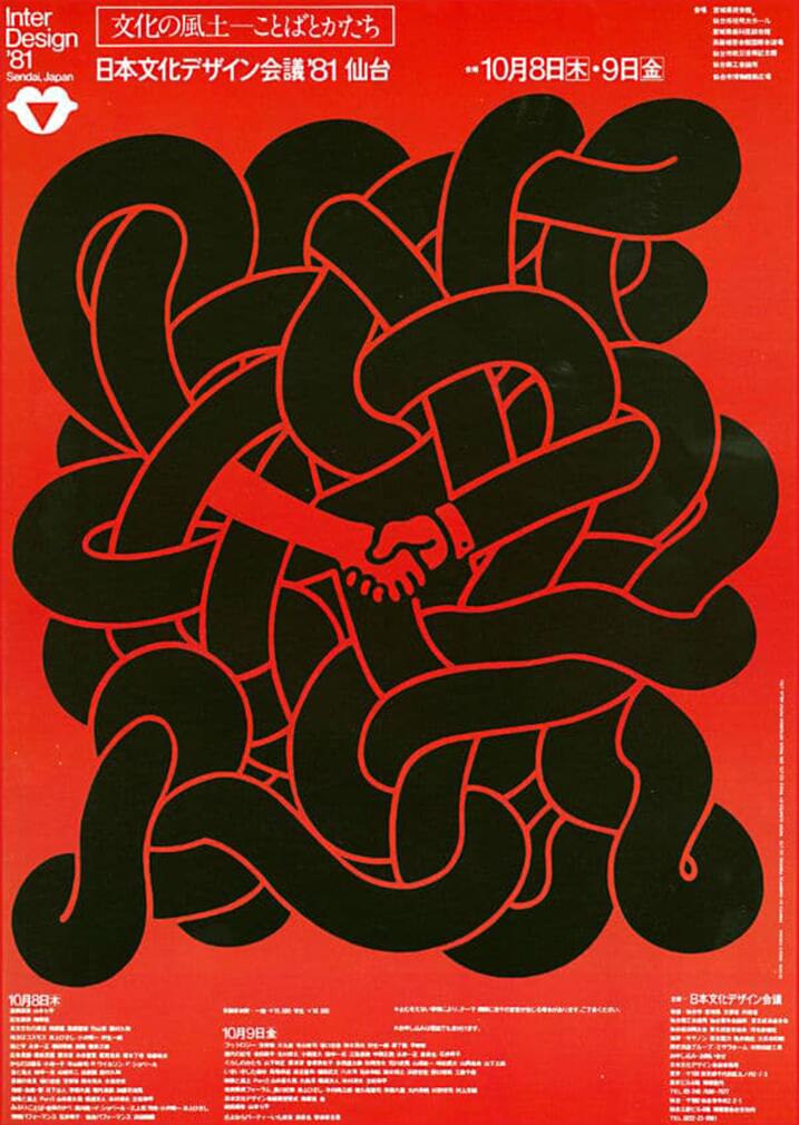
This poster also does its job successfully in the sense that it shows us sometimes you don’t need popping colors to be attention-grabbing, but a balance. With the abstract composition and details that the viewer will definitely try to understand, it is inevitable that people will want to look at this design longer than others and will try to figure out what it is about.
It is a design for a film festival, so we would want this poster to stay in the minds of the audience a bit longer than, say, a poster for a party on a weekend. The confusing but fun story telling in this image would probably help the viewers remember what it is about and it makes the festival look promising.
In my opinion, another thing that makes this design good is the usage of geometrical and neat lines, and shading details only where they are necessary (on the trees and clouds). Nothing else in the poster is colored that way; the human figures are painted in a plain way. So normally this could create a chaos if not made properly, but in this illustration, the opposite happened because there is a well balanced, yet still striking order.
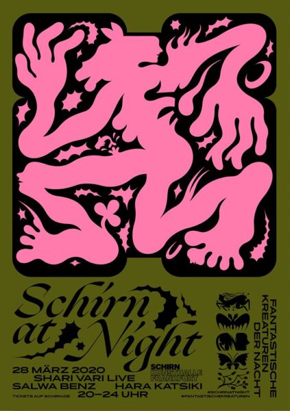
This poster has been on my inspiration lists since the first time I saw it. Benedikt Luft used only three colors, but he did it in such a way that the graphics, the contrast, and the artistry of it all came together in a perfect harmony.
Something else you can do when designing a poster is to use very simple illustrations. If you manage to combine them with good typography, you will have a striking poster design.
All the following examples are designed by using very few and basic colors. With simple illustrations made with a precise technique, these images successfully take their places in this article.
If you also want to master this technique, the notes to take from these designs would be to use typography in a limited space, to keep the image in the focal point and make it simple but unexpected. The other thing is, of course, like I already mentioned a few times before, to use a limited color palette which would still make sense.

Paying attention to contrasts and to keeping the texts as readable as possible would be another note for me to write down. Whether it be with the pattern use or precise drawing skills, simple illustrations make most of the memorable poster designs.
This last example is great to show how combining simple illustrations and crowded compositions can also work wonders. The key to making this kind of a design is to keep the balance with geometrical composition, a vibrant color palette, and enough space for the texts while keeping them easy to read.
To conclude, when designing posters, not only typography or the image, but also the colors and the composition matter a lot. Mastering these skills is not an easy task, but with the risk of sounding a bit nerdy, I will say that “practice makes perfect.”
Making different boards on Pinterest or practicing by trying to use the things you find inspiring in others’ artwork in your own style — I’m only suggesting to do it for practice reasons, I’m not saying copy other people’s artwork. Never do that. NEVER — would probably help you improve your own design style faster.
And speaking of posters, PosterSpy is a great platform if you’re a designer looking to find clients or if you are a business owner with the intention of finding an artist to design posters for you. “The showcase platform for poster artists,” PosterSpy is here for both clients and creatives. Just click here and see the magic with your own eyes. There, not only can you find inspiring work, but also you can work with many artists on a commission basis.
Are you an artist working digitally? You should check out Wacom’s pen displays and pen tablets that will make your work life easier and better.
Are you already working on your own Wacom tablet? Then don’t forget to tag us and use the hashtag #madewithwacom when you post your work on social media, so that we can repost it and our artist community can keep getting inspired from each other.
Looking forward to seeing your creations!
About the author:
Zeynep Alpay is a freelance multidisciplinary artist and illustrator based in Köln, Germany. Their work encompasses illustrations, animations, paper cut-outs, and traditional artwork.
For more information or to see more of Zeynep’s works, check out their portfolio, their Instagram, or their Linkedin.