

We recently had a handy article on inking with Clip Studio Paint, so here’s one on doing the thing that’s in the program’s title.
How is CSP Different From Photoshop?
It’s designed specifically for drawing and painting, instead of those being side uses for a catchall imaging program. It has a stronger brush engine with better “handling” and stabilization, better drawing and correction features, and in some ways, more control over tool customization. It excels at lineart in comparison, but its painting brushes—while harder to learn initially—are very satisfying to use. It also has several different color pickers, instead of Photoshop’s variations on one, that allow for different types of customization.
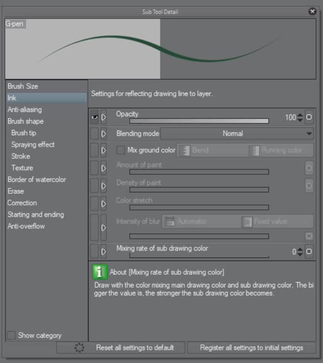
Brush Settings
All CSP’s built-in brushes essentially work the same, the main differences being between the shapes and textures. Everything else can be adjusted in the Sub Tool Detail window. (The wrench icon.)
I’ll be doing this entire piece with the default Oil Paint brush-
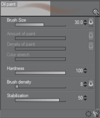
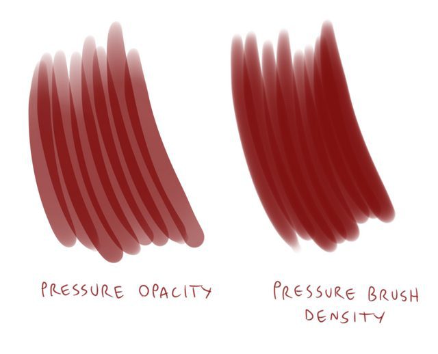
-And mainly adjusting only the brush size, hardness, and brush density—the equivalent of Photoshop’s flow. I use that to control the “paint” thickness instead of the opacity tool since it’s less likely to cause “overlaid stripes.”
With some brushes, lowering the density will create a “dry brush” effect, but not this one since it doesn’t have that texture. Stabilization will be kept around 75. I used to set it to half that when I painted on an older Intuos, but the newer Cintiqs are more sensitive.
Here are some other settings I won’t be using for this piece, but are important to know:
- Blending Mode: Works just like layer modes, causing different color interactions and changes to the existing image.
- Mix Ground Color: Causes your brush to smear the existing color, like watercolor paint, or wet paint in real life. This was on by default, but I turned it off because it adds another layer of complexity.
- Thickness: Brush’s aspect ratio.
- Spraying effect: Same as photoshop’s “scattering:” turns your brush into dots.
- Stroke: Changes the gap between your the instances of your brush’s pattern.
- Texture: Adds a texture to your brush from the “image materials” library.
- Border of Watercolor: Adds darker edges to your brush.
- Post correction: Smooths your curves and sharpens your angles after each stroke.
- Brush stroke: Changes the length of the “tail” left after you raise the pen.
- Starting and Ending: Allows you to set your brush to taper, fade, or do something weird at both ends of each stroke.
- Anti-overflow: Lets you constrain your painting area to a separate “reference layer.”
On to the painting:
Painting
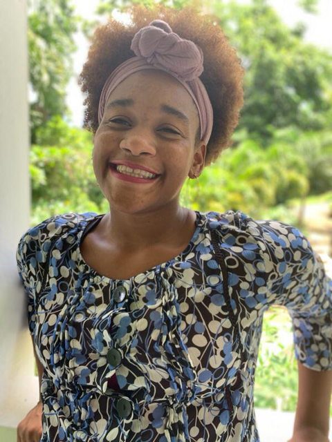
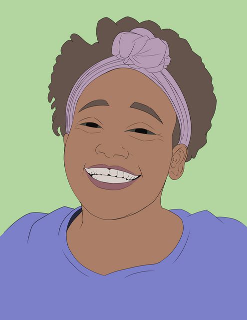
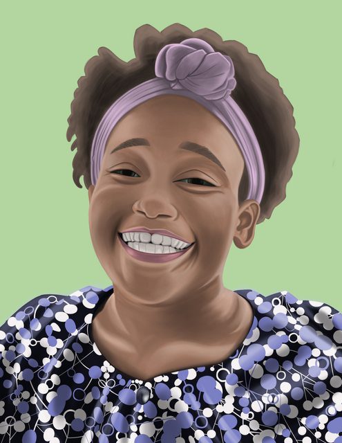
I’ll be painting u/Inuwa-Angel from Reddit, with thanks for her portrait request and permission to use it for this article.
My reference:
After starting with a paper sketch, I use the polygonal lasso and move tools to make some corrections. The pencil sketch was fairly close for being done from observation with no measuring, but this gets it a bit closer:
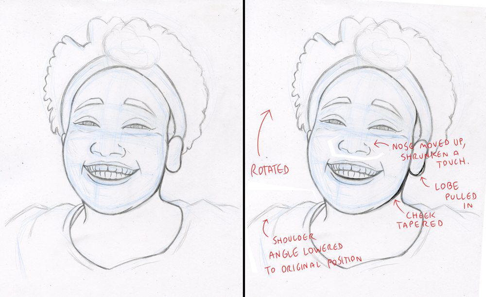
If this was going to be a line drawing, I wouldn’t have gone into even this much detail: Using hard lines for every facial crease makes the subject look older. it’s just a placeholder for edges that are going to be much softer, so I’m just noting where those creases are, not how strong they’ll be.
Some proportions are exaggerated—slightly wider smile and eyes—since copying every detail of the photo directly tends to result in more muted expressions than you might want in a drawing. If you want a perfect likeness, take a photo.
I add a paper layer: a background fill layer that can’t be moved or erased.
Layer > New Layer > Paper
You can use any color, but mine will be white.
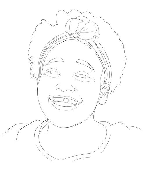
Then I draw some very thin lineart, so I don’t have to worry about reshaping the features as I keep painting. Many more experienced painters prefer to work without lines or flats, and their power is awe-inspiring, but this can save you work. I’m using the Darker Pencil, but it doesn’t matter which tool you use.
One of the most common pieces of digital art advice you’ll find is to start from a medium-toned canvas instead of white. You will also find that advice here. It’s far easier to start with a middle tone and paint on highlights and shadows, than to start at the brightest value and paint literally everything else. I typically start with 50% gray, then cover it with other neutral colors during the “flatting” stage.
Layer > New Fill Layer > Set it to 50% gray
Hearkening back to The Nuts and Bolts of Color Theory, I used an eyedropper sample of her skin to generate a palette with Adobe Color.
I played with the settings until I got one with a medium brown, a blue for the shirt, a green for the background, and a purple for the headband. Thankfully, her outfit colors are also well-coordinated.
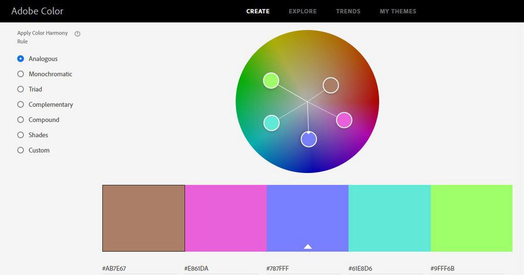
All others in the painting will be made by either changing these colors’ saturation and value (but not hue) and mixing them.
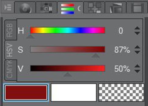
The Hue-Saturation-Value panel.
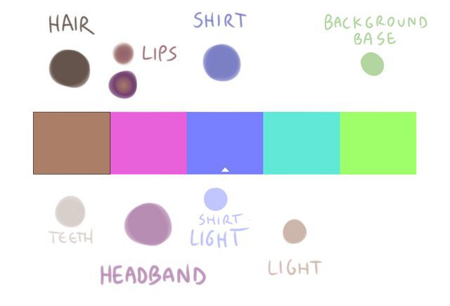
Skipping ahead, here’s what ended up being the final palette once the piece was done.
I lay in the basic areas of color with the fill tool and the pencil. This is called “flatting.”
Then I draw the shirt and paint in large areas of medium lights and shadows, using a medium-size brush, by turning the color values 15% up or 15% down from their base: Base skin is 65% value. First shadow pass is 50%, first light pass is 80%, and more desaturated.
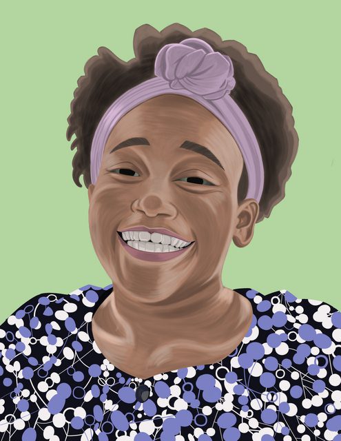
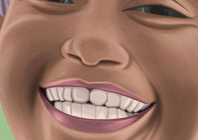
And we’re done!
…OK, it’s not very flattering yet, but all is as it’s supposed to be. Your piece will often look downright awful in the early stages. The best art advice I’ve ever gotten is to stick with your piece because it will suck until it suddenly comes together towards the end.
I do a second pass of shadows and lights, adjusted another 15% down and up, respectively. (50% and 95%) but with a much lower-density brush.
Still unflattering, but starting to take on some life.
Next stage will be where the bulk of the painting gets done. I blend by eyedroppering the edges of strokes, where one begins to fade into the next, then painting more of that color in the middle with a low-density brush until it’s smooth. Often very low density. Like 3-10%.
Then I adjust the value slider freely to add the brighter highlights and the darker darks, monitoring the thumbnail while I do it to ensure the overall balance looks good.
Yeah, yeah, I know:
But even though this is by far the longest stage, it’s the simplest.
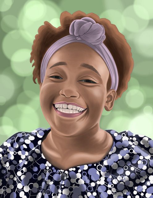
Finally, with our subject dialed in, it’s time to do the background. For pictures where the background is an important part of the image, I recommend doing it first, but for ones like this where it’s more an afterthought—an annoyance, even—it’s fine to do it last to make sure it coordinates with our portrait’s final colors.
I tried to paint the trees in the background, but they were too distracting due to the uneven shape. They didn’t even read as trees, especially once I blurred them. So instead, I’m going to paint a bokeh.
I use a brush with low density at about 80% hardness and all pressure settings, including brush size, turned off, then manually adjust the size for each dot.
Finally, I tweak the whole piece’s colors with adjustment layers to make them more interesting. This isn’t cheating either. Most artists adjust the colors afterwards, just like most art photographers. I raise the saturation a touch to make it pop more, then I add another adjustment layer to turn down the brightness and saturation on the shirt alone, so it looks less plastic.
And finally, I add a texture by dragging and dropping it from the materials panel. This is a rough paper texture, but shrunk down and set to soft light mode.
Finally, I go back and paint in a few of the brightest highlights with a large, soft, low-density brush.
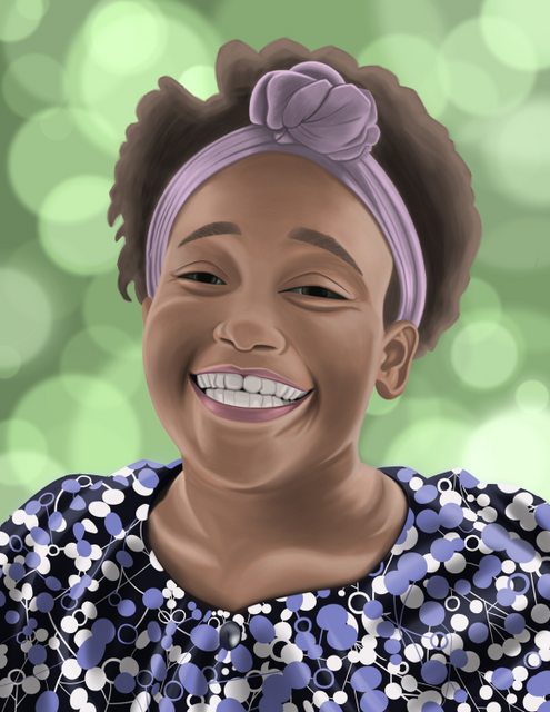
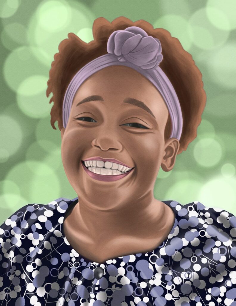
Our finished painting:
Since I constrained myself to one brush here…
I didn’t get to explore the many textures and effects CSP’s others have to offer, or even get into the blending or decoration tools. However, once you know the basics of the sub tool details, it’s just a matter of picking a brush and tweaking those settings to get any effect or texture you want.
There are also countless downloadable brushes and brush packs available all over the internet, both free and paid, and I encourage you to try them. (Just don’t go too crazy, or your menus will get too cluttered to find anything.)
I hope this gave you a good lesson on the basics, but it’s just barely scratching the surface of what this program’s capable of. When it comes to digital painting, CSP can do anything Photoshop can, and in some cases, do it with less hassle.
About the Author and Artist: CS Jones
CS Jones is a Philadelphia-based freelance writer, illustrator, and occasional photographer. He spends his spare time listening to Spotify and waiting for trains. Someday, he’ll finish that graphic novel. In the meantime, his work is best seen at thecsjones.com or @thecsjones on Instagram.


