

Part 1 of a 2-part series
Color is one of the most complicated and subjective topics in art. So I’m going to try to summarize it in the shortest terms possible.
First off, I’ll skip covering the color wheel, the scheme types, and color symbolism here; this is just about the nuts and bolts of applying color to your drawings.
You could say representational painting is a process of rendering forms, then painting light over them. This is sometimes literal, in the case of artists who proceed in sequence from pencil sketches to line art, to flat colors, and then highlights and shadows; or not, in the case of artists who jump right in and paint everything from intuition, starting with blobs of color and refining them down. (Note: Wacom Cintiqs are great for this.)
But either way, your piece is still composed of objects defined by their shapes and local colors, with light providing the rest of the visuals.
What Is Color, Though?
Maybe it helps to know how we see colors before you try to represent them.
A photon is the tiniest particle of light, and each one has a color. White light is the result of photons of all colors hitting your eyes at once, and most light bulbs emit a mixture of so many colors that they’re almost white, as does the midday sun.

Any Color You Like
When a photon is shot out of a light source, it hits the first object in its path. The atoms of the object’s material eat up most photons, but spit some out in our direction, making up what we see as that object’s base color, or “local color.”
The Two Colors
When a photon leaves the object that ptui’ed it out, it joins the other-colored photons bouncing around the room to form the combination that hits our eyes. So, essentially, the color we see an object as is a mixture of its local color and the color of the light around it. It will retain some of the light’s original color, too—so a yellow streetlight shining on a red fire truck will strike our eyes as orange.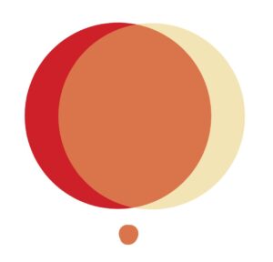
…However, we’ll still know it’s red: Your brain’s amazingly capable of identifying an object’s local color in different lighting conditions by comparing it to its surroundings. This is called color constancy.
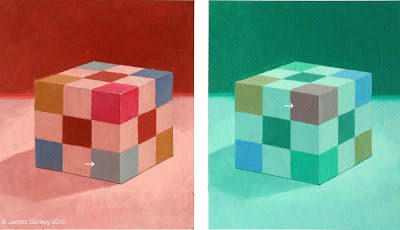
From James Gurney’s Color and Light
Trippy, right? That leads us to another concept called…
Color Relativity
…Which is the last concept in reverse: Surrounding a color by certain other ones can cause us to perceive it as an entirely different hue.
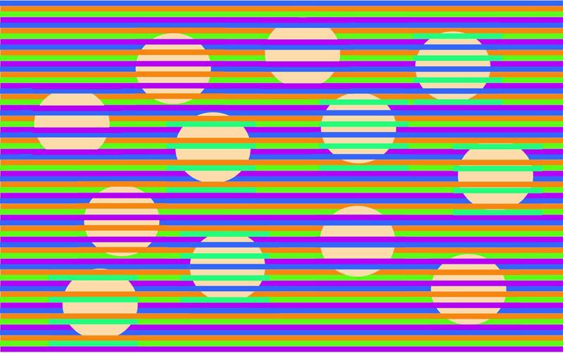
A “Munker Illusion:” All of the circles are the same color, only their positions on the lines are different. Image by David Novick of UT El Paso.
“Cool story, but how does this affect my art?”
Simple: These are the most basic principles you have to take into consideration while painting.
That’s why—until you develop an intuition for mixing local and light colors—I recommend you paint with the first method from the intro: Starting by drawing out the subject’s form, then using the fill tool (or a large brush) to add local colors, then moving on to painting light and shadow colors over them.
Additional light sources will add more colors, and as a beginner, it might be impossible to guess the exact hue a red fire truck under a yellow streetlamp on a blue-moonlit night will end up as. But by painting the yellow highlights and the blue shadows using layers at half (or whatever) opacity over the local red, you can let the process determine it for you.
Weird.
Color relativity is also very useful in picking color schemes and choosing where to use which shades. For example, on a subtler level than the Munker Illusion, cool colors surrounded by warm colors will look more darker or more drab; warm colors surrounded by cool colors will pop more. This can help you decide where to place certain lights and objects in the painting, and even create the illusion that there are more colors within a limited palette than there actually are.
This forms the foundation of color harmonies, combinations that look pleasing to the eye. This is due to some complicated psychology and wavelength stuff, which I mentioned I had to leave out, but see the “homework” section.
…It’s also why great colorists, such as master painters, will mix in splotches or overlays of different hues to create a more pleasing visual effect, even if they realistically wouldn’t be there.
Creating Harmonies
Oh yeah, speaking of that, you shouldn’t be adhering directly to realism. That little overview of how color works in the real world was only a guide to make sure that you have a solid foundation on which to modify it and mix your own.
A fixation on the exact shades things are “supposed to be” will hold you back. Personally, it was one of my biggest obstacles to learning digital painting for years. “I’ve colored this fire truck red, but is it the exact right shade of red? If I get it a bit off, did I draw a bad fire truck?” But that was as ridiculous as it now seems writing it out: In your world, there’s no reason a fire truck has to be a perfect #CE2029. It can be any variation you want as long as it still reads as red, and you can and should adjust it to work better with your palette.
Sometimes, less is more. One of digital art’s biggest upsides—the fact that we have a choice of unlimited colors at hand with a click—can prove a double-edged sword for new artists. A smaller palette creates harmony and encourages creative changes to the color of objects and light.
Paradoxically, when creating a colorful piece, you want to reduce the total number of colors used: this keeps it from losing its unity. E.g., try consolidating all of the light blues into your scene into one light blue that you use everywhere, using the eyedropper to make sure that you get the same shade every time.* Tamping down the number of colors in your piece and focusing on blending the ones you have will give you a much stronger and better-mixed piece.
*There are some artists who will paint their palette in a separate layer off to the side of the canvas for this reason.
Now Pick A Palette
“If you choose your colors ahead of time, you’re more likely to end up with nice, pleasing color schemes than if you were to just dive right in and start picking colors randomly,” says Ctrl+Paint’s Matt Kohr.
So here’s an exercise I’d like you to try: Next painting, pick five colors and use only them for everything. (You are also allowed black and white.) It doesn’t matter what the subject is, and you shouldn’t pick it based on your palette, since this is meant to open your mind to coloring possibilities: if you just want to take a grayscale painting and color it this way as practice before you move on to do it for real, that also works.
How do you pick the exact shades? I can’t answer that for sure without a color theory section that would quattuordecimtuple* this article’s length. So instead, I’ll teach you to cheat. Gasp!
(*14x.)
There are online utilities like Paletton and Adobe Color that present you with a color wheel and automatically apply theory principles to generate a five-color palette based on a base color you select.
There are also palette libraries like Colrd and Color Hex Palettes, and plenty of artists share their palettes on Deviantart and Tumblr in the form of jpegs you can eyedropper from.
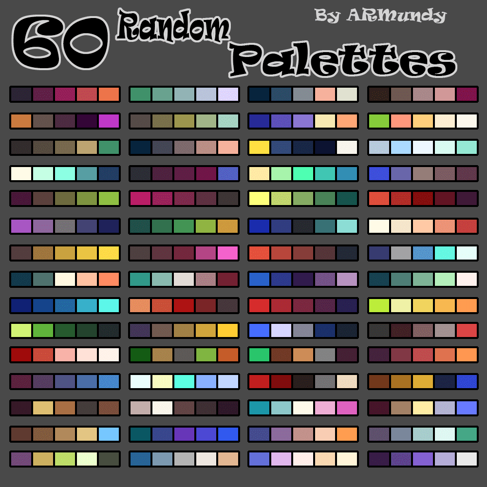
Image credit: A.R. Mundy on Deviantart
How are you supposed to do a whole painting without every possible shade you could need? Simple: mix them and do some improvising. A small range of colors, blended in different ways, can create a much wider range: remember how it only takes three to make up the whole spectrum of visible light?
Homework
Just as important to understanding color are many concepts I had to leave out, many quite fundamental. So here are some optional assignments to give you a more holistic view of color:
- Look up the definitions of “analogous,” “triadic,” “tetradic,” “complementary,” and “split complementary” color schemes.
- Try coloring a drawing with pre-made palette from one of the sites above that wasn’t made for digital art, but UX or graphic design. See how the results are different.
- Read a few articles on color psychology. Note what feelings and concepts each color commonly represents.
Sources:
- James Gurney’s seminal Color and Light, a must-have for digital painters in my opinion.
- Austin Batchelor — Digitally Painting Light and Color: Amateur to Master. I know the phrase “Udemy course” causes some people’s blood to run cold, but his are some of the best.
- Blender Guru — Understanding Color. (Goes in depth on psychology and the “homework” color schemes.)
- Marco Bucci — 10 Minutes To Better Painting — Colour Harmony
- Proko — Shape Value Color Edge
- Ctrl+Paint — Mixing Paint
- Sara Tepes — Color & Lighting Tricks for Digital Painting
- Baban Illustration — Picking a Unified Colour Palette — How to Bring an Illustration Together with Colour
- Corridor Crew — VFX Artists React to Bad & Great CGI Series
About the Author: CS Jones
CS Jones is a Philadelphia-based freelance writer, illustrator, and occasional photographer. He spends his spare time listening to Spotify and waiting for trains. Someday, he’ll finish that graphic novel. In the meantime, his work is best seen at thecsjones.com or @thecsjones on Instagram.


