Comprendiamo che può essere difficile lavorare con i colori e l'illuminazione, quindi ecco alcune intuizioni della talentuosa e adorabile Maria Poliakova. Maria è un'artista di Kiev che a volte impazzisce un po' con i colori, con grande effetto.
In questo tutorial, Maria illustra passo dopo passo il processo di creazione di un ritratto colorato utilizzando la sua Wacom Cintiq Pro 13. È entusiasta di condividere con te alcuni suggerimenti, spiegazioni e dettagli tecnici, così anche tu puoi imparare a disegnare un ritratto con colori vivaci, apportare modifiche al colore e organizzare il tuo spazio di lavoro.
Puoi leggere ogni passaggio qui sotto o guardare il suo processo nel video piuttosto esteso.
Portalo via Maria!
Passaggio 1: come trarre ispirazione
I believe that inspiration is not something you need to catch or wait for. This is something that you can do yourself. For example, I have a folder called References with many subfolders inside: faces, ‘sculptures’, ‘traditional art’, ‘nature’, ‘animals’, ‘bugs’, ‘light’, ‘colour’, ‘cloth’, ‘flowers’ etc. I’ve been collecting them for years and continue to do so.
To organize the references I usually use PureRefAnd keeping in mind the theme of the future illustration, I quickly look through some folders. I look at various beautiful sculptures, multi-coloured beetles and butterflies. I browse through the works of old masters, some beautiful photos, and then I feel how inspiration appears.
Now I see my future illustration more clearly and move on to the next stage.

Passaggio 2: schizzo approssimativo
Mentre faccio i primi schizzi, cerco di non rimanere bloccato nei dettagli e faccio solo linee e valori di flusso leggero. Tutto ciò di cui ho bisogno ora è creare forme semplici e di base e mantenere la silhouette chiara e leggibile.

Passaggio 3: definizione dello schizzo
Now, after I’ve chosen the sketch I like best, I reduce the opacity of this layer, then I create a new layer atop and draw a clear sketch with more details and refine it.
Usually, I use extension Lazy Nezumi on this stage. It helps me to do my lines smoother.

Passaggio 4: schizzo a colori
The most fun part of sketching. You can open your reference folder ‘bugs’ or ‘insects’ or ‘butterflies’ and see their beautiful combination of colours. So, I take a big soft brush, pick a vibrant color and start to combine colors.
Also, on this stage, I often use ‘Hard Light’ blending mode.

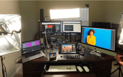
Passaggio 5: Preparare l'area di lavoro
Now I can start to add details, but before that, I always prepare my workspace in Photoshop.
I open multiple views of my work: Go to Window-Arrange-New window for…(name of your file). Then do it one more time. To set up one of the window in B&W go to View – Proof Setup – Custom – Device to Simulate – sGrey.
Now I have three windows with my picture. I place them as shown on the image. This allows me to see my work constantly from the distance and check my values and see my mistakes easily.

Passaggio 6: pennelli
At the beginning, I usually use the combination of two brushes: soft for big values and texture for details.
All my favourite brushes are from these packs: Speedpaint Brush Panel by Jonas de Ro and Kylo Watercolor Brushes.

Passaggio 7: Utilizzo dei riferimenti
L'uso corretto dei riferimenti è una cosa molto importante per un artista. Dovrebbero essere usati come guida in anatomia e fulmini. In questo lavoro, mi sono ispirato ad alcuni riferimenti facciali, e ho anche scattato una foto della mia mano.

Passaggio 8: regolazioni del colore
For making vivid, bright colors I often use this blending mode: Overlay, Soft Light and Hard Light.
For correcting colours go to Image – Adjustments – Selective color. Also, don’t forget about shadows, they shouldn’t be only of dark grayish colour. Pick deep and saturated colors from your color wheel.

Passaggio 9: come disegnare un volto
Face is different to paint, but once I started thinking about the face as a geometric object, everything became easier. For better understanding, I started with a plane head and an Ecorche head.
After I learned muscles and big shapes, it became clearer how to draw a face. Now, except for the large folder with references, I also have a mirror and a lamp on my desk, so I can check how light works on my face at any time.

Passaggio 10: divertiti
Usually, I analyze everything I paint, trying to not to do any extra work. But I also try to relax, enjoy the flowing lines, colours and see the beauty of everything I do.
Sometimes, when I’m stuck on something, I experiment with blending modes or with Color Lookup, or with Selective colours etc. I move sliders in different ways and it helps me to refresh my vision and see which places in my illustration are too dark or too gray.

Passaggio 11: ritocchi finali
Now, it’s time to make final touches.
I merge all layers and make a layer with Soft Light, and I do strokes with a soft brush. Sometimes they are dark strokes, sometimes colorful, or I might highlight something from time to time. I do all this to make the picture look whole. I need the viewer to look at the main object, the main story and all my strokes should work to achieve that.
Also, I have a small tip: if you want to see how your illustration works – send it to your phone. For some reason, I immediately see all the problematic places on a smaller display. And at the end, I usually add Filter-Noise-Add noise-Amount 2.5

Speriamo che la lettura ti sia piaciuta e che tu abbia imparato qualcosa 🙂
Segui Maria sui social media:
Artstation – Behance – DeviantArt – Instagram – Youtube – Facebook – Tumblr – Linkedin