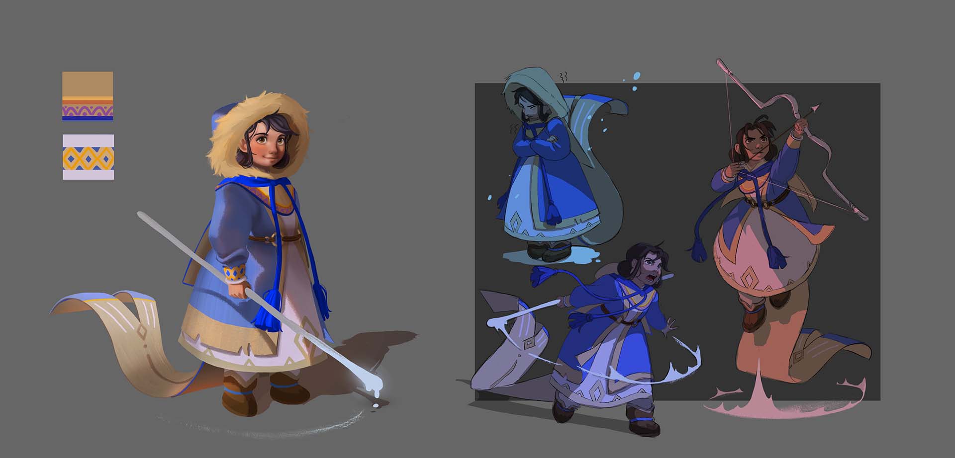
Eunbi Kang is a Korean visual development artist and illustrator who recently graduated from the highly renowned ArtCenter College of Design in Pasadena, CA. In the video below, she explains why character design sheets are so important and shows off how she created hers using a Wacom Cintiq 16 pen display.
Kang originally created the digital painting she works with in the video some time ago, but never developed it into a full project. She’d always loved this piece, and had received a lot of positive feedback about it from her followers, so she knew that she would eventually return to it and possibly even turn it into an animation. We asked Kang to show her visual development process, starting off with how she can extract a character design sheet from her final artwork.
Why is a character design sheet important?
A character design sheet is an important reference for artists working on projects like animation, comics, or illustrated books. It details how a character behaves, looks, and acts, and generally depicts the character in multiple full-body poses seen from multiple angles and shows a wide variety of facial expressions.
Sometimes artists also include a written narrative to tell the background story of the character and to help better define their personality and predict their behaviors in the story. Here are some reasons why a character design sheet is important:
- Achieves consistency and continuity in the look and feel of the character
- Helps to control small details that give the character life on the page
- Enables artists to maintain consistency in character design for sequential illustration
- Ensures that despite the efforts of several or more artists, their work is cohesive, as if a single artist did the drawings
- Provides a shared reference “map” for teams to consult when working with the character or the world into which it interacts
Creating a successful character design sheet involves establishing shapes, thinking about how the character carries themselves, and drawing the character repeatedly. It’s important to keep designs as simple as possible and eliminate useless noise. Too much detail can clutter up a design. Design rules should be believable, but not necessarily realistic.
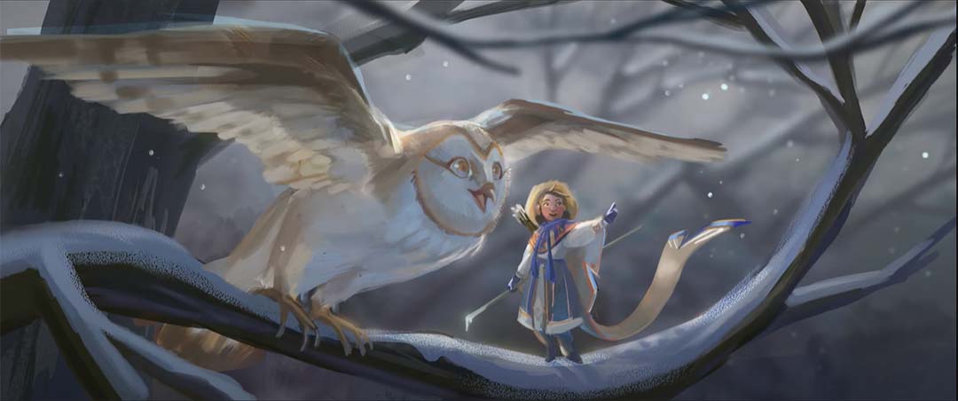
Reworking an old piece into something new
When Kang looks back at her original digital painting, she explains that there were elements she wanted to preserve, like the colors — the vivid blue of the winter coat, and the individual shape languages — the long wood stick and the long tail and tassels on the cape, so she decided to keep these elements in her new piece. However, she decided to change some things that looked questionable to her like how the shirt was connected to the skirt and the look of the boots. She wanted to keep the big ideas from the original painting but make it clearer and easier to read overall.
Using her Wacom Cintiq 16, Kang first created a new sketch from the original painting, and then did a process called color blocking – adding in the base colors using the lasso tool and basic default brushes. She focused on separating the individual layers, like the skin tone layer and the skirt layer, so it would be easier to mask the discrete sections if they were on separate layers in case she wanted to make changes later on.
Next, she determined the direction of the light and added a multiply layer on top of her base colors to create shadows. Kang finds this part of the process to be especially fun because she says it’s where the character’s form works with the light, and is the moment where you bring your flat 2-dimensonal character to a rendered image. For this painting, Kang put her light source at the top left, pointed towards the character, because she found it made interesting shadows from the arm, nose, and skirt.
Details from the shadows
After deciding on the direction of the shadow, she began detailing the face. Kang finds it easier to extract the details of the face from the form created by the shadows; she just focuses on which part of the character protrudes out or which is concave, making more shadows. To really make things pop, she uses little brushes on top to apply some texture.
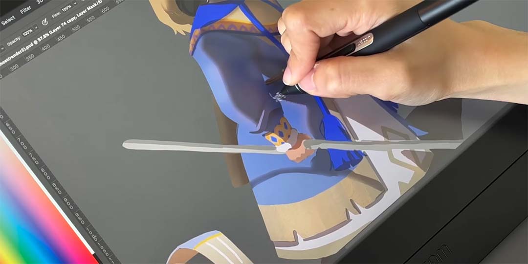
“One of the things that I was amazed about the Cintiq was how delicately it captures textures and pen pressures,” she says. “So, it was so easy to control my pens and fully enjoy my texture brushes. When I first got this Cintiq, I was literally trying every brush that I have and was just amazed about how it mixes the color well and how smoothly it shows my brush works. And the monitor itself showed the exact colors I was looking for — it showed the cobalt blue that I wanted, and it showed the distinctive light and shadows that I expressed.”
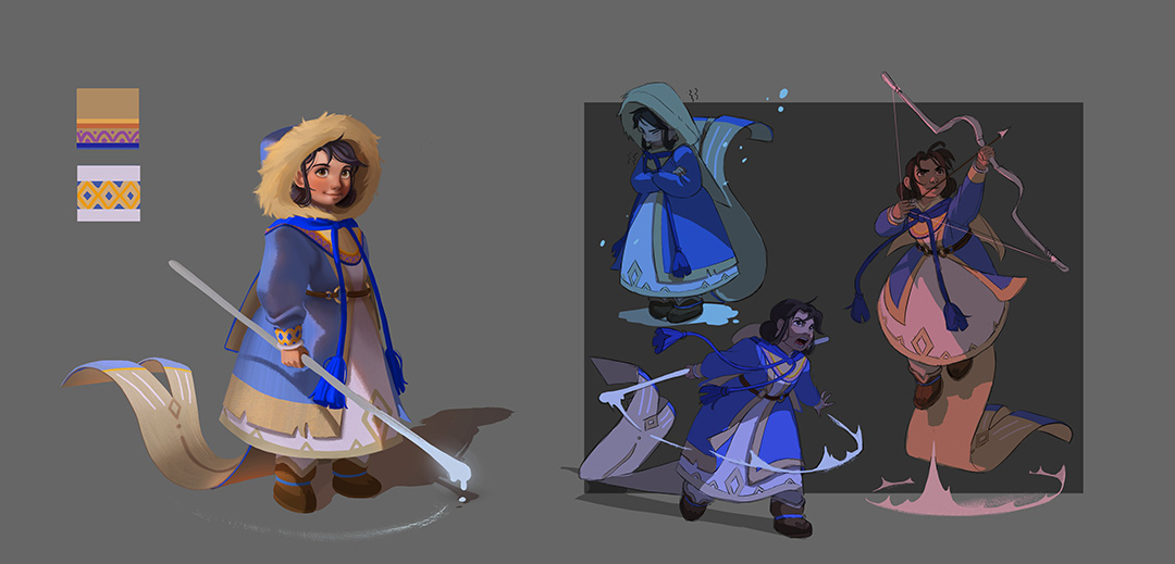
After further rendering, Kang moved onto character poses. She decided that one of the most interesting features of this character design was the tail of the cape. She knew that the cape would move differently depending on the condition. For instance, on cold days, it might curl inward like a squirrel’s tail. In contrast, when the character was fighting, the cape might create a zig zag shape to show the intensity of the situation.
After doing a few rough sketches, Kang cleaned up some of her linework and focused on making the character poses clearer while keeping her original ideas from her rough sketches. To exaggerate the scene, she added graphic shadows and light on top of the base colors. She first created multiple layers and then added overlay layers.
To decide which colors to choose, she had to consider the in which type of situation the character was being portrayed: was she fighting at night under a bright moon, or was she fighting in a dark forest engulfed by fire?
“This is the part where I used my imagination. You know when we were little children, we always drew some cool characters and made super intense stories. I used the same technique. This is the final image! I am satisfied with how it came out and happy that I could bring my old character and make it better.”
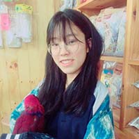
About Eunbi Kang
Eunbi Kang is a South Korean-born visual development artist and illustrator for games, animation, and more. She recently graduated from the illustration department at the Art Center College of Design in Pasadena, California.
While pursuing her career, she won the independent Environment category at the 2022 Concept Art Awards, and the Japanese illustration Award. She has a fascination for vibrant color palettes and fantasy themes. Follow her on Instagram.

