Proko is a hub for artists to improve their skills and connect with a community of like-minded peers and talented mentors. They provide a wide variety of online courses that can be beneficial for both digital and traditional artists. To see all of Proko’s offerings head to their website or check out their Youtube channel, where they post free short tutorials, including the one below.
The blog post below is a summary of this video, “How to digitally paint in grayscale,” featuring artist Jon Neimeister.
In this lesson, we’ll be exploring a simplified digital workflow just to get used to using our tools in a digital environment. We’ll keep this process fairly simple for now, and dive into more advanced techniques later.
While our end goal is to be able to paint original images from imagination, we’ll start this course off by using references. Using a reference takes a lot of complicated decision-making off your plate, and allows you to focus on learning just the process. The important thing is that your reference has very clear and simple shadow shapes, that’ll make the whole thing a lot easier.
Let’s begin by making a clean and accurate drawing to work from. It’s important to take our time with the drawing step and build a solid foundation that we can paint on top of.
Lay-in
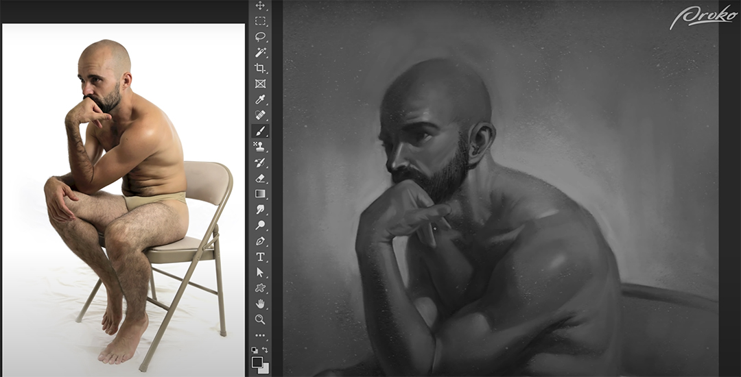
Let’s start with a simple figure painting. I’m going to start with a fairly simple drawing lay-in here focusing on the gesture of the figure’s largest forms first, such as the rib cage, hips, and head, and drawing the limbs as relatively simple cylinders with just a hint of anatomy applied to them.
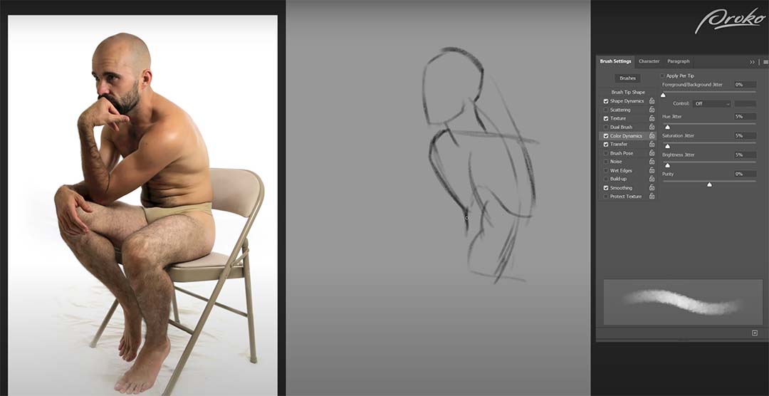
I’m also working with more of a constructive method than an observational method, so I’m looking at my reference, observing the shapes, forms, and gestures, but then drawing them using perspective and simple shapes in 3D form rather than simply focusing on the two-dimensional shapes and silhouettes from my reference.
As I go through this process, some of my shapes and forms may end up being slightly different from the reference. As long as my figure looks accurate on the canvas, I’m not concerned if it matches the reference perfectly. As long as the overall proportions and perspectives feel correct.
I can still use some of the 2D shapes of the reference to double-check my proportions, such as the small negative space between his closer arm and his further leg, creating a little triangle of white next to the belly. I found that to be a helpful reference for my proportions but you’ll notice that the reference also has a small triangle of negative space between the two arms and next to the pec. In my drawing, that’s not there.
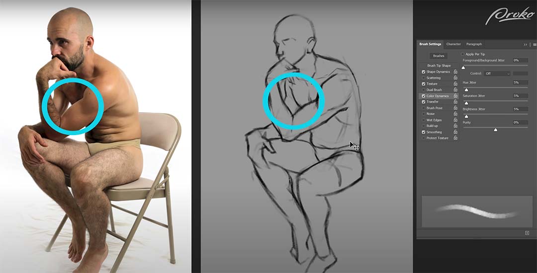
Although different from the reference, I’ll keep this pose because I trust my construction and proportions. My pose is slightly altered. Throughout the drawing process, I started with simple forms and progressed to more complex ones. I use the eraser tool with a soft brush to lightly erase and refine my line work. This helps me fix issues and add missing details. By repeating this process, I refine the figure from a basic gesture to a complete anatomical drawing.
If you zoom in too early and start working on things like arms, legs, and feet, you’ll lose the context of the whole figure or the whole painting. Whenever you’re painting, whether digitally or traditionally, it’s best to start with big general shapes and stay zoomed out, and then once your overall painting is in a good place you can zoom in a bit more and start working on the details.
I’m also going to sketch out the chair as any time you have a figure that’s sitting or leaning against something in the environment, it’s very important to draw the object in the environment to be sure that the weight of the figure is properly distributed on the object they’re interacting with.
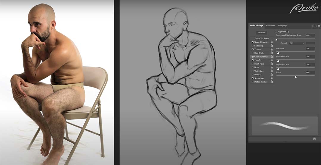
Remember that the drawing doesn’t necessarily have to be super clean or pretty, it’s more of a road map for our painting. As long as it provides us with useful information that will help us make good painting decisions, then that’s enough for now.
We’ve invested a lot of time in preparation before we start painting, but it’s important to take our time with these early stages. The more accurate your drawing is and the stronger your value block in, the easier it will be to execute your final painting.
If you start your painting too early, you might get halfway through and then realize you messed something up and now instead of just having to fix the drawing, you also have to fix your values, colors, and maybe even your layer structure. Breaking our painting process into clear, distinct stages helps us to focus on solving one problem at a time and is much easier on our brains.
Painting
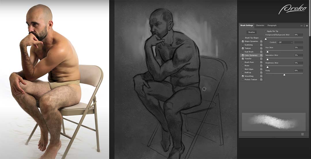
I’ll begin the painting process by toning the canvas with a simple dark gray. Once I’ve toned my canvas, I’m going to start applying some basic value patterns to the figure.
Once I’ve blocked in all my shadow shapes, I want to separate the figure from the background a little bit, so I’m going to grab a lighter value and simply paint around the figure. I’m not going to paint around the entire figure, as I want the focus to be more around the face and chest, and let the legs fall away into more subtle contrasts.
Blending, values, and shapes
The way I like to blend is to eyedrop one of the colors that I’m trying to blend and then lightly paint it over the color I’m trying to blend it into. I might eyedrop a shadow color and then lightly paint over a mid-tone with very subtle pen pressure.
Because my brush’s opacity is controlled by pen pressure, the brush stroke I lay down will then become an intermediate tone between the two values that I’m working with, and I can then use my eyedropper tool again to select that intermediate value and paint the transition between the two.
Speaking of blending and softening edges, remember that we have the smudge tool at our disposal. The smudge tool allows you to smear the pixels on your canvas as though they were soft charcoal or oil paint.
The value I toned my canvas with is pretty close to the mid-tones or shadows of the figure and the reference, so because the tone of the canvas is equivalent to my mid-tones of the figure, I can grab a lighter value and begin rendering the lights on top to create my forms and then simply blend them.
It’s worth noting that as I’m going through this painting process, I’m looking for areas where I can omit and simplify details to create a clearer sense of focus, and contrasting areas of complexity and simplicity.
I’m starting to work on the background a little bit now that I have more values on the figure established, it’s a bit easier for me to tell where the background needs to go.
I’m tweaking some edges, strengthening some contrasts, as well as adding a subtle indication of a floor plane by carrying the light from the right side of the image over to the left. So this figure isn’t just sitting in an ambiguous floating gray texture but rather there’s some sense of space to the painting.
Details
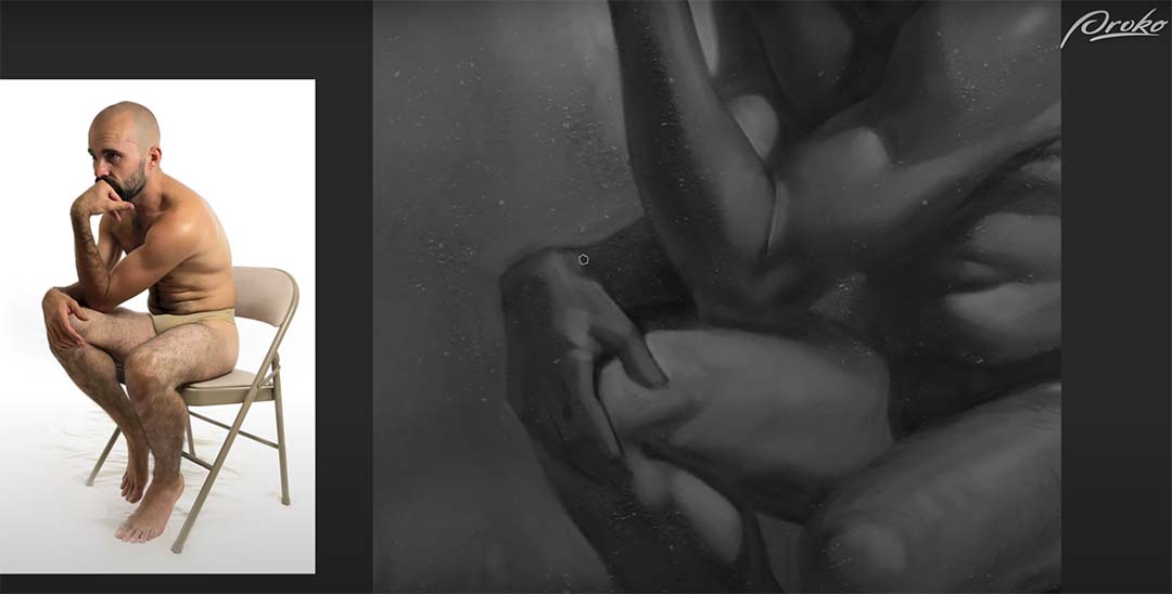
Once I’m happy with the figure as a whole, I can start going into more detailed areas like the face and hands. At this point, I’m going to zoom in a little bit closer. I recommend not zooming in too much.
I’m following the same process for the face that I did with the figure: placing down a tone, eyedropping that tone, lightly painting to create a transition color, and then repeating that process over and over to blend. I’m also looking for areas to lose detail in the face. For instance, I’m letting most of the eye bleed into the shadow of the eye socket, as well as the nose and the shadow side of the face.
I’ve chosen to make the beard the darkest value in this painting. That combined with the bright background reinforces that the face is the focal point and other areas are secondary. Now that I have the entire figure as well as the areas of detail painted in, I’m combing through and looking for other areas where I can erase further detail.
In this case, I’m going to simplify most of my shadows to just a single flat value. You can see that on the chest, the belly, and the legs. I’m ignoring a lot of the reflected light and just simplifying those areas to flat values. And as long as I get the edges of those flat values transitioning into the midtones correct, it will still feel like three-dimensional form.

