An easy way to combine two photos in Adobe Photoshop
Maybe you’ve been using Adobe Photoshop for a while, or maybe you’re just getting started. There are many ways to do different things with the software, as well as all kinds of tips, tricks, and hacks to do things simply and easily.
In this tutorial Colin Smith, the creator of PhotoshopCAFE, demonstrates an easy way to do one of the simplest, but most sought-after, things in Adobe Photoshop — combining two images into one. But he also shows you how to make it look good!
Click here to download the images that Colin uses so you can follow along! Check out the video below for the Adobe Photoshop tutorial, or read on for all of the details.
In this Photoshop tutorial, we’re going to combine two images and make it look like they belong together.
Image sizes and placement
Now, the first thing you want to do is you want to look at the size of the image when you’re combining the two. So go under Document Dimensions and take note of the size. This is to avoid any resolution issues. You want to take the larger image and drop it on top of the smaller image. So that way we’re only scaling down and we’re never scaling anything up — because that softens the image and it loses quality.
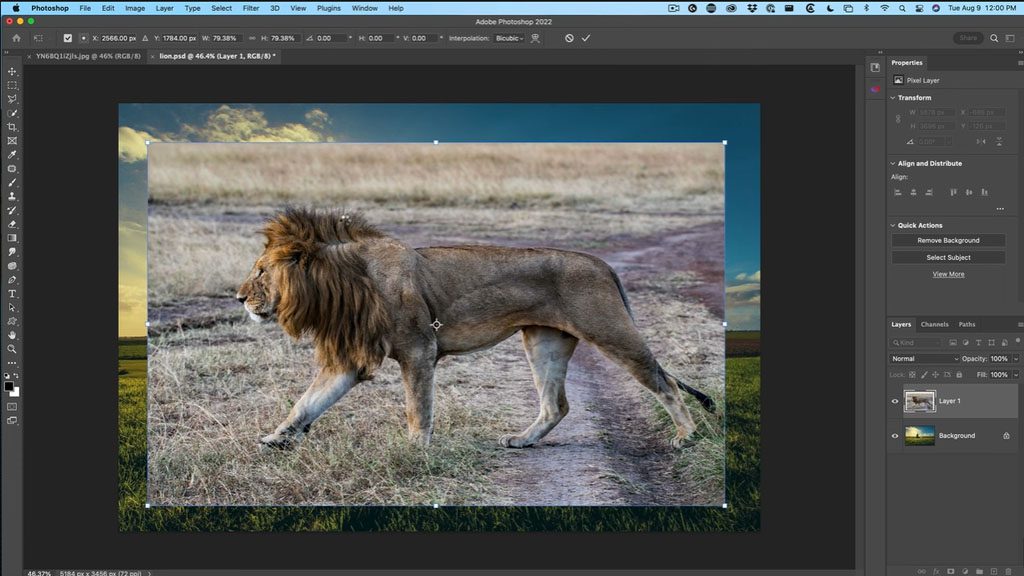
Let’s choose the Move Tool, and with the Move Tool selected, we’re going to drag and drop this into the other documents. So just drag it, but don’t let go — go into the tab, and the second image will open. Move to the middle, and don’t let go yet! Hold down the Shift key, and then let go. The reason we held down the Shift key is it will center it. And if we look now at the layers, we’ve combined the two images into one.
Obviously, we want to cut out the lion and match the color so it looks realistic, so that’s the next step. First, make sure the Move tool is selected and hit Ctrl-T or Command-T for Free Transform. Let’s scale the lion a little bit so it fits within our boundaries.
If it’s not set to transform proportionally, that’s another use for the Shift key — when you drag the image, hold the Shift key, and that will keep it at the same aspect ratio. Also, if you hold down the Alt or Option key, we can scale it from the middle.
So let’s just drag this into the middle and hit Enter. Now we can see the whole image. Let’s cut out our lion!
Cutting out the lion
So go under the Tools menu, and we’re going to choose either the Object or the Quick Selection Tool. It doesn’t matter which, because each of these will give us the option that says Select Subject. Click on Select Subject, and Photoshop’s AI will make your selection for you!
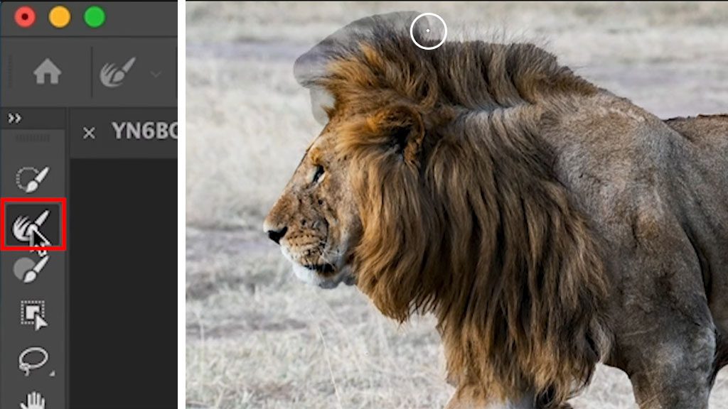
Right now, we want to fix the fur areas, so let’s choose Select and Mask. And now we’re in the select and Mask workspace. What we want to do is use the Hair Tool, which is the Refine brush, and then we’re going to go around the edges here of the long hairs, and this will help us get a better selection.
All right, a couple of other little settings that help with the selections: under Radius, we’re going to set this to 1, and then turn on “decontaminate colors” at the bottom, and then click OK.
We’ve got our lion! Let’s resize it and position it. Hit Ctrl-T or Command-T for Free Transform, and once again, let’s scale this and we can move it into position.
Blending the feet
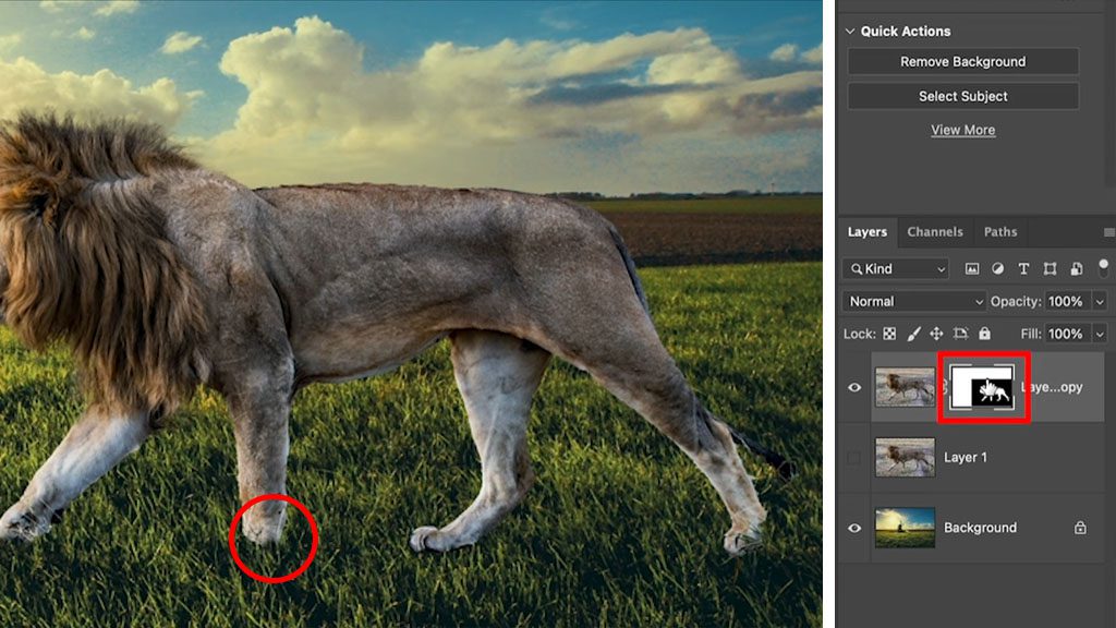
Now what we need to do is blend these feet in so they look like they’re actually in the grass.
So we’re going to make sure we’re selecting our layer mask. Not the layer, but the mask next to it. And we’re going to grab a brush. With the brush, we’re going to paint with black. Black will hide the layer, white will show it. And then with the brush, we’re just going to brush around the feet.
So now, the lion is sinking into the grass and not skirting across the top of it.
Matching colors
What we need to do now is match the color of the lion with the rest of the image, and then we’re going to create a shadow to match the shadow here. So first thing, let’s match the colors with the lion layer selected. Select the lion layer, not the mask. Grab your Move tool, and go the Image menu, and select Adjustments, then click Match Color.
So with Match Color, what we want to do is we want to match the color from our background to the color of our foreground. Under source, you’ll see all your open tabs are there. Make sure to choose the same image you’re working on. Then, under Layer, you want to select the layer you’re matching — in our example, it’s called Background. When you select it, it will immediately take the color of the background.
Now, this is a little too strong, and that’s what the fade slider is for. So if we look at Fade, on the left is the new color, and if we drag this all the way to the right, it will have our original color.
So what we want to do is find just the right blend between the two. So as we move it to the left, we bring in more of that new color. And we just need to find a nice match and just find where it matches your eye. Click OK.

Adding a shadow
Now, why don’t we add a nice shadow so it matches the windmill over here? With our layer selected, we’re going to go down to the little “fx” button for Layer Effects, and we’re going to choose Drop Shadow. Set the Opacity to 100, Distance, Size, and Spread to zero. This is going to create a solid black shadow. And if I drag, you can see that’s the shadow it’s going to create. And we’re going to use this just as a little mask.
First, we’ll separate this shadow out into a brand new layer. If we right click on Effects, and click Create Layer, it will create a nice black layer out of that shadow we made.
Select the shadow layer, click the Move tool, and now we’re going to go to Free Transform by pressing Ctrl-T or Command-T. Right click the lion, and select Flip Vertical.
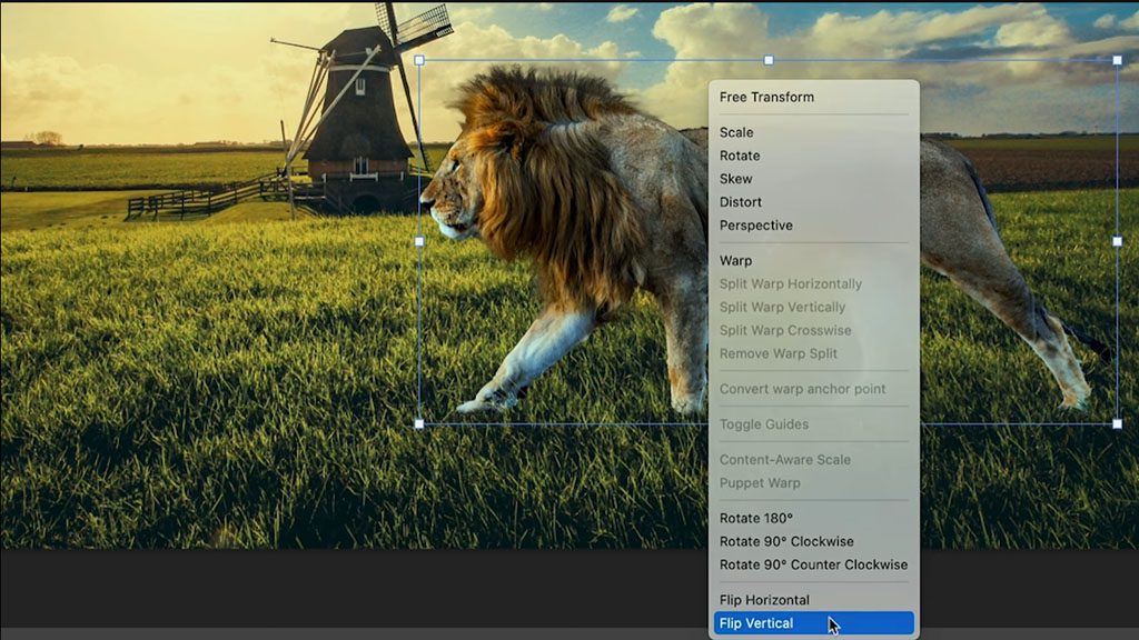
Now drag it down, and you can see the shadows are starting to appear underneath the lion. If you look at the original image’s shadow, see how it’s kind of moving a little bit to the side? That’s called skewing. Let’s skew our lion’s shadow.
So we’re going to right click and choose skew. And if we drag it, notice how we can skew that. So let’s just copy the angle that we’re seeing from the other shadow and line up the feet.
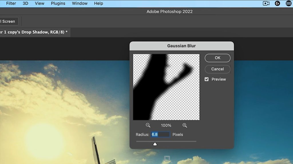
It’s not looking quite realistic yet; we’ve got a couple more things to do. First, I’m going to apply a blur on the edge. Select the shadow’s layer, go to Filter, then Blur, and select Gaussian Blur. Move the slider until it looks good — I’m taking it to about 14.8. Click OK.
Now we’re going to reduce our Opacity. Make sure your shadow layer is still selected, and in the Layer properties, adjust the opacity down so the shadow kind of blends into the background a little bit better.
Now, there are other things we could do such as displacement maps and different things, but I want to keep this simple because it’s a beginner’s tutorial. So, the last step is a little trick I came up with which works well when you’re combining layers and you want to just tie everything together. And that’s by applying a little bit of a color to it.
Tie it together with a color overlay
In the Layer menu, click the New Fill or Adjustment Layers icon, and select Solid Color. We can choose any color we want; let’s get a kind of warm color tone here. Select your color, and click OK.
Make sure this color layer is selected, and change the Blend Mode of this to Color only. The color is going to change and everything else is going to remain intact. Now we want to blend this color in with the original color.
So we’re going to take the opacity of this layer all the way down, and then just bring it up a little bit and see how it looks as we start to apply some of that color. Notice how it really ties everything together!
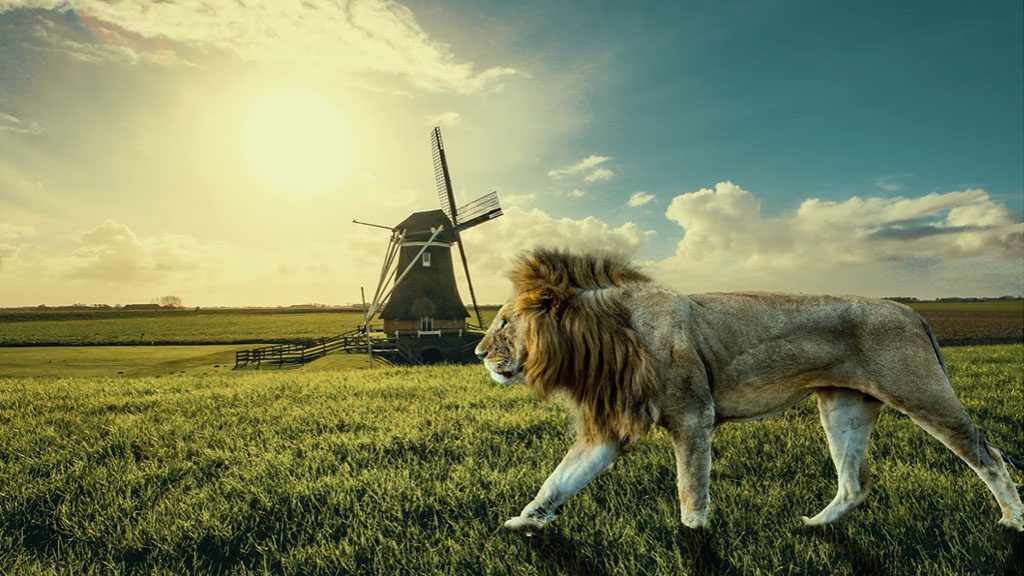
I wanted to just keep this one simple for beginners. There are a lot of different things I could have done, and I’ve created a lot of other tutorials that show you how to do all those other things, like displacement maps and more accurate color matching, and different things like that. Maybe the next one you might want to look at is Layer Masking for Beginners.

About the presenter:
Colin Smith has been using Adobe Photoshop professionally for 20 years. He does training for Adobe and Apple and has written 20 books. At his YouTube channel, PhotoshopCAFE, he has hundreds of easy to follow Photoshop Tutorials and tips as well as Lightroom tutorials and occasional photography tech or drone videos.
For more information or to see more of Colin’s free Adobe Photoshop resources, check out the Photoshop Cafe website, or check out his premium training library.

