

If you’re just getting into creating digital art with Adobe Photoshop and your Wacom device, or have been using them for a while but want to deepen your understanding of how Photoshop works so you can level up your artistic practice, this guide is for you. The best way to create digital art is to use the full range of the features available in software like Photoshop — and you need a creative pen tablet or display, like a Wacom Intuos, Wacom One, or Wacom Cintiq, to do so.
This article is Part Three of our four-part, complete guide to Adobe Photoshop’s brush engine. If you haven’t already, be sure to check out Parts One and Two before continuing. This post will explore the Brush Settings panel. This will be important to understand before Part Four, which goes into how to create your own brushes.
Table of Contents
The Brush Settings Panel
The biggest thing to remember when working with this panel is not to let yourself be intimidated. Nothing here will permanently alter your brush, and if you want to reset it, go to that hamburger menu in the top right corner and hit Clear Brush Controls. Or if you want to keep your changes, you can save it as a new preset.
First, a note on workspaces and the brush settings panel
Photoshop has several different premade Workspaces — window arrangements designed for certain tasks. Try them! And don’t just stick to the same one all the time; try using each one when you’re doing the task it’s intended for, and once you get into the flow of using the program, try making your own with the windows you use most.
There’s one specifically for digital painters, so let’s start there. This article will be easier to follow if you have a Photoshop window open while you follow along. By default, Photoshop gives you the Essentials Workspace. Go to Window > Workspace in the main menu, and set it to Painting. This will give you easy access to the features we’ll be talking about. Note: if you don’t want to change your whole workspace, going to Windows > Brush Settings will pull up the panel we’ll be dealing with most, and you can pin it to your sidebar.
Select the Brush tool, and then click this icon in the sidebar that’s popped up: the Brush Settings panel.
Note: Since a lot of these settings control how brush tips are distributed on the canvas, the theoretical brush tip — the one you see in the picker — will be called the tip image, and a single tip image placed on the canvas will be called a tip stamp.
1. Brush Tip Shape
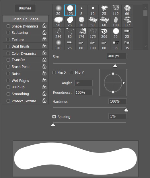
This is just an expanded version of the Brush Preset Picker, so if there’s anything here you’re confused by, just revisit that section in Part One. But there is a major difference: this panel only changes the tip image. All other brush settings will be carried over, which isn’t the case when you select a whole new brush from the Preset Picker. When you do that, it’ll come with its own settings — unless you padlock the panel in question.
Also, there are two extra options here:
- Flip X and Y mirrors the brush tip horizontally or vertically, respectively. This is unnecessary for most brushes, but crucial for object brushes or others where the specific shape matters.
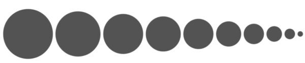
- Spacing adjusts the amount of space between each tip stamp. The lower the spacing, the smoother the brush gets, whereas higher spacings will drop one image at a time. It goes by percentages, so at 1% spacing, the tip stamps will be laid on each other so thick they form an unbroken line. At 100%, they’ll be placed perfectly side-by-side. Anything over 100 will put a proportionate amount of space between them. Unchecking the box makes it totally random.
Another important note: Jitter, Control, and compatibility
For the rest of the panels, there are two sub-adjustments you can make, that you’ll need to know: Jitter and Control.
Jitter is just randomness, simple as that. A higher percentage = more random. That being said, most Jitter sliders will have a drop-down list of various ways to Control the effect, making it not entirely random, but instead tying it to how you draw. Control methods don’t fully override the sliders, so if a slider is turned up, it will still add some jitter to the effect.
- Off: Default to the slider.
- Fade: Causes the effect to drop to zero on every stroke. This is another one of those Photoshop features that’s named the opposite of what it does: it applies the effect at the beginning of your stroke, not, as it sounds, at the end. When you select this option, the number box next to the drop-down menu will activate. This is where you specify how many tip stamps the effect will take to fade out once you start drawing.
It’s best demonstrated: set the spacing to 100%, go to the Size Jitter option in the Shape Dynamics panel, select Fade as the control method, and enter “10.”
See? Over the course of ten stamps, the brush size is reduced to nothing. This is the only control method that doesn’t need a pen tablet or display, like a Wacom Intuos or Cintiq.
- Dial: This is for the Microsoft Surface Dial, if that’s something you’re using.
- Pen pressure: this is usually set to brush size and/or opacity by default, but this option lets you assign it to other functions.
- Pen tilt: Most Wacom products come with Pen Tilt support, which tracks the angle you hold the pen relative to the tablet surface. This adjusts that.
- Stylus wheel: The Wacom Airbrush Pen comes with a little wheel at thumb level where the two keys usually are. This option lets you assign it to a brush setting.
- Rotation: This one is for the Wacom Art Pen, which has a bonus feature called Barrel Rotation that detects when you turn the pen in circles. This lets you control settings by doing that.
If you select a control option and see a little warning triangle pop up next to the box, that input method isn’t working. Either because you don’t have the device needed, or because one of your pen features isn’t working and the Wacom driver needs to be restarted. Here’s the best tutorial for doing that.
It’s less likely, but it can also mean that the option you’re trying to use is already set to control another incompatible feature. It can also trigger if you’re using a mouse to navigate the menu, then go away when you pick up the tablet pen again.
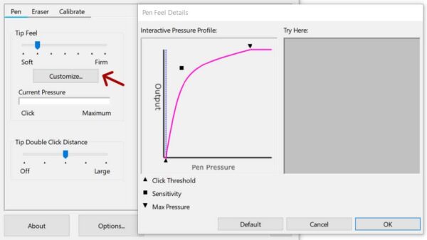
Yet another important note: can I tweak my pen pressure?
One option Clip Studio Paint and several other programs have that’s conspicuously missing from Photoshop is a Pen Pressure Curve: an adjustable line graph that lets you fine-tune your pen’s sensitivity. With some devices, you’re out of luck, but most Wacom products let you adjust this in Wacom Center.
On to the rest of the Brush Panels:
2. Shape Dynamics
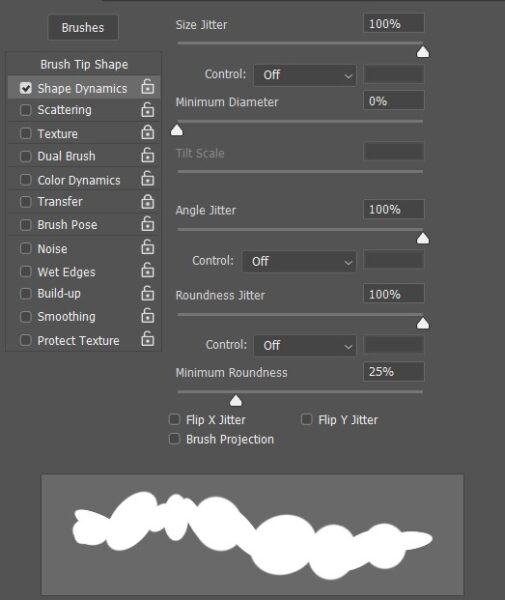
This panel can radically change your brush’s functions in all kinds of ways, some of which will only be useful for experiments, others which will be exactly what you need.
- Size Jitter grows and shrinks the brush as you draw. Great for adding more variety to scatter brushes, or creating a blobby effect like a leaking pen on stroke brushes.
- Minimum Diameter: If you don’t want the tip stamps to go below a certain size, enter it here.
- Angle Jitter spins the brush. This is also very useful for some scatter brushes. Subtle angle jitter is also the key to making an ink brush look real, as it creates a craggy stroke that’s similar to the way ink bleeds into paper.
Important Angle Jitter feature: Direction
Angle Jitter has two control functions the others don’t: Initial Direction and Direction. And the latter is one of the most useful brush features in the program, with whole classes of brushes based on it.
- Initial Direction angles the brush towards the first direction you move the pen in, but doesn’t change it if you turn the stroke. This is perfect for placing tip stamps in straight lines.
- Direction angles the brush so that the top of the stamp always points the way the pen is moving. This works really well with Pulled-string Mode Smoothing to ensure that the line of tip stamps is even.
- Roundness Jitter makes the brush go from circular to ovular and back.
- Flip X and Y Jitter flips your brush tip at random. This is also good for adding variety to scatter brushes.
- Brush Projection automatically sets Tilt and Rotation to control Brush Angle and Roundness. If you don’t have Rotation, Tilt will cover both. If you have a tablet that supports tilt, pick a basic Round Brush, then try checking this. You’ll notice that when the pen’s upright, the brush cursor is a circle, but when you tilt it, the brush stretches into an oval:
The brushes whose previews are an icon of a drawing tool instead of a tip image are called Natural Media brushes, and they have extra settings to make them mimic the real properties of that medium. Clicking them will replace the above settings with one of three sets unique to that tool.
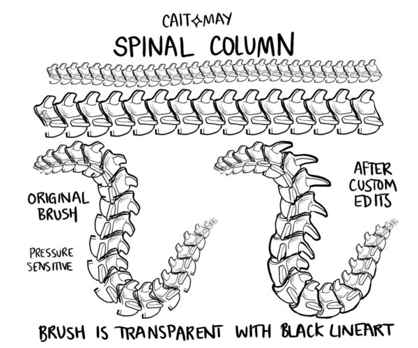
3. Scattering
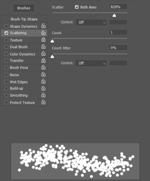
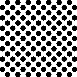
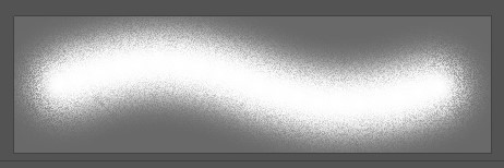
This setting scatters your tip stamps to the four winds. Often used for effect brushes like stars and snow, or for small object brushes like falling leaves. The percentage slider spreads the stamps out across a wider area. This creates a more truly random-looking effect, but also makes them harder to control.
Normally it only scatters them vertically, unless you use:
- Both Axes, which spreads them out in all directions, forming a loose cloud of brush tips around your cursor.
- Count, which increases the number of brush tips, making the scatter pattern thicker, but more like a solid line. This causes massive lag at the highest settings. Turn up Spacing to decrease the count below the minimum.
- Count Jitter, which randomizes the number of Tip Stamps placed as you draw. The effect of using the slider alone is very subtle; this is mostly useful in conjunction with the Control menu options, letting you set how many stamps are laid down with pen pressure or the like.

Scattering hints
- Scattering works alongside a few settings from the last two panels: Turning up Spacing decreases the number of tip stamps, and most of the time, you’ll want to turn on Size, Flip, and/or Angle Jitter to make them look less identical.
- If you want a wide scatter while keeping tip stamps out of areas where they shouldn’t be, use selections or layer masks to mark those areas off.
- Enable Airbrush Style Build-Up Effects also works on scatter brushes, causing them to keep dropping tip stamps for as long as the pen’s held down.
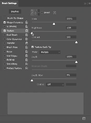
4. Texture
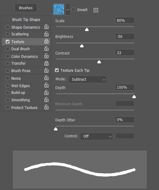
This feature uses the same patterns as the Pattern Stamp, it just applies them differently — in one of several ways depending on the blending mode you pick. Since this panel works differently from the others, I’m going to cover the options in order of importance, instead of from top to bottom.
Image
The Image picker choose a pattern.
Some modern versions of Photoshop have a very small set of default patterns. Like the brushes, however, you can get the old ones back — but the process for doing this is different. Go to Windows > Patterns, then to the hamburger menu on the top right. Click Legacy Patterns and More. Note: you won’t find this option in the menus of the Pattern Stamp or Brush Textures toolbars, only here.
More importantly, you can download packs from the internet in the form of .PAT files, and import your own. This you can do from any settings menu. Don’t save them into Photoshop’s “Patterns” folder on the hard drive, though; that’s where it places them after importing. If you try to put them there before, you won’t be able to import them and they won’t work.
Mode
The whole Texture panel revolves around Mode. In fact, the combination of the specific Image and mode is what determines whether a Texture will work for you at all.
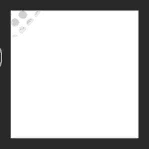
Texture Modes work differently from normal blending modes, and there’s very little info on them online, I tested them out myself with a pattern from Screentones’ 600 DPI Print Pack, since the two-tone dots will make it clear how each mode handles lights and darks:
With a black Hard Round brush and the brightness and contrast sliders on zero:
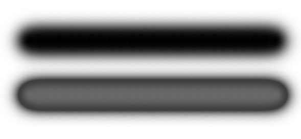
- Multiply paints the pattern inverted:
- Subtract paints it the right way. For some reason, this is the opposite of how Multiply and Subtract work on Layer and Brush Modes.
- Darken also inverts it.
- Overlay:
At first, it seemed like Overlay did nothing but produce a black mark. However, when I tried it on some softer brushes, it sticks the texture in the partially transparent bits:
- Color Dodge seems the exact same as Overlay, even when I tried it with different colors and mixing them.
- Color Burn, at high flow, is also identical to Overlay and Color Dodge. At low flow, however, it paints the pattern on as if it were a normal brush, darkening it as you add more color:

- Linear Burn works the same as Color Burn, but blends smoother, without the clear separation between transparent and non-transparent bits. Works with hard brushes too.
- Hard Mix: Same as Overlay et al, but with a harder separation between the transparent and non-transparent parts.
- Linear Height: At 2 to 15% Depth, makes the pattern show through with varying clarity.
- Height seems to work the same as Linear Height, no matter what settings I change.
Depth
Increases or decreases how much the pattern shows through the brushstroke. Whether it does one or the other depends on the blending mode.
Depth Jitter
Randomizes the above, of course, creating a blobby effect kind of like Size Jitter.
Minimum Depth
Activates if you select a control mode for Depth Jitter.
Texture Each Tip
Changes how the tool works, causing each tip to be textured separately instead of applying it consistently like the pattern stamp, causing a more random effect that’s better for blending.
Size
Zoom in or out on the pattern.
Brightness
Remember: On all the modes except Subtract and the two Height ones, dark colors are rendered as light and vice versa, so this changes the ratio between them. It won’t have any effect on a two-tone pattern like we’ve been using, but check out the effect it has on a pattern with some nuance, like the default Autumn Grass.
Also, if you can’t see your texture at all, check this slider first.
Contrast
Makes the texture go from subtle to hard, stark shapes lines.
5. Dual Brush
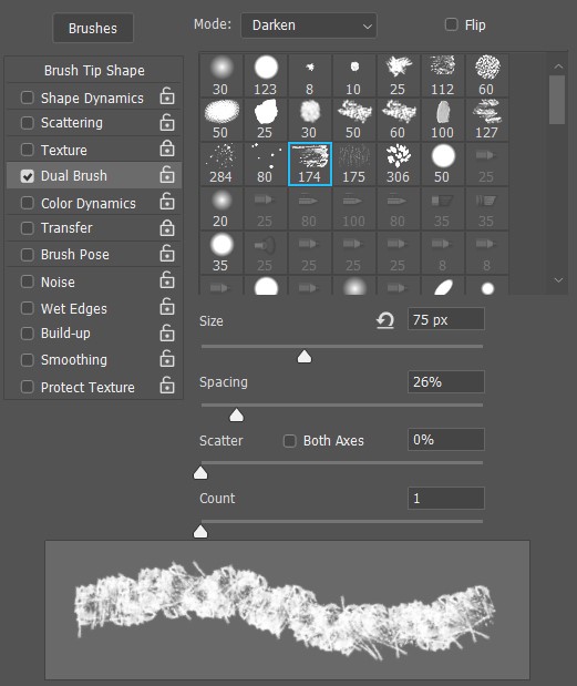
Dual Brush uses your primary brush tip as a container for a second one — and when combined with the other panels, it opens up a world of new options.
If you like the Hard Round Brush’s simplicity, but want to give it the texture of a splatter brush, you can do that. If you want a charcoal brush with the fuzzy edges of a Soft Round, you can do that too. You can create a brush that scatters tiny tip stamps strictly within the boundaries of a normal-sized one, or place a large media-brush tip within a smaller object-brush tip to stamp flowers with the texture of watercolor paint.
This function also has blending modes and for some reason they work totally different from the Texture panel’s. I won’t be doing a full rundown this time, I’ll just say Multiply, Darken, and Linear Burn are the most straightforward and the most useful in the majority of cases, just popping the second brush tip into the first one.
There are only a few other settings to control the inner tips, and we’ve already covered them in other panels: Size, Spacing, Scatter, and Count.
Some notes about Dual Brush functionality:
- On Overlay, Color Dodge, and Color Burn modes, inner tips are affected by Opacity, but not Flow. At low flows, they’ll show more through the main brush, remaining fully opaque—until you go below 5%, then they begin to fade.
- If your inner tip is smaller than the outer one, the whole brush will be smaller. Unless you set it to scatter.
- If you select a textured inner tip but the brush doesn’t change, turn up your Spacing a bit, and if that’s not enough, your Scatter. The tips are probably clustered so closely they’ve fused into a solid.
6. Color Dynamics
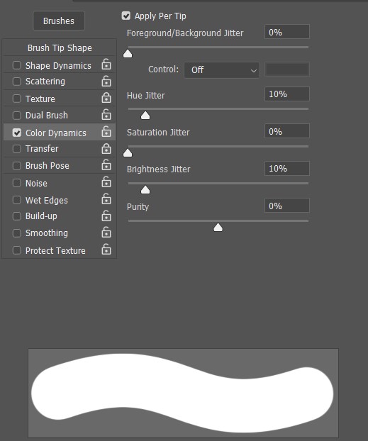
Apply per tip
With this off, each stroke will be assigned one color. With it on, each tip stamp will be a different color, causing scatter brushes to look nicely varied and stroke brushes to look like a stack of crushed Skittles.
Foreground/Background Jitter
This makes the paint various mixtures of the foreground and background colors. The rest of the jitters are a little notable for not having control settings, intended to add some genuine randomness into your life.
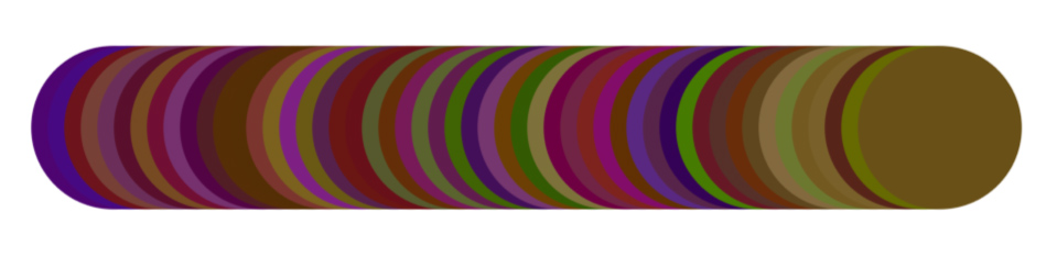
Hue Jitter
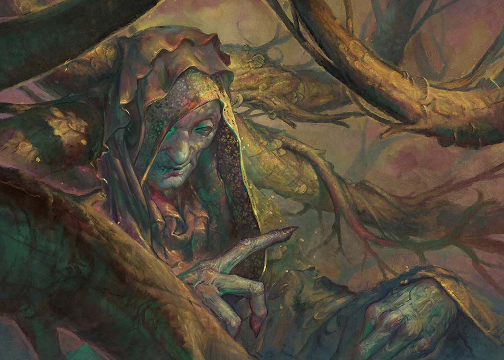
This changes the hue. Layering low-flow, hue-jittered strokes over each other is good for a psychedelic effect, adding all kinds of crazy color tones to your painting. Illustrator Apterus uses this a lot for his fantasy work, sometimes painting with it all the way at 100%:
Due to the crushed-Skittle effect, though, applying this per-tip is useless for stroke brushes. If you want a real rainbow brush with smooth transitions, you’ll have to use the Mixer Brush, a complicated tool that’s outside the scope of this article.
Saturation Jitter
This makes the colors more or less vivid.
Brightness Jitter
This makes them darker or lighter.
Purity
This is just saturation, going from -100% (grayscale brush) to +100% (Lisa Frank brush), with zero in the middle meaning the brush will paint exactly the color you picked. The purpose of this slider is to put a hard limit on Saturation Jitter if you don’t want your colors to get too bright or too dull.
Tip: How to prevent colors from clashing when using Jitters
For a little color theory, check out this older article. It details how hue, saturation, and value are the three ingredients of every color, the only things that separate any one from any other. And to preserve unity, one of those settings has to stay consistent no matter how much the other two change. So, if you want to randomize your colors without your painting looking like rainbow puke, use at most two of these sliders at a time.
7. Transfer
This might have a lot of cryptic settings, but if you’re using the normal brush tool, it’s actually the simplest window. Only two sliders will be available to you:
- Opacity Jitter, which jitters Opacity, and
- Flow Jitter, which jitters Flow.
The rest are only for the Mixer Brush, which is outside the scope of this series. In fact, if you have a pre-CS5 version of Photoshop, this panel will be called “Other Dynamics” and consist only of those two options.
Also, you won’t have this next panel:
8. Brush Pose
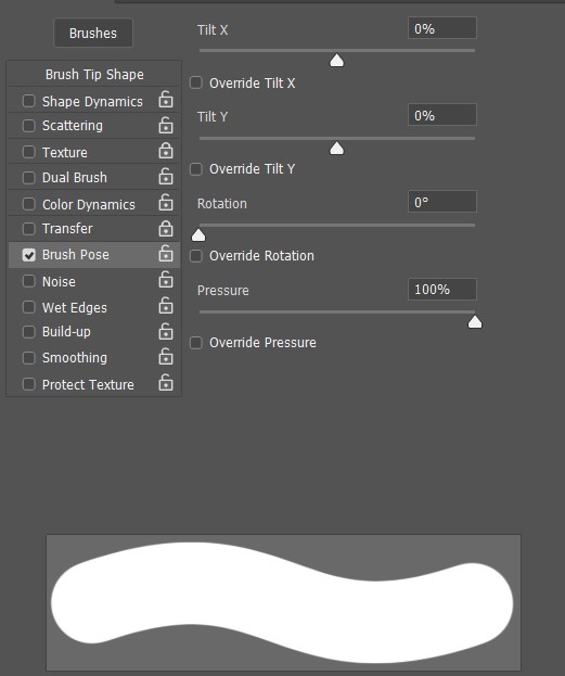
This tab makes the least sense without explanation. Aren’t these just things tablets themselves do? But it’s actually simple: this panel is for people who want to lock these settings at one value, or whose devices don’t have them.
Part of why it seems confusing is that dragging the sliders won’t have any effect on your tip preview. That’s because in order for them to affect your brush at all, you have to set the slider’s effect as a control method for another tool.
Clicking any of the Override buttons activates the slider, causing Photoshop to ignore your tablet’s input and always draw with that setting at the value you enter. By now, you’ve learned what Tilt X and Y, Rotation, and Pressure do, so you can guess what setting exact levels for them will do.
But since having to manually adjust the sliders defeats the purpose of setting a control method, there’s not much you can do with this panel that isn’t more efficiently done some other way. Instead of setting a specific Pen Pressure, it makes more sense to use a fixed-size brush. Instead of entering precise Rotation and Tilt values to make your brush hold its angle and roundness, you can just set it to that angle and roundness. The only unique benefit I see here for tablet users is if you want to enable tilt in one direction, but not the other.
9. Noise
This fuzzes up the partially-transparent parts of a brush. You can see here that it makes the default Soft Round look like spraypaint. It has little effect on hard brushes.
10. Wet Edges
Darkens the edges to make your brush look like watercolors. But also lowers the rest of the brush’s opacity, which can make it harder to blend with due to the overlapping-stripes effect.
11. Build-up
This is a duplicate of Enable Airbrush-Style Buildup in the Brush Options Toolbar.
12. Smoothing
This toggles whether Smoothing can be used on this brush.
13. Protect Texture
This ensures that your texture will be carried over when you pick a whole new brush from the Preset Picker, not just change the tip in Brush Tip Shape. Some brushes, like the Natural Media ones, don’t allow textures, but it’ll work on any other.
Note: Padlocks
You’ll have seen these alongside every setting. They do the same thing as Protect Texture, making sure that panel’s settings are applied when picking any other compatible brush, not just when applying a new tip to the current brush.
One Last Tip: Try stroking paths with brushes
Being able to use brushes on paths and shapes is a great way to draw manmade objects. It’s also the simplest way to use the Hatching and Dual Line brushes we’ll be making in the next article.
- On a new layer, draw anything with the Pen or Shapes tool. If you go with shapes, make sure the Tool Mode (in the toolbar next to the Preset Picker) is set to “Path.”
- Select the brush tool. Pick the brush and settings you want to stroke your path with.
- Hit enter.
- If you want to do another path, pick it with the Path Selection tool, return to Brush, and repeat. Anytime you have a path selected while using a brush-based tool, hitting enter will stroke it.
Stay tuned for Part 4 of this series, coming soon — it will take everything you’ve learned throughout the series and walk you through creating your very own, customized Photoshop brushes!
About the Author
Cameron “C.S.” Jones is a West-Philly-based writer and illustrator who’s been contributing to Wacom for three years now. You can see more of his work, including most of his contributions to this blog, at thecsjones.com, or follow him on Instagram or Twitter.

