

Here at Wacom we’re big fans of Collin Chan, a digital artist who’s been sharing art tips and exercises on his YouTube channel for years. Check out some of his recent work on this blog: How to draw a panda on the new Wacom One 13 Touch, How to master the 3d box technique, and Five essential tips for art students.
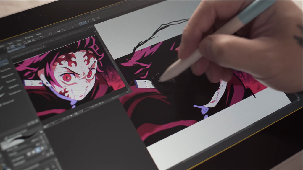
He’s back with more digital art education: in the below video and tutorial, he uses the new Wacom One 13 Touch to walk viewers through a scratchboard exercise that can help digital artists figure out their own personal style. The video, and all of the words of the tutorial below, are Collin’s — though they have been edited slightly for clarity.
Introduction
In this video, I’m taking a traditional method called “scratchboarding,” and making it into a useful exercise to help anyone better their digital art. The purpose of this exercise is to help you look at your subject in reverse, which means being able to look at any reference and seeing shapes rather than outlines! It can also be a useful tool to improve your art by working against your natural instincts.
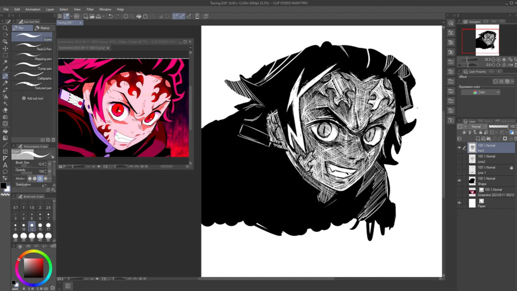
For this tutorial, I’m using the all new Wacom one 13 Touch and Clip Studio Paint software. In Clip Studio Paint, I’m using the G pen brush, keeping the colors to just black and white. We’ll be using an anime reference from Demon Slayer. There are going to be three stages to this exercise: beginner, intermediate, and advanced.
Stage I: Beginner
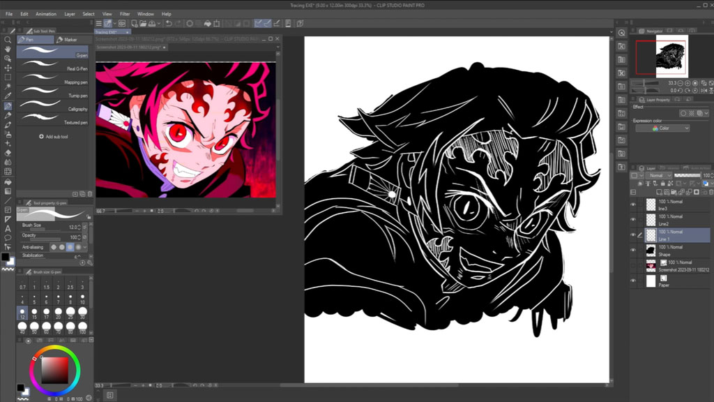
We will be tracing this reference, but not in your typical way. First, start to study the reference while you’re tracing. Ask yourself questions like: What direction is this line? How thick or thin is the line? How many shapes can you see in the face?
Begin by just tracing out the entire character in a large black shape. Don’t worry about the outline being exact. When done, it should look like a black blob. Don’t panic about doing anything in the background — we are leaving that out. Duplicate and save this layer as you’ll use it again later. Then turn down the transparency to this layer so you can see the reference underneath.
Once you have the transparency, start to outline and trace the reference in white. While tracing, be sure to understand that it’s OK if your lines are not exact or smooth! A few incorrect lines are just adding more character to your drawing. But remember to always be studying the face while you’re drawing. Be sure to look around and see if you can mimic the line weight, or even the same movement.
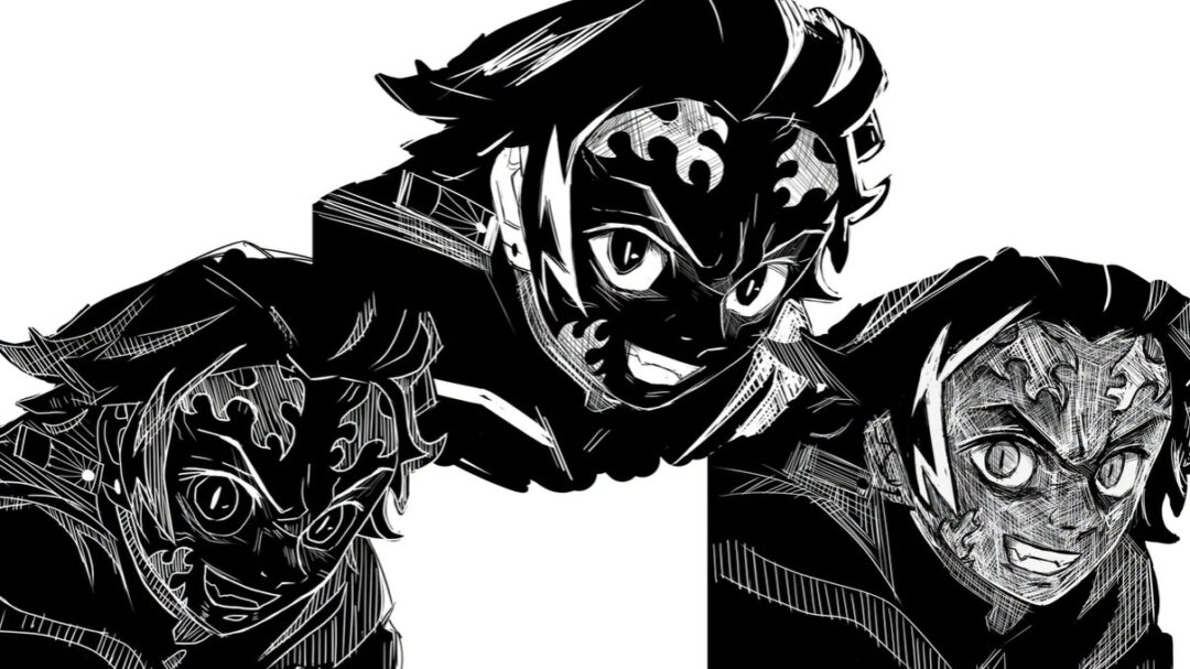
In the end, you should have a finished traced drawing. Now, add more to this drawing by adding some directional line shading to give more movement and dimension. I also refine certain lines, like the nose, to make it pop out more. Remember, at this point, you are able to take your artistic liberties with this drawing. I decided to add some black lines to finish off some of the clothing. Remember there is no wrong or right, you’re just adding more or less characteristic traits to your drawing.
Above is the final product. As you can see, it’s definitely different from the original, but you’re able to see that this is a great step to finding your artistic signature.
Stage II: Intermediate
In this stage, you will be taking what you learned in the beginner stage to another level. You will be testing your free hand proportions, line work, cross-hatching, and anything else you decide to add to this drawing.
So being that we have already laid out the general shape in the last step, remember to turn the transparency down! We will begin this time by only tracing parts of the face in which you have difficulties free-handing. So instead of tracing the whole face, we trace landmarks as a guide.
Above, you can see my landmarks are the side of the face, chin, eyebrows, parts where the eyes and nose divide, some hair strands, the bottom of the nose, the top and bottom of the ear, the shoulder, and the earring. Yours may not look the same, but that’s fine because everyone’s approach is different.
Here are some helpful tips on how to use landmarks: if you have the bottom of the eye drawn, you can use that mark to find the distance to the top corner of the mouth. You would then use that distance to help you freehand this information onto your drawing. These landmarks are here to help you with more precision when free-hand drawing. Another technique you can use is finding large shapes and using those shapes as another measuring tool. Use this method as a general base to help you gesture in the proportions.
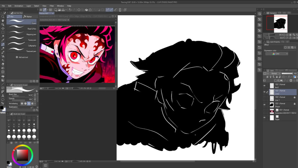
I start my approach to my landmarks by attacking the eyebrows and moving around to the flames, but always looking for shapes and spaces. I decided to try something different, and wanted to draw the white in the eyes and mouth. As you can see, this drawing does not have to be clean, so when you see the little black pieces in the eyes and mouth know that it’s something you would see in a traditional scratchboard piece. So keep it in!
Here is the best part of this exercise: turn the transparency down on both layers of the drawing. Now you are able to see how far you were from the original reference. As you can see, I’m not too far, but it is not a perfect copy! This is just proof that even though it’s not perfect, it still has your artistic signature on it.
Stage III: Advanced
For this stage, we will not be tracing anything, and instead will be free-handing everything! Just start a new layer and begin to take what you have learned from the previous stages and combine it all here. Take as many liberties as you would like to, and most importantly, any time you feel you have made a mistake just cover it up with black and keep it moving.
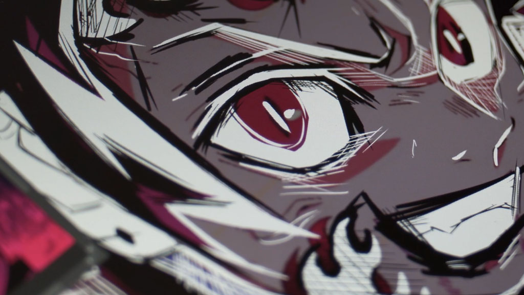
The first thing I do is start to lay the guidelines for the head, then the eyebrows and nose. Then I start to shape out the eyeballs and mouth, then cut out the shapes of the fire designs on the forehead. Again, I am never worried if I am exact or if my shapes are incorrect. I didn’t like the flames being so dominant, so I blacked them out and redrew them. I decided I liked the directional line shading, which helped me see I could use that method combined with cross-hatching to help illustrate the lighting in the reference.
I used directional line shading to lighten up the forehead, but I am also mixing some black line work to bring out the eyebrows, eyelids, and flame designs. Jumping ahead I took some liberties that I wanted to with the hair and clothing to be very loosely drawn, just so the viewers would pay more attention to the face of the character. Remember, if you’re asking, “Shouldn’t the drawing look exactly like the reference?” The answer is no! This is where you the artist, are showing your viewers your artistic signature and your interpretation of the drawing.
I really hope this scratchboard exercise helps you level up your digital art, but most importantly gets you motivated to keep practicing and showing the world your creations!
What device is Collin using for this tutorial?
Collin uses the new Wacom One 13 Touch for this tutorial. Want to learn more about the Wacom One? He also made this great video showcasing its design and features. Check it out:
About the artist
Collin Chan is a Canadian artist, Corel Painter Master Elite, and award-winning filmmaker. His realistic approach to digital and traditional artwork — including acrylic, oil, inks, watercolor and other mixed mediums — explores themes of humanity, truth and life. He has done art for companies including Wacom, Anker, Soundcore, Clip Studio Paint, Corel Painter, Zhiyun Tech, Moza, Olloclip, Insta360, Brea Reese, Pentel Pens, Daler Rowney and more. Outside of painting, he is closely associated with independent film, and you can see his most recent short films on YouTube. You can also see examples of his work on Instagram.

