Graphic designer and Wacom user Lauren Gonzalez, of 4TheCreatives, has worked with us on graphic design projects in the past — like this tutorial on making a custom Valentine’s Day card, or this exploration of how to make quality social media posts. For all of her graphic design work, Gonzalez uses her trusty Wacom Intuos Pro. But why?
In the below video and guest post, Gonzalez gives a practical demonstration of why she uses an Intuos Pro instead of a standard computer mouse for her design work — by creating the same design using a Wacom and using a mouse, and finding out which ended up better and which took longer! Watch the video below for, or read on for all the details.
Introduction
In this video, I am going to be doing something I’ve never done before: designing a holiday greeting card, first using my Wacom Intuos Pro, and then I’m going to challenge myself to do the same design using a mouse. The mouse is going to have an unfair advantage, because I’ll have already designed the card with the Wacom, so it should be easier and faster — theoretically. We’re going to see which one does better!
Wacom Design Process
I’m going to time myself. I have my sketches in front of me of what I was laying out for concepts. I start by going into Adobe InDesign, and putting together the color palette. I’m going to use the greens and reds, and I’m also going to have some golds with it.
I’m putting my green background in, and then I’m going to go to Adobe Illustrator to draw the different elements: leaves and some other components. I have this concept of having this elements around the edges like borders, and then there’s going to be the greeting message in the middle. I prefer Adobe Illustrator for drawing, because it has more of a smooth line when you’re just using the pencil and I like to freehand. I don’t really like to use stock shapes.
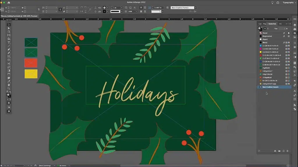
Then I import the illustrations into InDesign. Something great about Illustrator and InDesign is that they are both vector programs, so you can literally just copy and paste from one to the other. I’m going to put the different elements at the top so that it has this whole border effect, then I’m putting the holidays in the middle, and I want it to be gold.
I test different gold colors, create a gradient swatch to give it a shimmer, and then I add in the phrase so it’ll say “Wishing you the happiest of holidays,” and that’s going to be kind of curved around it so that the main focus is holidays.
I also am adding in these kind of Twinkle lights — it could be snow, could be magic, could be just some elements to give it more of a holiday-looking vibe. There are different ways to do the gradients, and I want to have it so the the light is in the middle, so it has this cool shimmer gold effect.
Wacom Final Design
We have the design! That took me 22 minutes to design from scratch.

Mouse Design Process
Now, I’m going to start completely from scratch. I’m not going to use any of the color palettes, or any of the Wacom design assets. Let’s see how long it takes to design this with my mouse!
I’m not enjoying this. I find it really hard to draw curves naturally, so they kind of look off. The little berries on the bottom right kind of look like little stick things just popping out, instead of nice curves like I had on the other one. At some points, I get to just copy paste, which makes it a bit easier.
Now I’m doing the type; it’s kind of annoying to have to keep taking my hand off the mouse and going and typing, whereas with my Wacom I can use the pen and go over to my keyboard with it still in my hand. You can’t really do that when you have a mouse; it’s too clunky. So I don’t like that aspect of this.
I have to do all these circles, and move all over the place to create that snowy magical look. This should be taking me much less time, since I just designed the whole thing already, but it’s actually pretty tedious.
Mouse Final Design Comparison
So here you have the one made with the mouse on the left, and the original done with the Wacom on the right.

They are very similar, but I think they are not equal. They should be the same, but the Wacom, I feel, is better. It’s more controlled. It looks just nicer so there you have it.
Summary
That was extremely challenging! I really disliked using the mouse. I not only dislike the way that it feels to work with, it but this constant clicking was annoying. I don’t know how people can enjoy working with the clicking.
I missed my Wacom very dearly — and it was more efficient. It took 22 minutes to do the first design with the Wacom, but that included figuring out the color palette and laying things out. Usually then when I do redo a design it takes a quarter of the time. But this was about the same amount of time, and I don’t think the results were as good. There are things that have jagged edges, and things just didn’t go as well. It’s kind of like writing with my left hand, when I’m a right-handed person. So that’s what I felt drawing with the mouse.
The final product:

