Bobby Chiu is an Emmy-winning concept artist and character designer, as well as the founder of Imaginism Studios, Schoolism, and the Lightbox Expo. Until recently, he also posted all kinds of art content on his YouTube channel — but he still creates regular video content on the Schoolism channel and his Chiu on This channel.
In the below video and this guest post, he walks through a drawing exercise that will help give a unique perspective on an always-hot topic: using references. Should you always use references? Never use them? Watch and read on for Bobby’s perspective.
So today, I want to do a little exercise about how to get creative with your paintings and drawings. For many of us, we can get really good at copying an image. But how do we get good at creating things out of our imagination? Well a lot of times, the best way to do this is with a transition exercise.
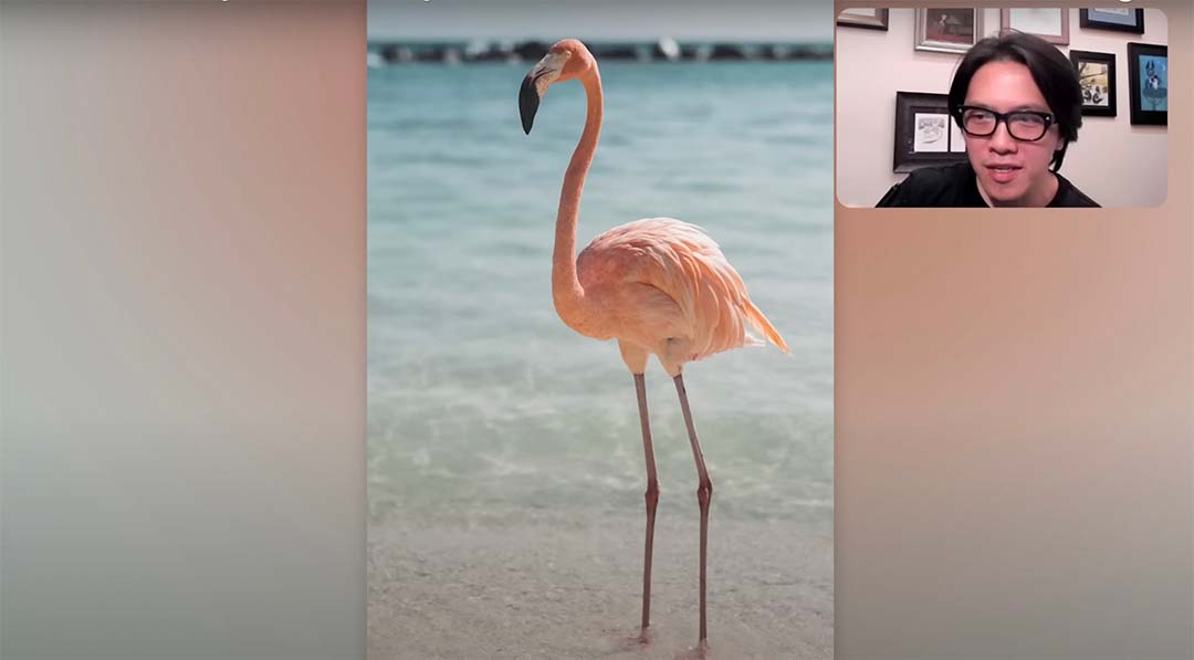
The Inspiration
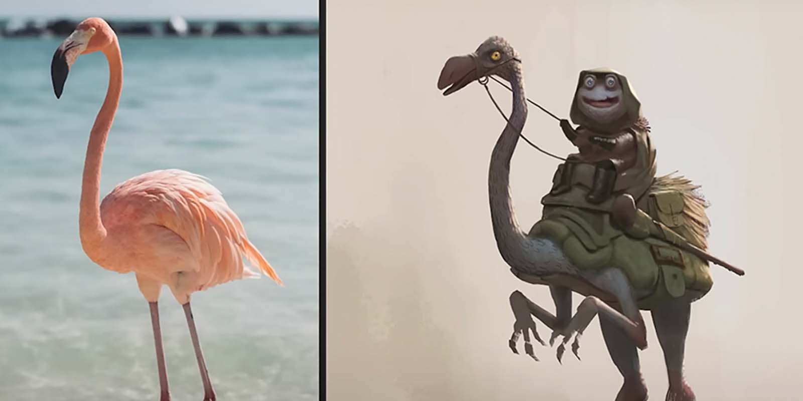
First, you get your inspiration. In this case, my inspiration is a flamingo. I really liked the overall shapes here, that’s very interesting. I also liked how the hump of the flamingo feels kind of like a shell. I feel like I could do something with that. I also like the lighting.
From those elements that I gravitated towards, I ended up doing a sketch. At first the influences of that flamingo were clear, except that I added in some front arms, a little adjustment on the legs and such. Those things that I really liked about the image are still very much there, and the influence of the flamingo is still very much there, but watch as the painting progresses and you’ll see how it gets less and less familiar.
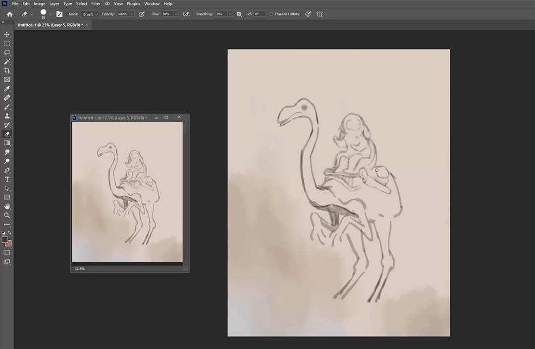
Since this sketch is more imaginative, generally with more imagination I create an entire line drawing. The more complex it is, the more thorough I am with my linear sketch. First, before I get into color and if the structure is a bit more complex, I don’t get into color right away. I do grayscale shading first.
In this case, because I felt very familiar with the overall structure of the creature, I went straight into color. I start off with some dark colors, first creating a silhouette. I’m concentrated on how the silhouette looks overall. I was a bit loose with the legs at the bottom as you can see, but that was part of the style. I wanted it to have a bit of sketchiness.
At this point, I still don’t fully know exactly what this thing is going to be – which isn’t the ideal situation – but hey, we’ve all been there, right? Where we start painting and sketching something before we knew exactly what it was. As I progress, I start to think about the textures, the specifics, the details of every element. I think, “what is that thing going to be?” And then I start to add in some colors with those things in mind.
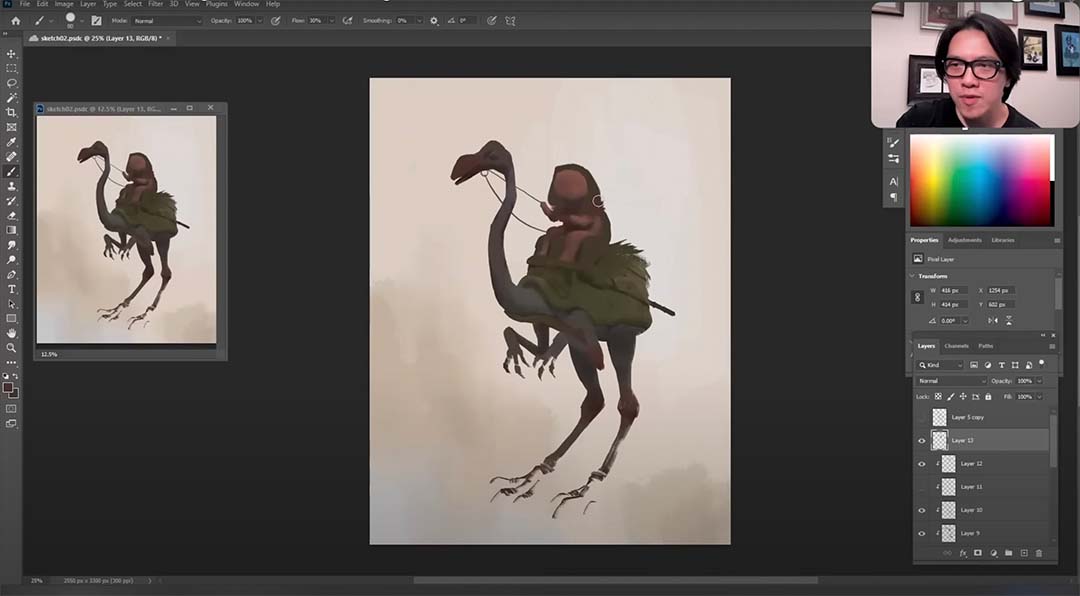
At this point, you can see that even though the entire thing still feels like a silhouette, I’m working on values, I’m working on the overall lighting scheme here. Even though just about every value here is quite dark, it’s generally like that because I don’t want want that much contrast between my tones. If I have stark contrast between my tones, it’s a little bit too vinyl, it doesn’t feel like I can really adjust things as much.
When tones are much closer together, where at a glance I really just see a silhouette, this allows me to rethink what I did before, adjust, and not have to paint everything over but just make my adjustments with the new tones. These new tones are more contrasting and they can also help me rejudge of things: I’m thinking things over, I’m changing my mind. It’s not really about how to paint this thing, but is more a glimpse of the thoughts that went through my mind as I was painting this thing.
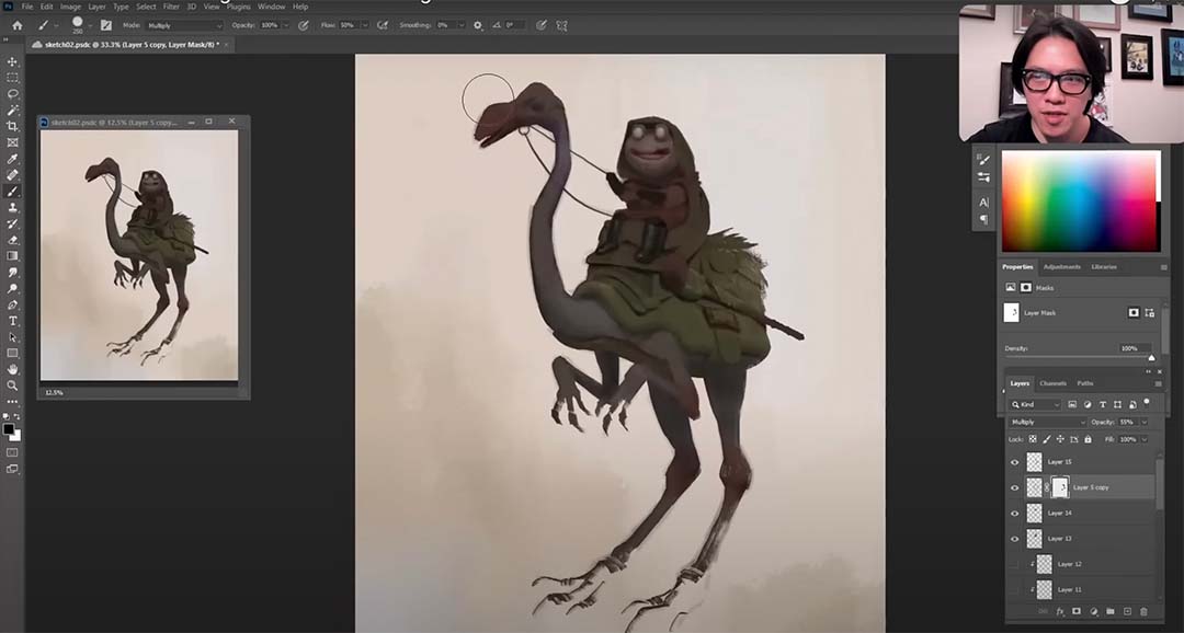
One of the thoughts here was I don’t like the long ears drooping down the riding character, so I went in there and gave it more of a hoodie and robes. I also changed my mind about the head, giving it more of these protruding eyes like a frog. Now things are still pretty dark at this point, but you can start to see a lot of details come out as I start to increase the contrast between my tones. Again, thinking about the reference image that I started off with, the shapes, the overall structure, and how I might take some of those elements and have it influence my final decisions on my creation.
The lighting in the reference image also compelled me, so in the very end I apply that kind of a lighting pattern back onto this creature. Except now it also includes the arms, the different textures, and the character on its back.
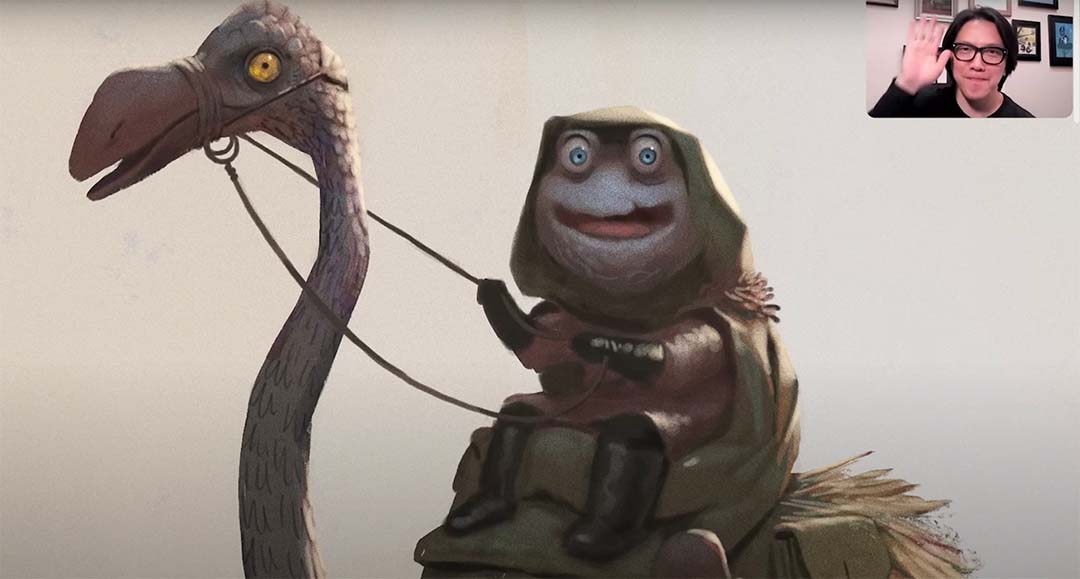
Okay and there we go! That’s the end of this exercise, which is really great for bridging the gap between people that are very reliant on references and those trying to get better at imaginative painting. It’s also great for those of you who don’t bother with references at all, and are only doing imaginative painting but are struggling. This exercise is really wonderful to bring you back to the basics and and take what we see in reality and put it into imaginative painting.

About Bobby Chiu
Bobby Chiu is a concept artist and character designer who has won a number of awards for his creative work, including an Emmy for co-creating the animated TV show Niko and the Sword of Light.
He co-founded Imaginism Studios, Lightbox Expo, and Schoolism, and is a co-owner of Magma Studio. Between his many responsibilities Bobby still manages to work in concept and character design, publishing art books, teaching digital painting, and streaming.

