

If you’re just getting into creating digital art with Adobe Photoshop and your Wacom device, or have been using them for a while but want to deepen your understanding of how Photoshop works so you can level up your artistic practice, this guide is for you. The best way to create digital art is to use the full range of the features available in software like Photoshop -- and you need a creative pen tablet or display, like a Wacom Intuos, Wacom One, or Wacom Cintiq, to do so.
This article is Part Four of our four-part, complete guide to Adobe Photoshop’s brush engine. If you haven't already, be sure to check out Parts One, Two, and Three before continuing. This post will take everything you've learned in the past three parts to finally explore creating your own brushes.
Table of Contents
Introduction
For our final article, it’s time to wrap up everything we’ve learned. Part III actually covered the bulk of what you need to know about making brush presets — most of the tools that make them unique are in the Brush Settings panel, and making the tip itself is the easiest thing in the world: you just select the part of the image you want and go to Edit > Define Brush Preset.
Remember: Brush tips are in grayscale. Black stays opaque, grays become translucent, and white becomes transparent. So make sure your tip image is isolated on white first. Also, to avoid straining your processor, it’s good to make them no larger than 1500 px (there aren’t many uses for tip stamps bigger than that anyway). But don't make them too small either, or they'll be blurry at larger sizes.
But the hard part of making a brush isn’t knowing how to draw a tip image or memorizing every slider of the Brush Settings panel, it’s knowing how to apply them and how they interact. So these four tutorials will show you just some examples.
Tip: Group your early brushes
You don’t want to mix your early experiments in brush creation with the finished brushes you’ll want to use for projects. Plus, saving different brush types into folders is a habit you want to build early, so you don’t end up having to search through a menu of hundreds of random brushes every time you forget the name of the one you need. Here's how:
- Open the Brush Preset Picker.
- Click the Gear icon to open the settings menu.
- Go to New Brush Group.
- Name it something descriptive, for example:

Five ways to create your own Photoshop brushes
There are several different ways to define a new brush preset, so these tutorials are sorted by their point of origin.
1. Creating a brush based on another brush
Brush presets can not be saved over, only duplicated, then the old one deleted if you wish. So if you want to modify one, you simply select it from the preset menu, go to Brush Settings, tweak it how you will, open the hamburger menu at the top right, and select New Brush Preset.

This will give you two options. The first, Capture Brush Size, is pretty self-explanatory, but you usually don’t want it since tip images tend to be way bigger than needed.
The second, Include Tool Settings, will bind it to the tool you’re using at the moment. This is just for convenience, so that if you make a brush for one tool only, you won’t have to go through the rigamarole of switching to that tool every time you use it. If you check it, it’ll give you a third option for whether you want to Include Color, which, of course, will make it default to that color -- but it won’t stop you from changing it.
Note: Liberating a brush
In your travels through the presets menu, you’ll find that in the last few versions of Photoshop, every default one has been assigned to a certain tool, indicated by the little symbol in the top right corner. Let’s say you’re browsing the Dry Media Brushes folder and see “Kyle’s Eraser - Natural Edge.” You’d love to paint with it, but whenever you click it, the tool changes to the Eraser.

To use it with whatever you want, you’ll have to make a duplicate with Include Tool Settings unchecked. For a little shortcut, right-click the brush, select New Brush Preset from the popup menu, and uncheck it there.
2. Creating a brush from a basic shape: Square painter
Now let's make some actual brushes, starting with a simple stroke one. There are so many of these online that you could go your whole art career without making your own, but it’s still a good skill to have.
Most painting brushes are either circular, or some irregular shape that imitates a traditional medium’s tip but would fit into a circle. Some veteran painters, though, swear by square and triangular ones.
First, you'll make a Tip Stamp. Create a new document, 1000x1000px. Tip: For general painting, keep your stamp height and width roughly equal. Brushes that are longer than wide or vice versa are harder to control, adding an unnecessary level of complexity.
Next, add texture. You could fill it with black and be on your way, but that would be boring. Set your foreground color to black, and your background color to white. In the Menu, go to Filter > Render > Clouds. Let it do its thing.
This needs to be stylized, however, or the result won’t look very good. Go back to the Filters menu, then select Filter Gallery. Pick Spatter. Max out the Spray Radius and set the Smoothness to 6.

Now go to Edit > Define Brush Preset. Name it whatever you like, as this is just a placeholder. “There’s not much black there for a brush preset," you might ask. "Will it even paint the right shade?” But this won't make a difference. You’ll see why soon.
Edit the Brush Settings like so: Edit Brush Tip Shape by changing Spacing to 5%. Edit Shape Dynamics by changing Size Jitter: Control to Off. Edit Angle Jitter: Control to Direction. Edit Transfer: Flow Jitter to Control Pen Pressure. Edit Noise to On.
Two things to note when you paint with this brush: One, your fears about the values being too light were unfounded. The density of tip stamps being laid across each other at 5% spacing more than makes up for it. In fact, in addition to Flow Jitter being set to Pen Pressure, you’ll need to paint with flow under 40 in order for the texture to show through. If you want even more texture, paint with Flow Jitter turned up (change this in the Transfer panel) in addition to the control method. It’ll give you an almost acid-washed look.
Two, when applied to a directional stroke, the clouds become nice paintbrush-like streaks. The grain of the texture is lost, however, which is why we turned on Noise.

Go on and save your new preset through the hamburger menu. Don’t check either box. And here you go:

3. Creating a brush from a photograph: Chameleon brush
Warning: This one’s complicated. But if you follow it, you’ll learn virtually everything about how to make a brush from a photo.
This will be purely a texture brush, meaning it’s not meant to be painted with; it’s only used once, to give your creature a coating of scales. You usually do this near the end of the painting, once the flesh is already done, then the only further stage is overpainting, rendering how light and shadows play off them. Our source image will be this photo by Girish Gowda from Wikimedia Commons.

First, download the image above and open it in Photoshop. Then, use the Rectangular Marquee tool. Pick somewhere on the body there’s a patch of flat scales uninterrupted by a shadow or an edge. Start dragging, then hold Shift to turn your selection into a square.

Copy your selection, create a new image, and paste the selection into it.

The next part will require some playing around with features you’ve possibly never heard of before, but if you follow the instructions below, it should work OK.
In the menu bar, go to Layer > New Adjustment Layer > Black & White. Adjustment Layers are one of the most useful tools for experimentation, letting you modify colors in the same way as “Image > Adjustments,” except non-destructively, meaning you can turn them off and on and change them whenever you want. This box will pop into the sidebar — set it to roughly the following:

- Selecting the “Green Filter” preset as a base will even out the values for you.
- After that, Greens are cranked up to max, making it even flatter.
- Turning Yellows up brightens it. This is as far as you can go without losing the texture.
If you picked another part of the lizard, modify them accordingly. Either way, you’re looking for a result like this:

That dark spot won’t go totally away, but we can minimize it. Make another adjustment layer, this time for Brightness/Contrast. Set Brightness to about 25 and Contrast to about 20. Then make another adjustment layer, this time for Levels. Set it to something like this:

And the result should look like the below (but if you’re incredibly particular, you can go in with Clone Stamp and paint out the remaining splotch):

Go to View > New Guide Layout. Set the Rows and Columns to 2 and the Gutters to 0:

Save that as a preset, and name it something like “Quarters.” It’s useful to have, both for making other photo brushes and for things like text layouts.
On a new layer, select the Gradient tool and click the gradient preview image in the toolbar (If you don’t see it, tap the Paint Bucket tool and drag it to the right). Under the Basics folder, select “Foreground to Transparent.”
Back on the toolbar, select the circle icon to change it to Radial Gradient mode, and to the right, check Reverse. For the last prep step, set your Foreground Color to white, hold Shift, and draw a gradient line from the middle of the image horizontally to one of the edges. You should have this:

I recommend stamping out the dark spot for smoother scales. I took a quick stab at it:

Finally, go to Edit > Define Brush Preset. Don’t worry about merging your layers, it’ll automatically sample the whole image. If you want, start a new document, paint randomly with it, and tweak your Brush Settings accordingly. Or you can dial in these ones:
- Brush Tip Shape
- Spacing: 60%
- Shape Dynamics
- Angle Jitter: Control: Direction or Tilt
- Flip X and Y Jitter: on
- Scattering (Optional)
- Scatter: 10-30%
- Both Axes: on
- Transfer (Optional)
- Flow Jitter: Control: Pen Pressure
Resave it, and you have your brush:

If you paint strokes that overlap at the edges just right, the scales should appear to blend seamlessly together:

This brush will already be transparent, so you won’t need to use blending modes or anything like that. One interesting trick is to paint the scales on one body part at a time, then use the Warp tool (Edit > Transform > Warp) to curve them to fit that part, making it look way more 3D. This tutorial by frequent Wacom collaborator Aaron Blaise will show you how:
Alternatively, there's this amazing tutorial by Robert Marzullo on how to overpaint shadow and shine onto reptile skin so it looks virtually real.
4. Creating a brush from a drawing: Hatching brush
I’m a "tradigital" artist, and occasionally still do lineart in pen. Hatching is both my favorite and least favorite part of this process; I love how it makes a drawing come together, but for seven years, I’ve been looking for a way to digitally automate the boring task of drawing hundreds of straight lines. The problem was that I just couldn’t find any way to do this that could actually blend in with ink-on-paper lineart. I still haven't, but the process I'll outline below is the closest I’ve gotten. It’ll still need some blurring and tweaking to make it actually look real, but it’s a good start and works pretty well for hatching backgrounds.
We'll make the brush tip first by drawing with another brush. Create a new image and turn on the grid with View > Show > Grid. Open the brush picker, and in the Wet Media Brushes default folder, select “Kyle’s Inkbox - Classic Cartoonist.” If you’re using an older version of Photoshop without the Kyle brushes, you can download them from Adobe here, or substitute it with any ink brush of your choice.
Before turning it into a hatching brush, we’ll have to turn off a few settings so the line will stay the same width. Open Brush Settings and visit Shape Dynamics. By default, the control methods for Size Jitter and Angle Jitter will be set to Tilt, and Roundness Jitter to Pressure. Set all of them to Off, but leave the sliders where they are. Save this as a preset so you can use it for lines of different thicknesses. Leave Include Tool Settings unchecked.

Hold Shift and draw two vertical lines following the grid. The lengths, thicknesses, and spacings are up to you — and if you end up liking this method, you can make different variations. I’m doing a thin one.

Highlight them, then go to Edit > Define Brush Preset. Name it whatever you want, then return to Brush Settings. For Brush Tip Shape, set a Spacing that makes the gaps on the sides of your lines roughly equal to the gap in the middle. Some trial and error will be necessary.
For Shape Dynamics, set Angle Jitter: Control to none. This brush relies on precise angles, so you’ll get the best results by changing the angle yourself with the arrow keys between strokes. But if you have an older version of Photoshop without that shortcut, set the control method to Initial Direction.

Turn on Flip X and Y Jitter so the bumps and crags in the ink won’t be identical for every line. If you want it to have rougher edges, select a craggy inner tip and drag the Size slider up until it comes right to the edges of the outer brush.
Unfortunately, this brush can only paint in straight lines because curving it messes up the spacing. To make it perfect, you can use either pulled-string smoothing, a Lazy Nezumi ruler, or draw a straight path with the Line tool, then stroke it (see Part III’s final tip).
You can carve precise shapes out of it using the eraser tool, and if you need curved or angled lines that match the hatch, you can fill them in with the brush you made by modifying Kyle’s pen.
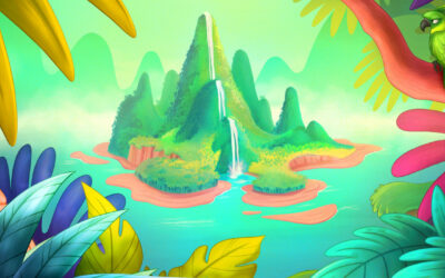
5. Creating a brush from a painting: Foliage brush
Our source image for this one can be downloaded from Stockvault:

Download the image and open it in Photoshop. Pick a leaf of your choice and, using your Wacom, trace it on a new layer. Select the trace and define a Brush Preset from it. Then, it's time to adjust the dynamics; open Brush Settings and make these adjustments:
Brush Tip Shape:
- Spacing: 75%. This might seem annoyingly scant when you first start painting, but the last thing you want with a foliage brush is to paint it so thick it becomes one color.
Shape Dynamics:
- Size Jitter: 30%, no control method.
- Max out Angle Jitter. Really mess it up.
Color Dynamics:
- Apply Per Tip: on
- Saturation Jitter: 10%; Brightness Jitter: 10%. For some subtler color variation, or:
- Hue Jitter: 20%, Brightness Jitter: 10%. Looks awesome, but a bit cartoonier.
Paint with 100% Flow if you want a more stylized look, or if you want subtler blending, you can turn it down as far as 70. Go any further and you’ll lose the distinction between the leaves -- which is only good for distant foliage.
I always paint from dark to light, first drawing the silhouette of the bush in almost black, then moving up to midtones, then highlights. One caveat for drawing plants is that since the leaves that get the most light are on the outside, they have to be painted last.

A fun hack for trees is to find a silhouette of a dead one, like this one:

Ctrl-click the layer icon to select it, then fill it with brown. Then, use your new foliage brush to paint the leaves on a new layer over it, and add detail to the trunk with a rough, woody brush:

A final tip: Make brushes per-project
For extended illustrations that have lots of repetitive elements, try drawing one element, sampling it, and making a brush out of it, with no obligation to use it again for anything else. Keep these types of brushes in a folder named for your project, then when you’re done with the drawing, save it to your hard drive as an ABR and delete it from your brush list. If you find something you can use for other illustrations, that’s a nice bonus -- pop it into another folder.
Conclusion
I learned a lot by working through this series. I still will not be using Photoshop as my primary software for painting -- I love Clip Studio Paint and I’m more fluid in it from years of practice, plus it still has some drawing-tailored features Photoshop doesn’t -- but I will be putting more effort into learning more about the things Photoshop excels at, like photobashing.
Even if Photoshop isn’t your program of choice, it’s the original. Every other image editing program I’ve used has ripped off this brush engine with varying amounts of changes. Some have improved on it, others are lower-quality knockoffs, but in most painting programs, you’ll find the same brush tools just under different names, so understanding how they work in Photoshop is still useful.
All I hope is that you learned anywhere near as much about them as I did.
About the Author
Cameron “C.S.” Jones is a West-Philly-based writer and illustrator who’s been contributing to Wacom for four years now. You can see more of his work, including most of his contributions to this blog, at thecsjones.com, or follow him on Instagram or Twitter.