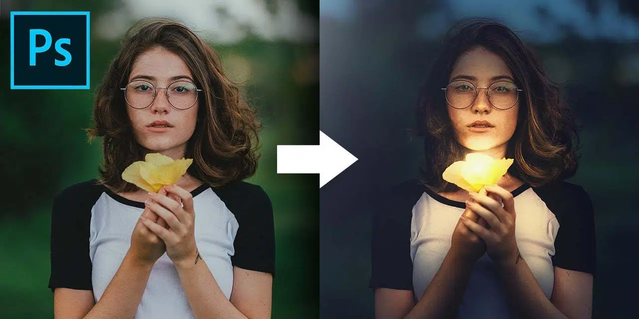
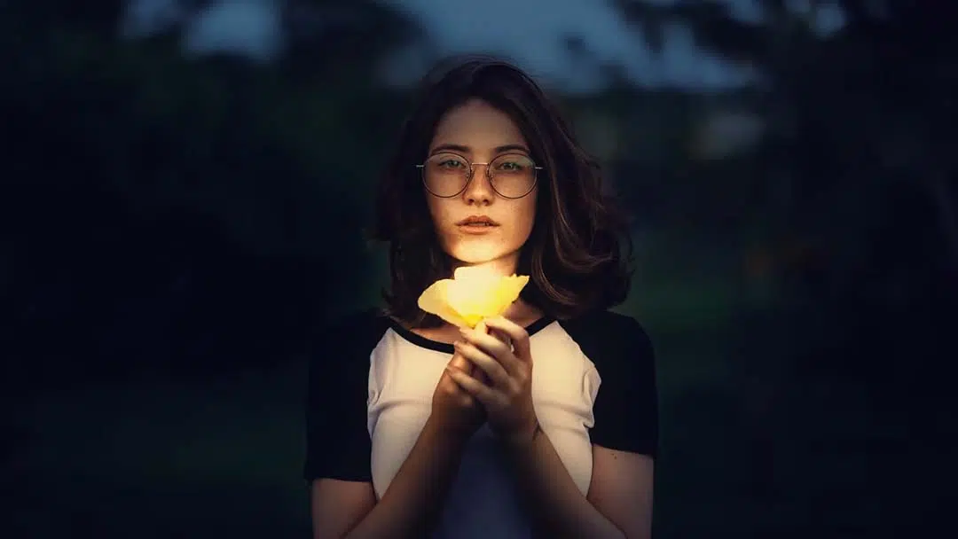
In this tutorial, PiXimperfect’s Photoshop master Unmesh Dinda gives you a thorough walkthrough on how to dramatically change the lighting scheme of an image in Adobe Photoshop. His process relies heavily on Curves Adjustment Layers – these are a special type of layer that applies brightness changes to the image without having to permanently alter it.
When you hear the term “color grading,” you might think of the consistent tints applied to movies that give them their distinctive hues. It’s similar but not quite the same here; this is more more of a lighting transformation, similar to the process he uses in How to turn day into night with Adobe Photoshop.
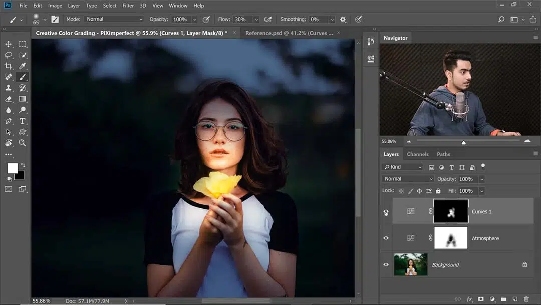
Turning daytime into twilight with Curves Adjustment Layers
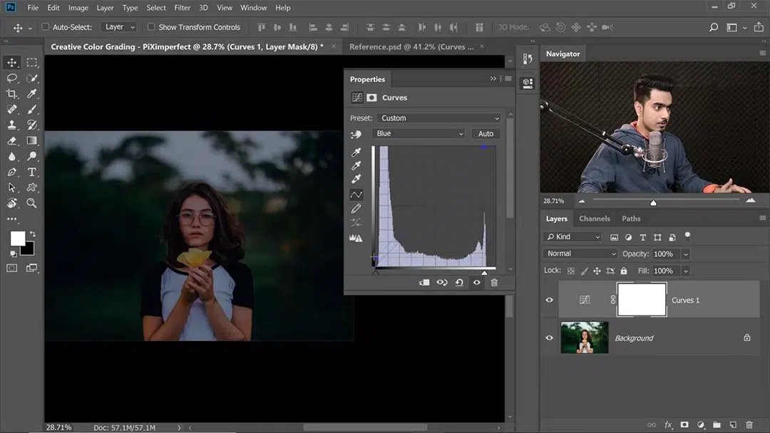
Although it seems at first to just be a very precise version of Levels, Curves is a feature with many hidden talents. After darkening the image, Dinda largely gets the job done by tweaking the different colors that Curves can be used to single out: Under the RGB toolbar, first he cranks up the blues, giving it more of a nighttime tint. Then he decreases the greens in order to add more magenta, the two colors being the opposites.
Lightening the subject
In this image, the flower is going to be the light source. This means falling back on another one of Dinda’s staples, masking out parts of the adjustment layer to create the impressions of light or shadow.
Using a Soft Round brush with both opacity and flow set to pen pressure, he masks out some of the curves adjustment layer that’s darkening the image so the brightness of the original image shines through.
Creating warm highlights
He then creates another Curves adjustment layer over it to add highlights, painting those in over the face and fingers atop the broader light of the last pass. He accomplishes this by turning up the brightness, then decreasing the blues to create a yellow tint, as well as increasing the reds to arrive at an orange. Then he masks out the entire layer, painting in just the “extreme highlights” on what will be the brightest areas of the image; this means the light source and the parts of the subject being directly exposed to it.
Because the subject is a dark brunette, though, her hair is such a different shade from the rest of her body that it has to be done separately. For this, he creates an even brighter Curves Adjustment Layer than the one used for the highlights, dabs in a few areas of shine onto the hair, then erases where it’s “overflowed” onto the face and background.
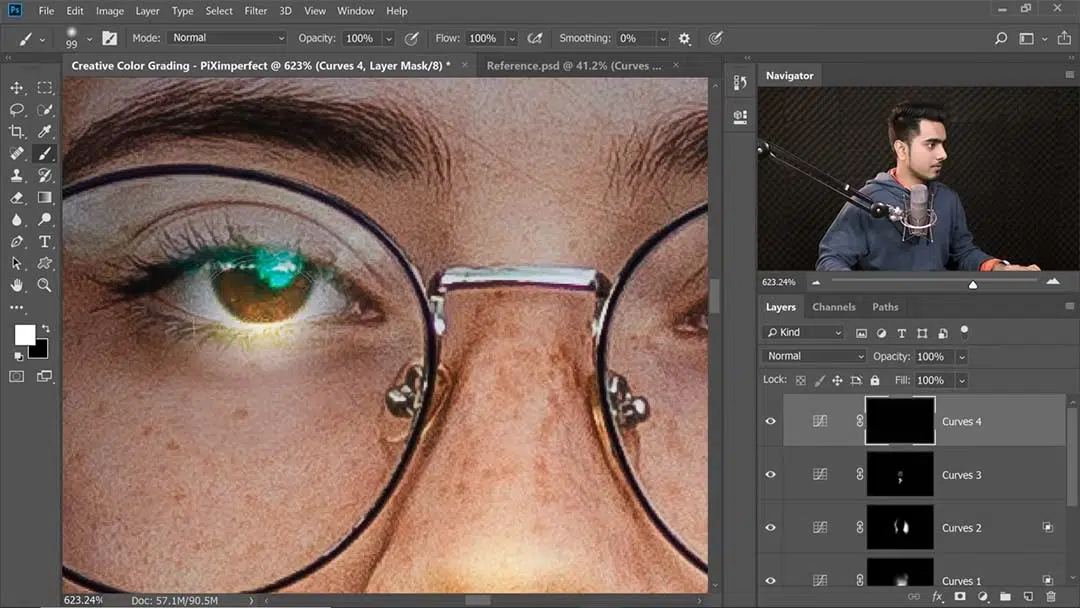
He creates another Curves Adjustment Layer to add highlights to the eyes — he brightest lights so far, but also the smallest — as well as painting a white dot on an overlay layer to add another highlight to the eye.
Creating the shadows
Surprise, this means another Curves Adjustment Layer. “It’s all a game of Curves,” as he puts it. As opposed to all the last ones, for this one, he drags the curve down, making the image darker, so he can mask in the shadow areas as opposed to the light ones.
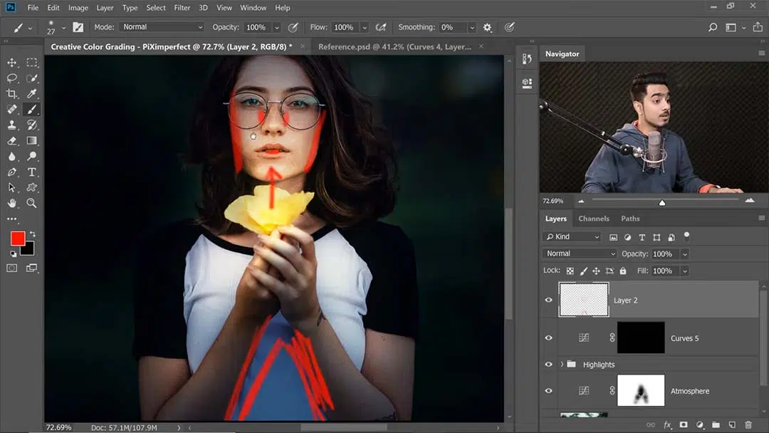
Since the light on the subject will be coming from below, the shadows will be cast onto the upsides of the cheeks and lips, as well as the sides. He then paints in some dark and dramatic shadows beneath the arms, since they’ll be the part blocking the most light.
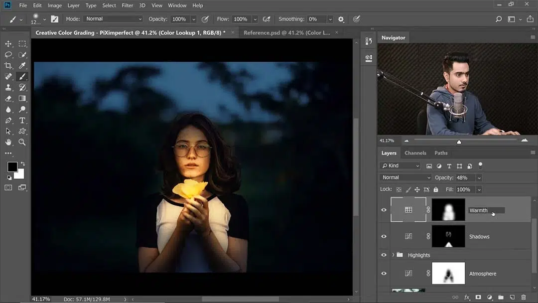
Further warming the highlights and shadows
Now that both highlights and shadows are created, Dinda decides they both need some warmth. For this, he uses a Color Lookup Table Adjustment Layer, a more rarely-used type that lets you choose from a variety of shades to tint your image.
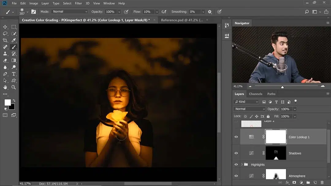
He lays it on thick, picking one that turns the entire image orange, then masking it in over the entire subject to make her colors dramatically warmer than the background’s, even after turning the Opacity below 50%.
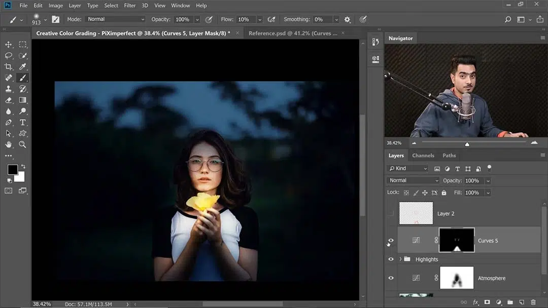
Adjusting the light
He begins this step with another Curves Adjustment Layer and takes it up just a hint. He then blacks out the mask (again, making the entire effect invisible), and with a big, soft brush, dabs a little over the source of light. He then uses Blend If in the layer styles panel, Alt-Clicking the slider to break it apart so it covers a range of shades, to constrict it to the light areas of the image.
Finally, he creates the light source overtop the flower by painting it in directly. With a white brush, he zooms in and paints a single ball of light over the flower.
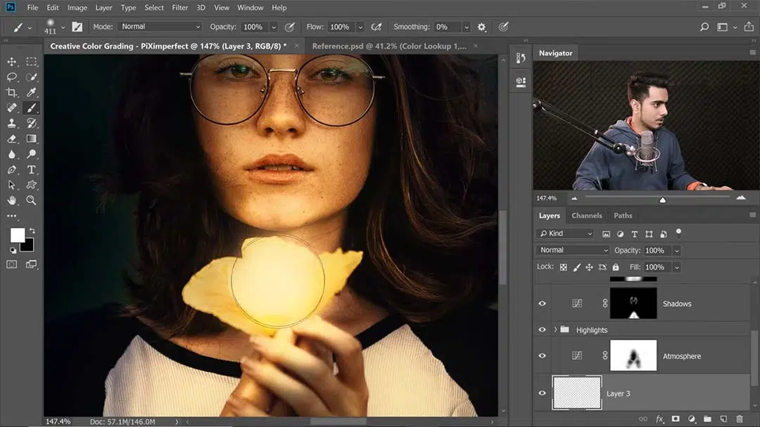
He then changes the blend mode to Color Dodge to make it look more realistic, and decreases the Fill so it won’t be too bright for the image.
Stylizing the Image
To top it off, he decides to create a faded effect. So, shockingly, he creates another Curves Adjustment Layer, this time tweaking the individual colors’ curves just slightly to balance out the colors of the image and make them less saturated.
Taking a break!
“Most of the time we are so engrossed in the editing process that we miss out the important stuff … Then in haste we just post it online. And then a day later, we look at it and [are] like, ‘What the heck was I thinking?'”
Dinda calls this step “compulsory,” and “the most important stage of the image.” So, he suggests, always take breaks during the process, returning to your image hours later or the next day in order to make sure there’s nothing there you regret!
Finally, for those who want a more concise, but detailed summary of this tutorial, he’s posted a step-by-step guide with his notes here.
About the Author
Cameron “C.S.” Jones is a West-Philly-based writer and illustrator who’s been contributing to Wacom for three years now. You can see more of his work, including most of his contributions to this blog, at thecsjones.com, or follow him on Instagram or Twitter.