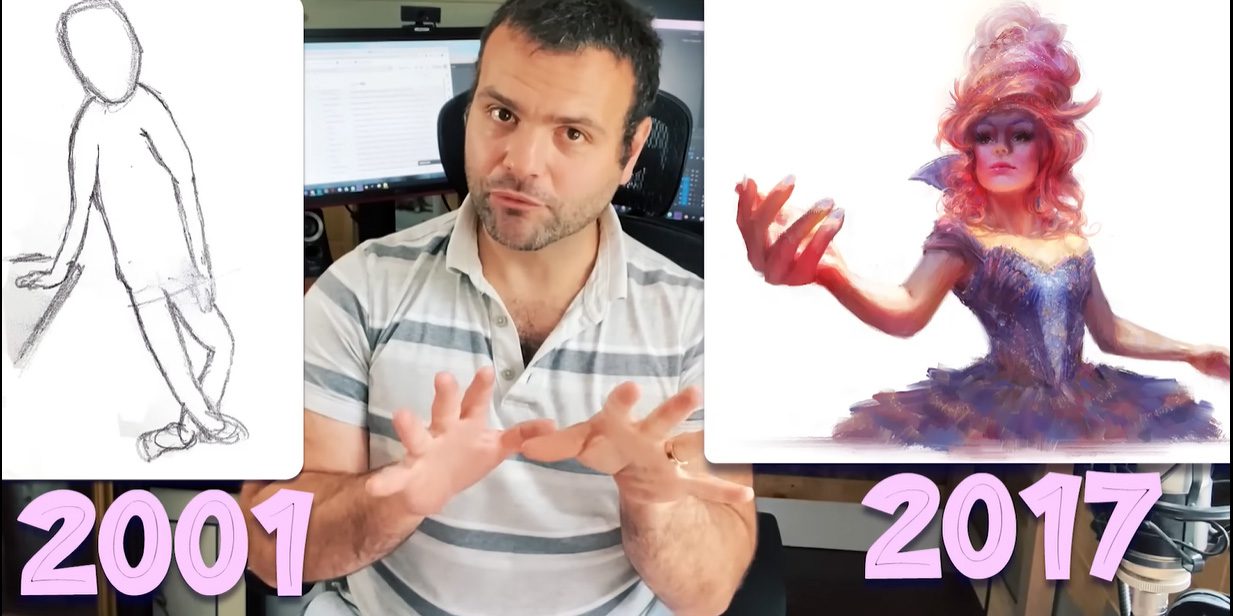
In this video and guest post from Marco Bucci, he discusses his art journey — how as a teen, he was not an adept artist. But through hard work, he became a well-respected professional. How did he do it? Read on.
Digital Painting: lessons I’ve learned along the way
I began my art journey when I was 19 years old. I wanted to go to art school in college, but the artwork in my portfolio got me rejected, so I had to learn on my own. Fast forward about 20 years and today I get hired by big studios like Wizards of the Coast, Disney, Marvel, and Blizzard. It’s even come to the point now where I’m turning jobs down.
In this video, I want to share some information I’ve learned on my creative journey. In the previous video, I talked about how I learned to draw from scratch, but in this one, I am going to focus on painting.
Painting starts and ends with drawing, and my teacher, Nick Kalislian, first showed me the power of good shape design. Nick’s shapes always felt so flowy and friendly to draw, which I’ve come to learn is the mark of a professional.
My early life drawings had shapes, but there was no thought given to their design. This is the mark of a beginner. When you watch a professional artist draw, you’ll witness care for every shape. Professional artists often draw over and over a shape, to find the best design.
Understand the building blocks to shapes
- Straight line
- C-curve
- S-curve
A couple of years into my drawing journey, a lot of my studies were recreations of art that I liked, but with an emphasis on understanding the underlying shape language. I studied a lot of animation because the shapes are so distilled and made obvious in that medium.
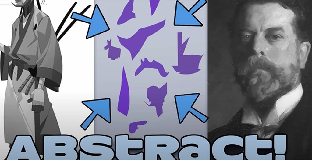
I learned a lot of drawing principles from cartooning, but I also wanted to be able to paint realistically and one of the biggest mental hurdles I faced was the question of what makes the two styles different. In actuality, all the shapes are equally abstract! But it’s the complexity that edges make the difference.
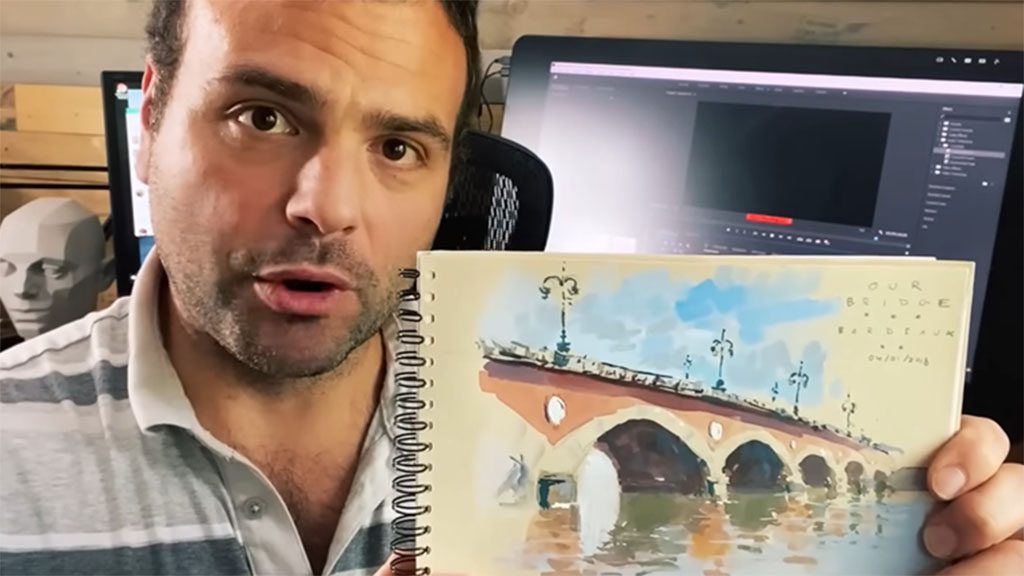
Get out in the world
I think it’s important to sketch from life, because you don’t necessarily want a camera pre-filtering things: you want to be the filter. When you’re out there in real life, you allow other senses to filter into the work. It’s important to engage with your subject directly from life.
Of course, there are still times to use photo references, but it’s my experience with painting from life that allows me to bring life to what I reference from photos.
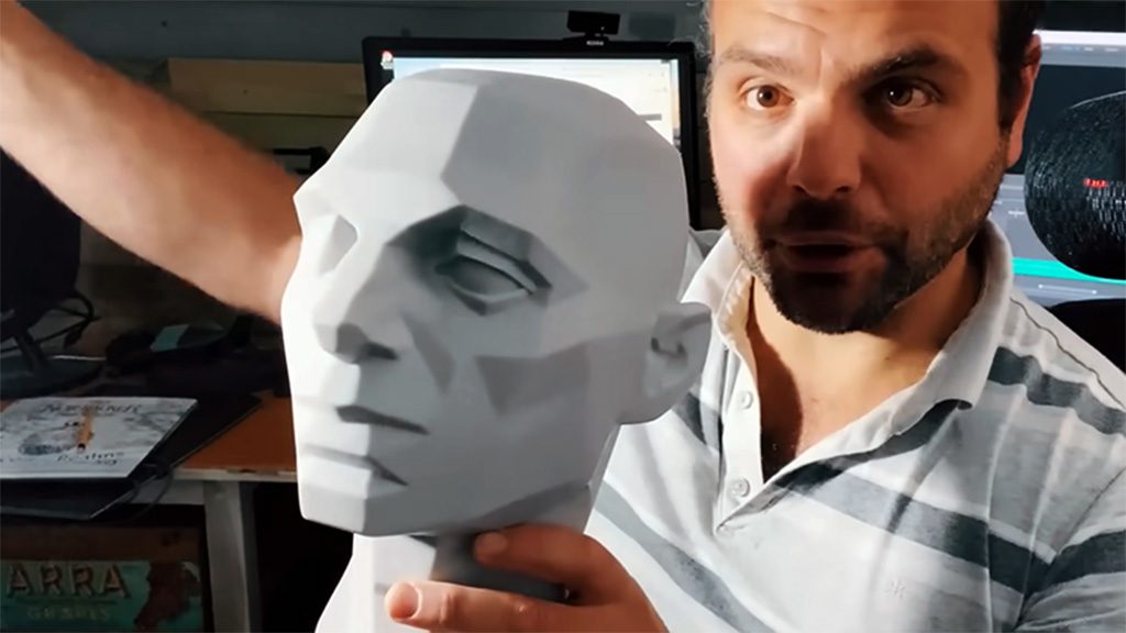
Value Your Values
Values present a difficult challenge for most beginners. But the best way to reduce the complexity of the values is to break the scale into groups, from which you can pick averages. Start by reducing your subject to just one light value and one shadow value. Light and shadow values are the two most important things to establish because they tell you the most information about the direction and position of the light, which are both linked, and the orientation of the planes in 3D space.
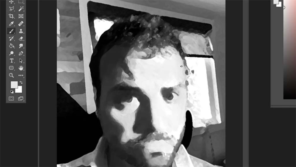
An Exercise for Simplifying Values
Take a photo of your face with just one light source, throw it into grayscale then go into your filters. I’m using Photoshop, but you could recreate this in any app. What you’re trying to do is isolate the light and shadow shapes. You can’t do this with every subject matter, because nature won’t always give you simple shapes, but with the human head, it usually does work.
- Start with Photoshop’s angled strokes filter. Play with the settings to reveal the simplest shapes possible.
- On top of that add the dry brush filter and play with the settings to simplify those shapes.
- Go into brightness/contrast and play with the sliders until the values are as few as possible.
- On top of that base grab a non-textured brush and paint into the light and shadow shapes, eliminating detail as you go, until you arrive at average values. What’s useful here is you get to feel what it’s like to paint simple, abstract shapes.
- When you’re done, flip back and forth to appreciate the simplicity and even trace the shapes to start building a mental catalog.
- The next step is to paint the picture yourself, but still, use references.
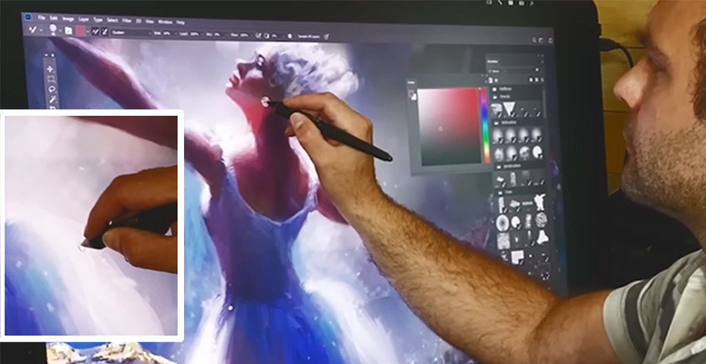
Color?
There’s one more fundamental we haven’t talked about yet, color. I’ll talk about it in the next video.
If you like these videos you might want to check out my eight-week art mentorship program which I just released on demand. It’s about 40 hours, over eight weeks of intense art training designed to skyrocket your skills. It’s kind of like these videos, but way more in-depth, with demonstrations, examples of student critiques, and homework assignments. You can find it, as well as all of my premium content at marcobucciartstore.com.

About the author:
Marco is a professional Canadian artist with 15 years of experience in the film, TV, game, and print industries – primarily as a concept artist and illustrator who recently upgraded to a Wacom Cintiq Pro and ergo stand. He strongly believes that it is the duty of experienced artists to pass on what they’ve learned, and it’s for this reason that he’s a passionate teacher at CGMA.
His clients now include Disney, Marvel, MtG, Hasbro, Lego, Lucasfilm, and more. Check him out on YouTube, Patreon, Instagram, or his website.

