School of Motion is reimagining art school with world-class training that is available on your schedule from anywhere on Earth. They offer a wide variety of courses that can take your creative goals to the next level. Check out their website to see all of their offerings. The below video originally appeared on School of Motion’s YouTube Channel.
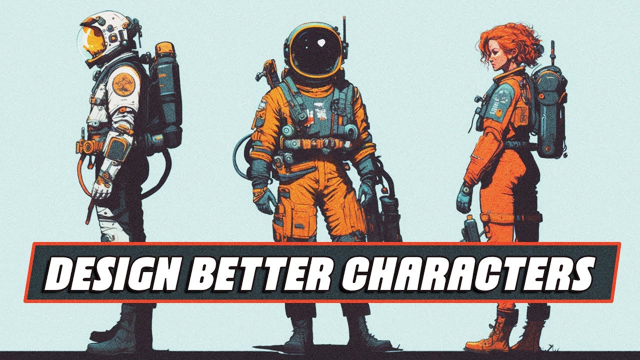
Designing characters that are unique and exciting doesn’t have to feel overwhelming. Today we will focus on three simple tips that will make your character design animation ready in no time!
Tip one: Don’t skip all the planning and prep work before you start drawing
Taking time to plan and research your character can make all the difference when it comes to successful character design. Here are three steps to help improve your planning process before you dive into designing your character.
Step one: Get to know your character
If there’s one thing that you need to know about character design, it’s that every choice, line, and color that you pick and make should all be in the service of one thing: story.
Effective character design plays as big a part in the story as good animation. That’s why it’s essential to take the time before you start designing your character to ask questions such as: Where does my character live? What are their personality traits? What are their strengths and weaknesses? How does their arc play out in the story? Knowing how your character will move and act in their world will help you hone in on the correct design for your character.
Step two: Pick a target audience
While designing your character you need to figure out who this character’s audience is going to be. This will have a large effect on what style and detail you put into your character. For example, the character design in kid’s shows will typically be much simpler than a character in a video game meant for older audiences. God of War uses realistic character design perfectly as it grabs the attention of its older target audience.
Step 3: Research and gather reference
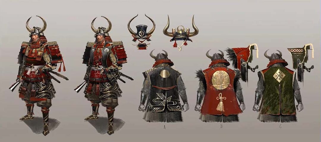
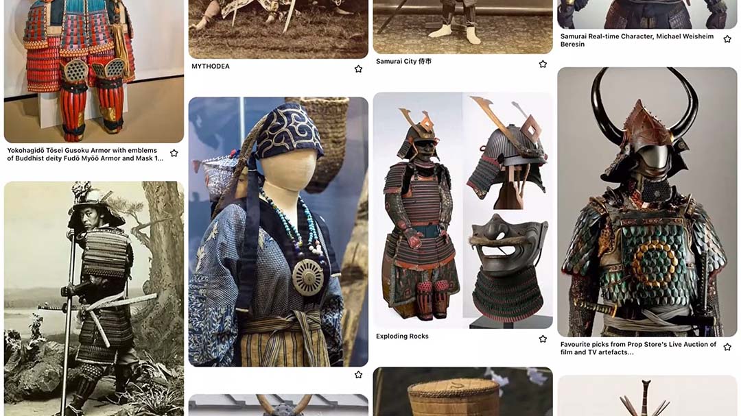
Reference is an artist’s best friend. This is especially true when your character is from another culture or time period. Researching those different periods or cultures before you start designing will help you get the right image of who your character should be. It can be helpful to gather images and create an inspiration board on Pinterest so your reference is all in one place.
Tip two: Construct characters using basic shape language
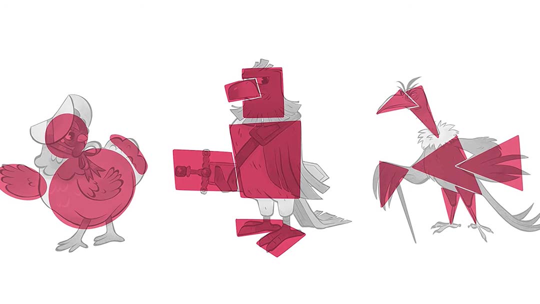
Shape language is the secret language that every human knows. Your brain comes pre-programmed to see certain shapes as dangerous, safe, or stable. Circles typically represent peacefulness, softness, approachableness, or harmlessness. Squares typically tend to be interpreted as sturdy, strong, reliable, solid, or sometimes inflexible. Triangles can be interpreted as sharp, directional, dynamic, dangerous, or unpredictable.
You are not confined to one shape, though; you can use more than one type of shape while designing your character to give them more complex traits.
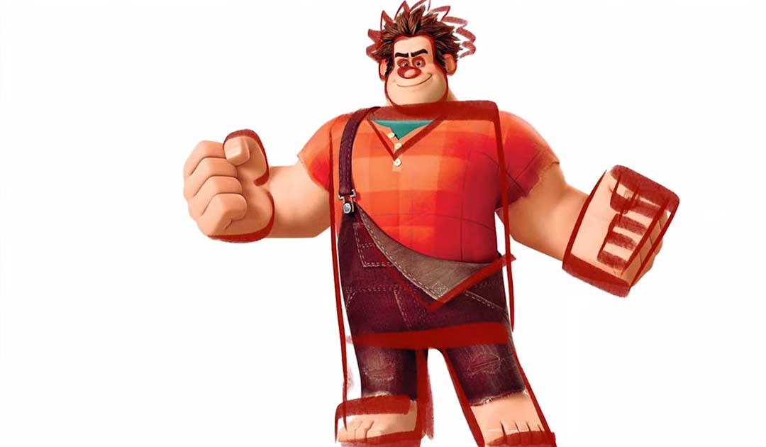
Let’s take a look at Ralph from Disney’s Wreck-It Ralph. In Ralph’s character design, his appearance perfectly conveys his story at a glance. Despite being the villain in his video game, Ralph needed to appear intimidating and strong while also exhibiting the potential for growth and change.
His design effectively utilizes all three shapes to achieve this balance. The dominant use of squares and rectangles portrays his strength and sturdiness, symbolizing his role as a wrecker. However, there are also rounded elements in his facial features, indicating his softer and more vulnerable side.
Additionally, the spikiness in his hair, and the big triangle on his chest, emphasize his villainous nature. It’s clear that Ralph’s character designer invested significant thought into his story arc and created a three-dimensional character.
Tip three: Use contrast
Contrast is when two or more opposing elements are placed next to each other, while variety is just when a wide variety of elements are present in the design. The human brain loves contrast, and the more contrast in a design, the longer a viewer will look at it.
One of the easiest ways you can add contrast is to use the principle of big, medium, and small. For a basic example, compare these two snowmen. Which one is more visually interesting? The one on the right, because it uses the principle of big, medium, and small to create contrast compared to the one on the left, has no direction.
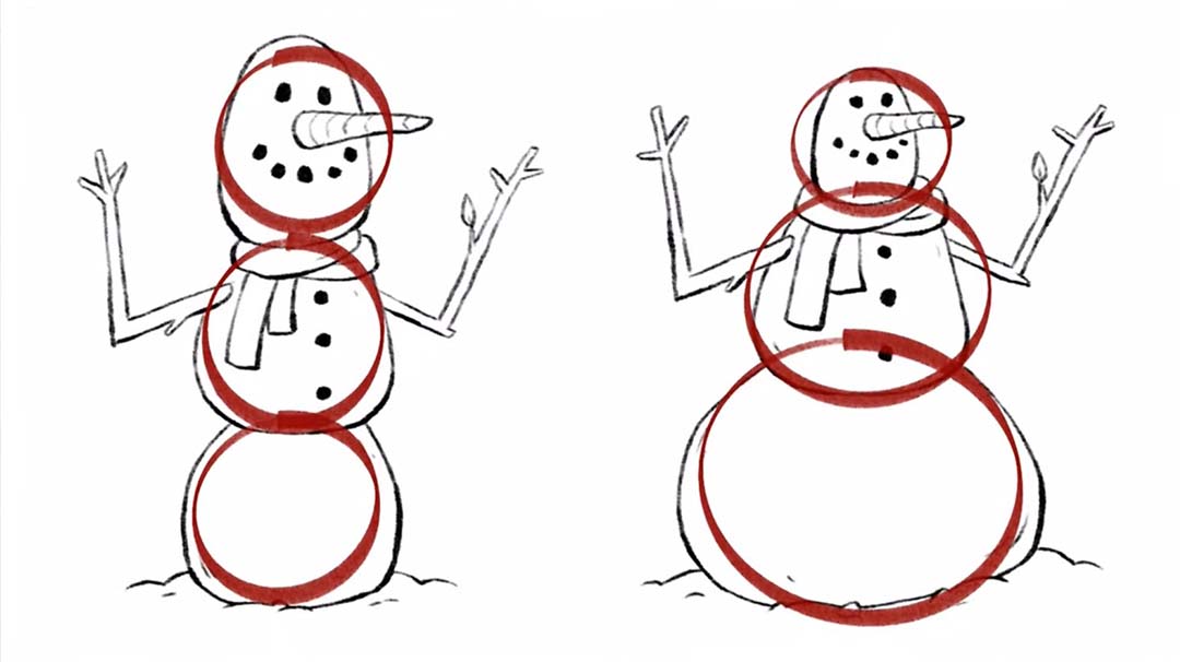
You can always break up a character into groupings of various sizes. These groupings start at the horizontal lines on your character design, then from their chin, waist, knees, and ending at their feet. It is important to include the principle here to create contrast. Ralph is a great example of using the big, medium, and small principle in vertical groupings.
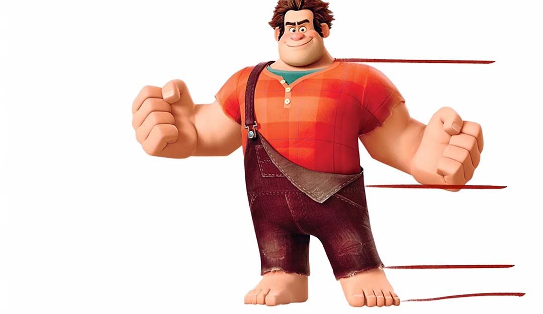
This principle can also be applied to the smaller and finer details of your character. If you can apply this principle to their clothes or hair or any part of their design, it will add contrast and be more visually interesting to look at. The goal is to not have any groupings on your character that are all the same size and shape.

Want to learn more?
While this was not a complete guide to character design, it will certainly get you started on creating great characters ready for animation.
Interested in learning the entire process to illustrate for animation? School of Motion’s Illustration for Motion course has you covered. For more tips, head to School of Motion’s Youtube Channel, or find complete courses on their website.

