Let’s start with a question: What is the purpose of an art portfolio?
Don’t think about it just from your point of view, though — think from your client or admissions officer’s as well. On your end, the purpose is to achieve a goal: usually, getting accepted to an art school or finding work. On theirs, it’s an indication of whether you’ll be a fit for their specific needs.
So you need to go about it differently than you would, say, picking pieces to post to social media; the audience and purpose are different. Let’s start with a hack most artists don’t take advantage of, so if you follow it it’ll immediately put you miles ahead.
Tip: You should have multiple portfolios
If you already have a portfolio, chances are it’s a general-purpose one — a broad overview of everything you do and are as an artist. These do impress people, but they’re not as likely to get you into school or hired. That’s because the biggest problem portfolio reviewers complain about is too much irrelevant material. If your portfolio shows everything you can do … it’s more likely some of it will be irrelevant to a particular audience.
So let’s walk through how to make themed and targeted portfolios. A themed portfolio is set up for a general type of program or client, and collects a variety of pieces within a particular art style or type of piece. A targeted one is customized for the specific one you’re applying for.
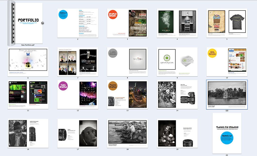
The basics of a good portfolio
If you’re going to be applying to a lot of schools or jobs, first you’ll want to make one themed portfolio for each broad type of program you’re applying for. For work, one for each position you’re open to working in.
According to every source I consulted, a portfolio should be from 10 to 20 pieces, with several citing 12 as the ideal number. If you don’t have 12 good images for your intended program or position … you’re probably not ready to major or get a job in it. Sorry.
Next, copy all your best pieces into one folder on your hard drive. This is the image pool you’ll draw from for your targeted portfolios.
Then, when it’s time to send them out, you can pick one of your themed portfolios ones to apply to most schools or companies. But for “highest-value” applications — the schools or jobs you’re dying to get accepted by — make a targeted portfolio featuring the work that you think would best fit exactly what they’re looking for.

What pieces should you put in your portfolio when applying to art school?
What type of pieces are appropriate will vary wildly between schools and programs. Fine Art portfolios should focus on pieces that show your unique personality and make a statement, for example, whereas ones for technical or industry-oriented programs should focus on images that are as close to professional work in that field as possible. But overall, here’s what you should be trying to demonstrate:
Focused versatility
Schools encourage branching out much more than workplaces; their reasoning being that this is the experimental phase of your life and you should be throwing art at the wall to see what sticks. They want to know that you’re willing to try a wide variety of media and subjects, not just become a production machine for one type.
For digital arts programs, toss in a few traditional pieces to show you can draw without Ctrl-Z. And for traditional ones, you have even more leeway. Fine Arts departments, especially, encourage you to work in and on different media. Art School Prof recommends trying painting on unusual materials and found objects, for example. Vary your compositions, too. Multiple sources in my research mentioned they get tired of always seeing subjects centered in frame.
The “focus” part comes in because you still want it all to remain relevant to the program.
Your voice
Schools are generally looking to see whether you have the kind of potential and artistic intentions they’re trying to bring out. Even the hardest technical ones won’t just drill process into your head: if they’re any good, they also want to see what’s unique about your art and help develop it. A large part of that lies in you as a person, your story and what makes you different from their thousands of other applicants.
Many like to see works dealing with identity, so if you have any pieces that address this, make sure to include them — not for cynically pandering reasons, but because they’re an important part of who you are and what you bring to the school’s table.
Technical skill, but not mastery
Most schools want to see some level of technical proficiency – but not necessarily expertise. Some value it more highly than others. “CalArts, for example, they really look at your technical ability, and MICA [Maryland Institute College of Art], they really look at expressing your artistic voice,” says Youtuber sakuraopal, who was accepted to multiple schools with her portfolio and ended up going to CalArts.
You don’t need to be a professional-level artist to get into great schools, though. If you’re already a master, why go to art school in the first place? What would they have to teach you?
On a similar note, it’s important to include drawings representing earlier stages of the creation process including studies and sketches, not just the shiny finished pieces. This shows a bit of your process — like “showing your work” in math classes.
What to avoid
Portraits of celebrities, anime, fanart that doesn’t put a new spin on the source material, closeups of eyes, zentangles and mandalas, anything copied from a photo reference with no changes, or bad photos of your traditional pieces are all things that should be avoided.
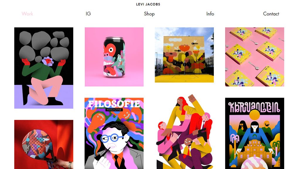
What pieces should you put in your portfolio when applying to a creative job?
“People think ‘my portfolio is about me,’ when it’s really about the client’s needs!”
– Marshall Vandruff, art teacher and co-host of the Draftsmen podcast
Although they look similar, job portfolios are very different from school ones. In some cases, what clients are looking for will be directly opposite.
Mastery
Where schools usually want to see enough competency to take you the rest of the way, in the working world, the more skill and polish you have, the better. But this doesn’t necessarily mean technical skill; skill comes in a variety of forms. It could be how creatively you communicate ideas or how simply you convey a complex concept.
Nobody excels at everything, and you want your particular strengths on full display in your portfolio. And it should focus on your best finished pieces, with just enough sketches to let a client know you can do that too if they require it.
Don’t think this means you need to be an art god to become a professional, though. There are jobs of some kind or another available to artists at every level above baseline competence. This also depends on the field: a magazine might accept rougher illustration styles than a video game company might accept for concept art, for example.
Versatile focus
This is where the expectations differ the most from art school. Where schools want to see versatility within the program’s subject, most jobs want to see as much proof as possible that you can nail the specific things they want you to create. So assemble a topical collection of work with just enough variation to reassure them you can branch out if they need it.
Don’t worry, though — this doesn’t mean you should switch from drawing what you enjoy to only what you think is marketable. There are countless stories of potential students and prospective employees submitting portfolios full of their most boring art because it’s in a genre that’s popular, but still getting rejected by everyone. Often, these end in the applicant deciding to draw what actually appeals to them — and getting hired.
Your voice … but also theirs
The apparent contradiction in what art directors are looking for is one of the hardest parts of the job search: they seem to want someone who brings a unique style to the table … but who can hide it and draw as close to the project’s pre-existing style as possible. But what this really means is they’re looking for someone who’s already good at doing the type of art they’re hiring for.
So the compromise is tailoring your targeted portfolio to even more specific niches. This means your work won’t be the right fit for most employers — but that’s a good thing, as it weeds out jobs you’re not suited for and draws in clients in your area of specialty.
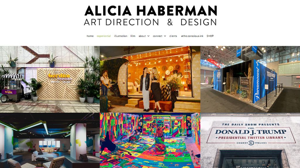
A few final tips
Start and end with your best. Start with your very best, since it’s the reviewer’s first impression of you. Then end with your second best to leave a strong final impression on them.
One common recommendation is that nothing in your portfolio should be more than three years old. This is not a hard rule, especially for your work portfolio if your style hasn’t changed very much. But definitely favor recent work over older work.
Get critiques from established art students and professionals, in real life or online, as often as possible.
Finally, consider how you’re presenting your work — just on Instagram? On your own website? A free host like ArtStation? Printed out in a nice folio you can bring to job interviews? Once you’ve got the work selected, it’s time to actually put the dang thing together and display it.
Here’s how to do that – check out the sequel to this post, The best places to host your art portfolio.
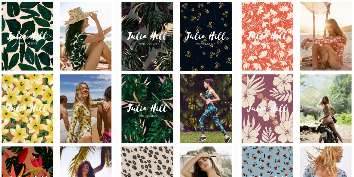
Note: this post’s feature image features portfolio pieces from textile designer and Wacom user Julia Hill.

About the Author
Cameron “C.S.” Jones is a West-Philly-based writer and illustrator who’s been contributing to Wacom for three years now. You can see more of his work, including most of his contributions to this blog, at thecsjones.com, or follow him on Instagram or Twitter.

