

Note: This is a guest blog post article written by artist Klaus Sherwinski. The view expressed in this post do not necessarily reflect the view of Wacom.
Anachronism in Action: I’m Supposed to Draw What?
When I set out last October to give a sketching demo on my brand new Wacom tablet, I didn't know what Köln’s audience had in store for me. It had been a while since I last spoke at the SAE Alumni conference, and I wanted to address a topic that is often at the center of my work as a storyboard artist: “How do we cram three characters into a shot, and still make it read at a quick glance?” I came prepared with THREE topics to guide us safely to our goal ... and then the audience threw me a curve ball!
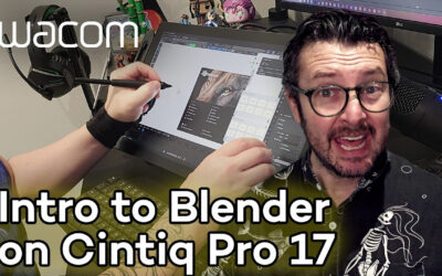
Watch the video above to see the drawing process – and how the audience plunged me deep into anachronism! I was filmed unscripted and live on stage at the Palladium in Cologne, Germany, during the SAE Alumni Conference in October 2025. Tools used were the Wacom MovinkPad Pro 14, the built-in sketching app Wacom Canvas, and CLIP STUDIO PAINT EX. Well, and a few years of experience drawing professionally for games like Horizon Forbidden West, Avatar: Frontiers of Pandora or Tomb Raider: Legacy of Atlantis. But let’s dive right in!

What do Pythagoras, the Pope, and a Storyboard Artist Have in Common?
Answer: They all think the number THREE is magical!
I can only speak for the latter, but let me break it down for you what this “divine digit” can mean for you in the context of setting up a complex shot that nicely guides the viewer through the image without overwhelming them. Here are the three main techniques to keep in mind. Beginners have to learn them, professionals have to live them:
- Rule of Thirds,
- Family of Three, and
- Three planes of depth.
Please note that, ideally, you think of these already as you are sketching. If you tackle them only in the rendering phase of the drawing, you will come to notice that you wasted a lot of time and energy during sketching – and no professional artist has time for that!

Rule of Thirds: Meet me at the Crossroads!
The Rule of Thirds directs us to draw lines (in the above illustration, they are blue) to separate a frame into thirds and place important storytelling elements where the lines cross. There is nothing magical about these points, however. What is important is keeping everything central to the narrative in a virtual "live area" (the white outline above) and guiding the beholder's eye into the composition without letting it escape. Having major storytelling elements on the edge of the frame would be detrimental to that.
As you can see, I placed the main character's face on one of the crossing points (the blue circle). Now, how important is the knee of the knight with the halberd on the left, you ask? It’s not important at all. It’s only relevant that the character’s face is not too high so he doesn’t lead our gaze out of the picture; that knee ending up on the other cross point is just due to the circumstance of the posing.
The shotgun is placed centrally in the middle, cementing it as the main element (I spoke more on that topic in the video above). The shotgun is also most important because there is only ONE of it. And this brings us to our next point.

2) Family of Three: Repeat, Resize, Rearrange
We hate repeating ourselves, that’s why smart people never do it in the same way. This technique is as simple as it is effective: Always include elements that you repeat in big, medium, and small versions. Indeed it doesn’t always have to be three, because nature doesn’t repeat itself with intent like that. How many different sized rocks can you spot? Could I have done a better job and vary it more? Perhaps I could even have included rock elements in the near foreground to give the camera a nice frame to peep through. Is this necessary however, or does this composition already work as is? That’s where your personal taste comes in. No drawing tool will make these decisions for you, but that’s exactly why we are fans of specific artists – we like their taste!
Notice how the knights are shown, varying in size but also in pose. They are indeed the core of the storytelling in this image. Their poses are going from holding their weapon ready with both hands (the one farthest away from us), to freeing a hand to potentially grasp at the central object (the knight on the left), to kneeling down and establishing contact with the ground with one hand while using the other to keep his comrade back (the knight nearest to us).
The main knight has obviously dropped his staff weapon already (as it's not visible in the frame), thus giving him more opportunity to act. This diversity in pose gives us a form of sequential storytelling; an illusion of movement, all in one single shot. What it also does is give us what is called a scale cue. Assuming human beings of similar age are also of similar size we can deduct that the smallest knight is also the furthest away from the camera. I have also employed another technique to help with creating depth, and it’s the following.

3) Three Planes of Depth: Values, Detail, Color
I am aware we don’t have color in this one; blue and green are just to identify planes of depth. Storyboard artists rarely use color, but if you check out our recording of the live demo, you will notice me addressing what is called stage lighting in this context, i.e. the purposeful changing of the light’s color depended on how far from the observer we are. The big point here however, is that depth is more important than almost anything else. Techniques like overlap and scaling – see above – are great for creating depth, but so are value and detail.
Notice how the main subject of our image is the knight up front getting a close up look at the shotgun (blue). We use the darkest areas and biggest amount of highlights for everything on this plane. We draw the most texture on the uniform, show ornaments on the pauldrons (armor), and give the face the most rendering; we create the most volume and employ strong outlines on this main character and his object of desire thereby making them pop to the front of the stage.
Compare this to our second knight character (green, the middle plane). No black areas, less highlights, thinner line work and no separating outline. The overall shape is just a medium grey flat area, something I haven’t even done for the third one. The third and smallest knight is very washed out, and his face is so rudimental that we can’t even discern eyeball from eyebrow. He becomes one with the background plane. It’s very easy to zoom in on a digital drawing tool in order to draw all that detail; not giving in to this takes restraint. And that was actually my last point for today.
Stop While You Can!
I started out as a comic book artist for Heavy Metal Magazine 20 years ago, so I am very prone to over-rendering, i.e. “drawing details where we know they are, but our eyes normally wouldn’t actually perceive them.” That said, details in comic books can work slightly differently than in storyboarding, and I’m happy to talk about that another time.
Case in point, I’ve just started on a comic book short story for publication later in 2026, which is easy because the Wacom MovinkPad line comes with a free trial license for Clip Studio Paint, the preferred drawing app for Mangaka and comic artists around the globe.
I hope I could inspire you to pick up the pencil or stylus yourself and give it a shot (no pun intended)! Looking forward to catching you on another digital excursion or at a real-life game, art, or animation event soon!


Klaus Scherwinski is a veteran storyboard artist who contributed to games like Tomb Raider: Legacy of Atlantis, Avatar: Frontiers of Pandora, Horizon Forbidden West, and many other projects. When he doesn’t give master classes on visual storytelling he is very busy creating concept art, comic books, illustrations and indeed storyboards for clients around the world.
Follow his work at his website, Instagram, or ArtStation.