Over the years, Proko has grown from a Youtube channel primarily featuring founder Stan Prokopenko to an art education empire with 116 instructors. The phenomenal concept artist Jon Neimeister, artist behind the below tutorial, is one of them.
In the last video of his I covered, he showed us how to work from a sketch to grayscale painting in Photoshop, and in this two-part series, he gives advice to aspiring artists on their own monochrome studies and overpaints their work. He covers four students’ work in total across the series’ two parts.
The first painting he critiques is by a student named “Patricia.”
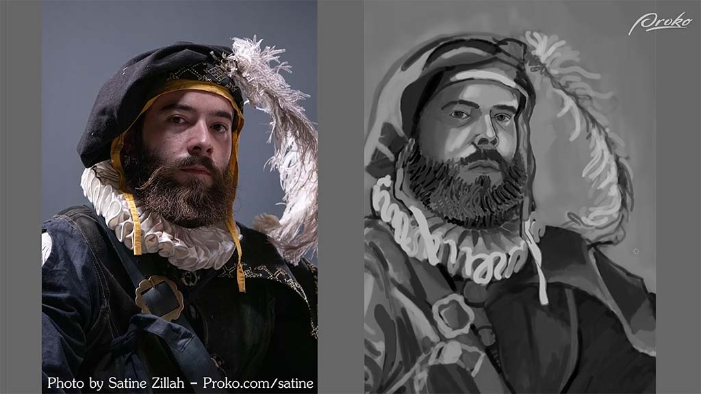
He compliments her “gestural, flowy mark-making style,” with its “Van Gogh sort of rhythm,” but suggests that she can improve her value control. She needs more separation between her lights and her shadows, as well as between her different local values, or the underlying “colors,” he recommends. Of course, the skin, the collar, and the feather are all generally lighter, where the clothing is generally darker. She did a good job separating them overall, he says, but once she got to the clothes themselves, she “started to lose control of the values a little bit.”
Looking at the reference, he continues, you can see that the hat and clothing are much darker than Patricia has painted them. By bringing their brightness down, she can not just match the photo more closely, but draw more attention to the face.
With this solved, he proceeds to the issues with the lighting. Starting with the ruff:
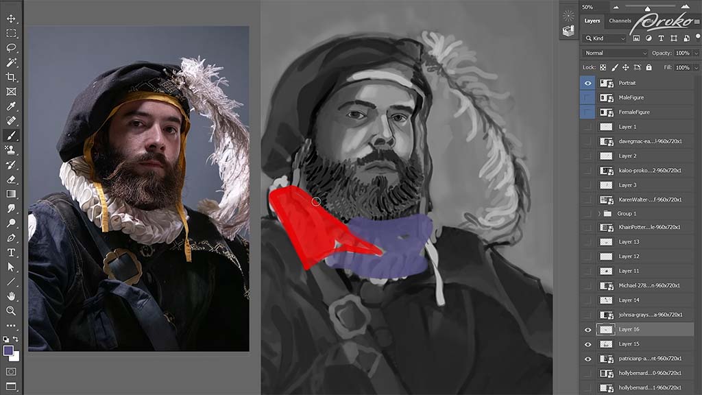
One aspect she missed, he explains, is that while she’s painted the entire thing as if it were lit equally, in reality, the red area is in light and the purple area is in shadow. Darkening the purple area will “reduce contrast and limit information to be sure that our focus stays where it needs to be,” meaning the face. This can also be a way to save time when painting, since it limits the amount of detail she’d need to paint into the dark areas. She could include just enough information to show it without having to render every fold of fabric. This will also have the side effect of making it appear more atmospheric.
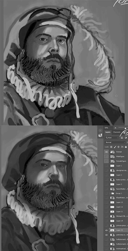
He moves on to the face, where “a similar thing is happening.” After darkening the shadow over the left eye, he points out that she’s put too much emphasis on the rimlight coming from the right side of his face, causing it to break up the overall shape of the shadow too much. He demonstrates how she can paint a darker swath of shadow across the right side of the face before going back and erasing some of it to re-add the rimlight.
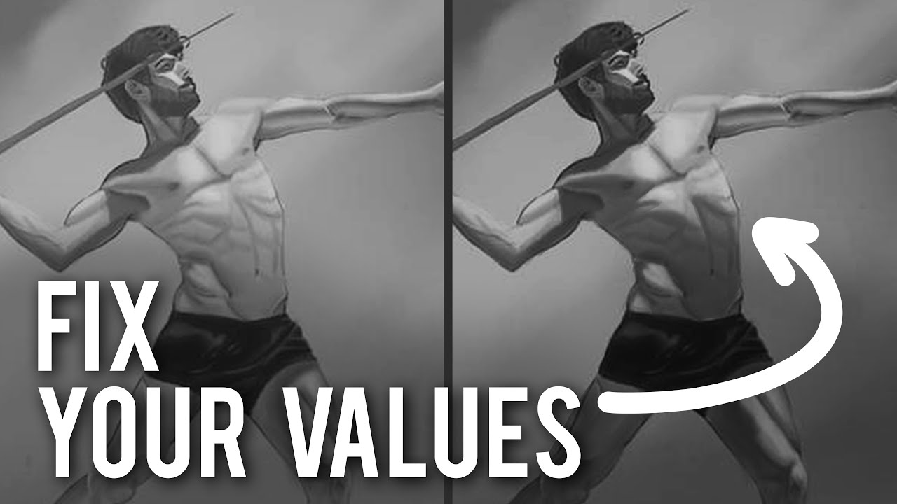
The second artist he critiques is “Karen,” who in my opinion already nailed it:
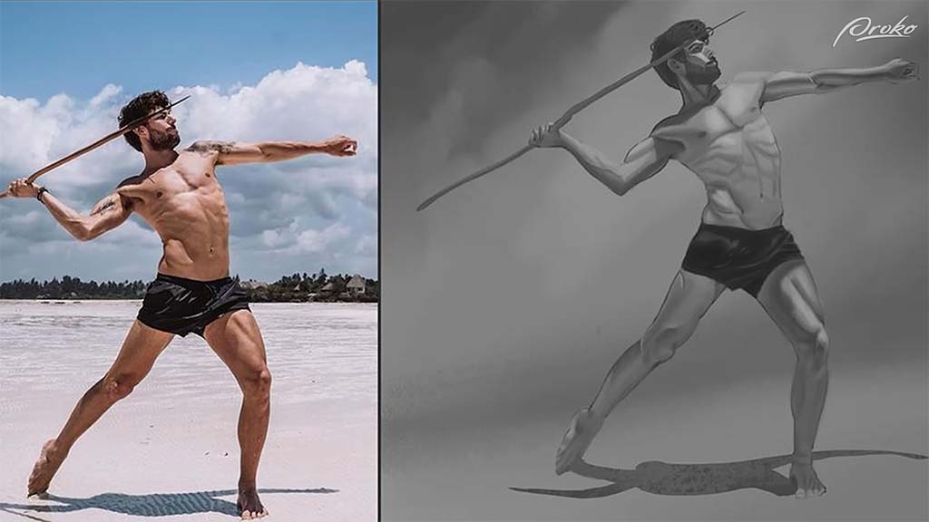
But he still finds ways to improve on it. The first problem he points out is that the shadows aren’t dark enough, being constrained entirely to midtones and mostly being used to outline the smaller muscles, where there should be larger ones describing the forms as a whole. What she needs to do, he advises, is “separate the shadows a little bit more from the midtones,” and on a new layer, he takes a dark gray brush and demonstrates where the extra shadows need to go.
The torso needs “form shadows,” or the natural shadows that occur when something is pointing away from the light source. In this case, the chest is pointed upwards towards the light, where the stomach is pointed downwards away from it, creating a distinct shadow shape across the torso, which he paints in over it.
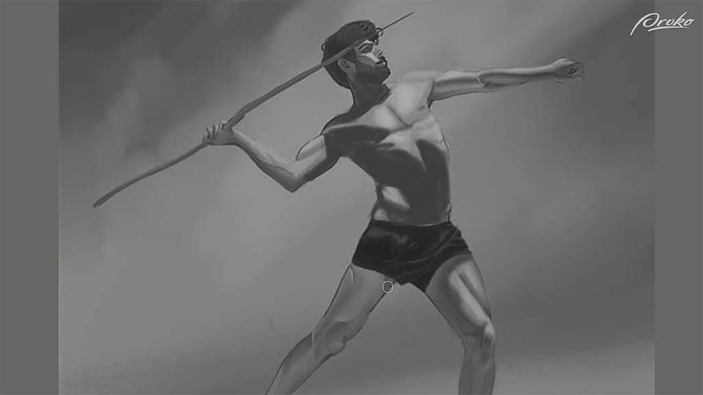
Karen also underemphasized how the left leg is shrouded completely in shadow, so he paints it in. Once done, he turns the opacity down to 40%, turning his opaque paint into perfect shading.
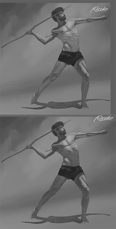
Once you have the large areas of shadow painted, he says, then you can go into the subtle rendering of the individual muscles, but “starting with that clear separation of shadow is ultimately one of the most important things for achieving a realistic effect of light.”
Neimeister continues this lesson with two more critiques — coming soon on this blog! Stay tuned for Part Two.

Want to learn more?
To see more of Jon Neimeister’s work, check out his website or Twitter. If you’re interested in expanding your digital painting skills even further, consider taking a full course from Proko.
This lesson is part of the Digital Painting Fundamentals course by Neimeister, but Proko has tons of courses by instructors such as Stan Prokopenko, Marco Bucci, and Trent Kaniuga.

