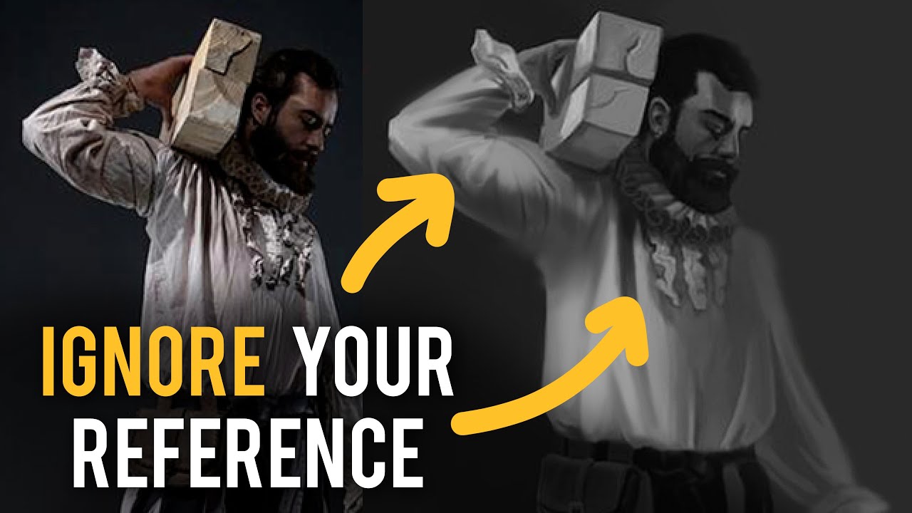
Over the years, Proko has grown from a Youtube channel primarily featuring founder Stan Prokopenko to an art education empire with 116 instructors. The phenomenal concept artist Jon Neimeister, artist behind the below tutorial, is one of them.
In this two-part series, he gives advice to aspiring artists on their own monochrome studies and overpaints their work. He covers four students’ work in total across the series’ two parts. This is Part Two; click here to see Part One.
To begin Part Two, Neimeister critiques the students’ layer organization as well as their use of light and shadow. It starts with a study by “Chris:”
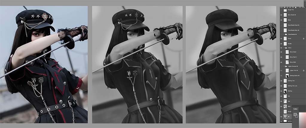
Chris, he says, has done a great job not just separating the dark clothes from the light skin and background, but his layer structure is on point too, with him keeping the body, hair, clothing, and hat all on their own layers.
One issue, however, is that he’s only painted the hair up to where the arm covers it. That works in this piece, but if he wanted to adjust the arm’s position later, this would leave a big gap in the painting. Instead, Neimeister suggests, one way he could solve this is by painting the entirety of the hair, including what’s not visible, on a separate layer, then using a layer mask to block out the areas of hair that are covered by the arm.
The other way Chris could handle it is to create a separate layer for every part of the image, meaning not just a separate one for the main swath of hair, but one for the face, and another for the bit of hair that falls behind the face. He’d paint the hat and the clothing on layers above that, then finally the arm and sword on a layer above all of them since they overlap everything.
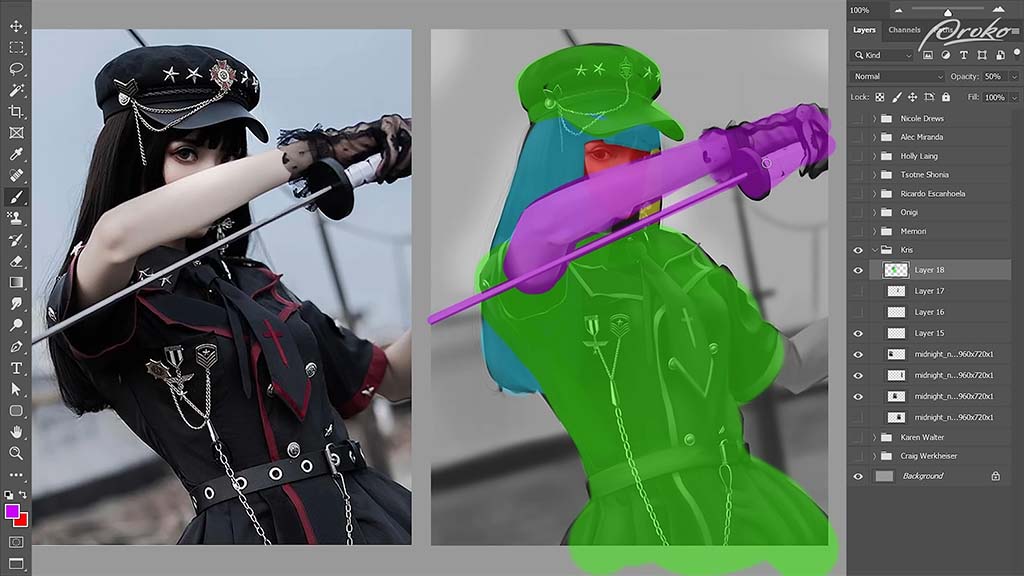
This might seem like a lot of work across too many layers, but for more complicated characters and poses, “you’ll often have to start adjusting your posing and your proportions to get things to look right, especially if you’re working from imagination.” So having the parts on separate layers will save you a lot of time having to repaint things compared to if multiple elements are painted onto the same layer.
Next up are three assignments from “Nicole:”
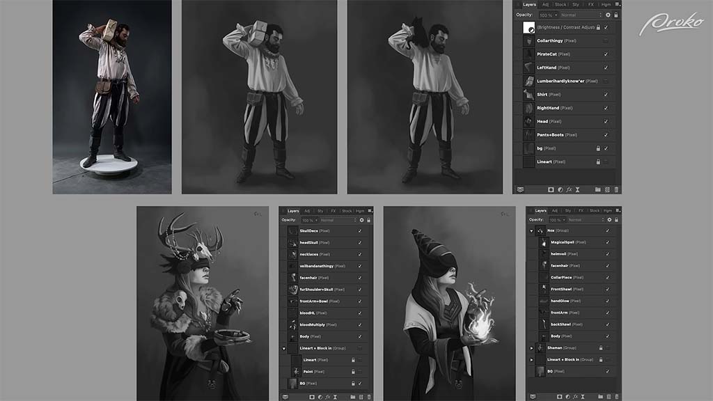
Overall, he says, her paintings are really good, which they are: “You’ve got a great grasp on your value control and are very clearly separating your light and your dark shapes, which makes these super easy to read.” He also compliments her layer structures and how she’s separated every element of the characters onto their own layers. He dedicates the rest of the video to her first study:
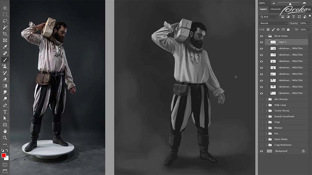
Unlike previous studies, instead of advising her to follow the reference more closely, he suggests she deviate a little more from it for the sake of a stronger composition.
He starts with the arm. The folds on the sleeve are too contrasty, he says, creating a distraction. And although that’s how it is on the reference, she can paint more shadow over them to make them stand out less. The upper arm also appears too flat, so she should “put a little less emphasis on the folds of the fabric and a little more on the cylinders of the arm.”
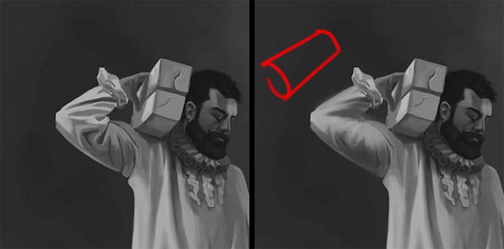
His next lesson is one in subtle shape design, as demonstrated by the clothing folds, which he then critiques. This one, he says, is “too parallel and even.”
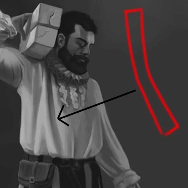
Although it’s accurate to the reference, it’s too boxy for his liking. So he tapers the bottom, turning it into a triangular shape. She also hasn’t fully captured the cast shadow falling over the arm, so he paints a darker value over the armpit to complete it.
In addition, he suggests deviating from the reference on the side of the shirt that’s cast into shadow. Although she’s captured it correctly, she could achieve a more atmospheric effect by darkening it so that it fades more into the background. Same with the bottom of the pant legs, to emphasize their cylindrical shape as they tuck into the boots.

Want to learn more?
To see more of Jon Neimeister’s work, check out his website or Twitter. If you’re interested in expanding your digital painting skills even further, consider taking a full course from Proko.
This lesson is part of the Digital Painting Fundamentals course taught by Neimeister, but Proko has tons of courses by instructors such as Stan Prokopenko, Marco Bucci, and Trent Kaniuga.
