Is there a decent alternative to Adobe Photoshop?
Many digital artists feel like the Adobe Suite is the only game in town, but it’s just not true. There are many other options out there, and many of them are just as good if not better than Adobe — and most of them are much cheaper. In this guest post (and in the below video), artist James Joyce explains why he switched from Adobe Photoshop to Clip Studio Paint for his digital painting and illustration work.
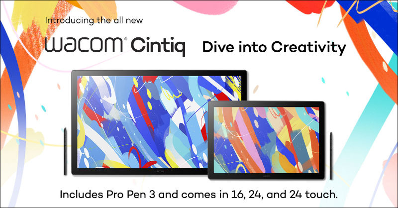
And did you know? Every purchase of a One by Wacom or Wacom Intuos comes with a free two-year trial of Clip Studio Paint! Wacom Cintiq comes with a free six-month trial, and Wacom One comes with a free three-month trial. See all the software that comes bundled with Wacom products here.
It’s incredibly scary to learn a new program – especially one with a steep learning curve. I may be a lot more comfortable using Clip Studio now, but it had some intense growing pains. Hopefully, I can help you skip all that and show you how to quickly adopt the tools of Clip Studio Paint to create your own works of art. But first… why?
Clip Studio Paint vs. Adobe Photoshop
Before we go any further, I want you to understand why I tortured myself to learn a new program when I was perfectly capable of using Photoshop, and why I think you should too.
Clip Studio Paint was designed for artists
The important distinction between Photoshop and Clip Studio is what they were built for. Photoshop was built to edit photos. Clip Studio was built for digital art. You can use Photoshop to paint and Clip Studio to edit a photo, but there are fundamental differences between the two because of their focus.
History: The rise of Photoshop
Photoshop wasn’t built for digital artists, but that hasn’t stopped illustrators from using it from the beginning. Craig Mullins – one of first digital artists and widely considered the father of Digital Painting – was painting digitally for 10 years with a mouse before he switched to completely digital in 1994. That’s the year they invented layers in Photoshop, by the way. I’m guessing that had something to do with it. Layers were game-changing for editing photos, but even more so for digital illustrations.
Digital painting wasn’t on Adobe’s radar because it simply didn’t exist like we know it today. Over time, they developed tools that were mutually beneficial to illustrators and photographers, but the primary focus has always been towards photo editing. Adobe got the jump on any competitors and created more programs designed to help all aspects of the design industry – Illustrator, InDesign, Premiere, and After Effects to name a few.
The rise of Clip Studio Paint
Clip studio, on the other hand, was built with a primary focus towards digital art. Originally, their parent company Celsys was looking to help animators, then comic artists, and finally illustrators. In 2012, Clip Studio Paint was released. It was great timing, because even though Adobe was dominating the digital art market, there was rising demand for digital illustrations. And the best part was that they could take advantage of all the advancements drawing software had made over the years while innovating many of their own.
Again, the important distinction here was their primary focus – digital artists. Digital Painting may not have been on Adobe’s radar, but it was the force behind the creation of Clip Studio. It was designed for painting, and the tools cater to that workflow – making digital painting feel effortless.
The digital art software landscape in 2012 may have been the launch for Clip Studio, but it was 18 years after Craig Mullins started using Photoshop for all his digital commercial artwork. By 2012, Adobe had launched the Creative Cloud and with it, its suite of landmark industry applications. Pretty much every major studio was using the Adobe Creative Suite to create the next generation of media and entertainment. Digital drawing and painting was synonymous with Photoshop.
Since every studio uses the Adobe suite, it can feel like Photoshop is the smart solution for digital art — but that doesn’t mean it’s the best one. And as a digital artist, I want the program that will allow me to express my vision as seamlessly as possible. For me, that’s Clip Studio.
The #1 reason I switched to Clip Studio
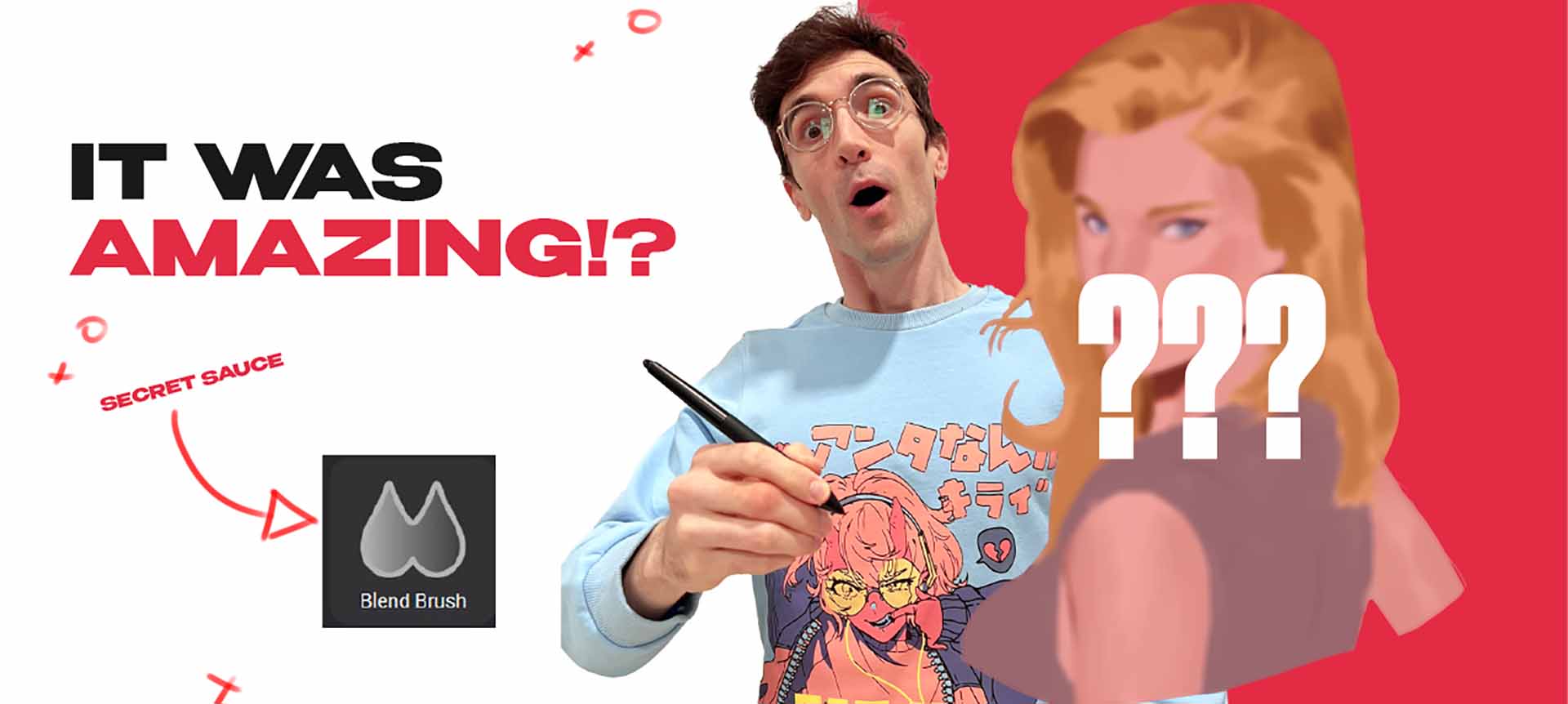
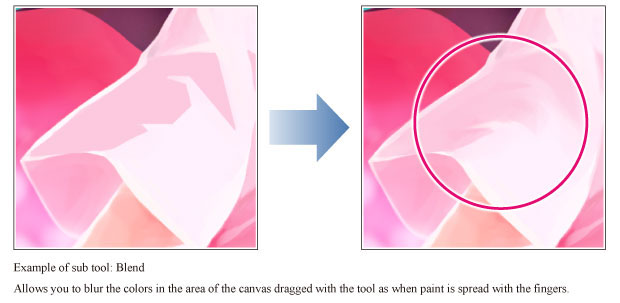
The reason I’m drawn to Clip Studio and captivated by the program is the blending tool. It feel smooth. Where Photoshop feels like I’m pulling paint unnaturally, Clip Studio made blending feel easy and instinctual.
I always imagined what blending paint should feel like as a digital artist, and Photoshop’s Mixer Brush always felt so uncomfortable. I avoided using it.
When I tried the Clip Studio Blending Tool … you know when you suddenly see a “God Ray” come down, seemingly from Heaven, and you hear that angelic AAAAHHH? It felt like that. I can’t really explain to you why the blend tool feels so amazing on Clip Studio and why its Photoshop equivalent, the mixer brush, feels so terrible. You have to try it for yourself. And trust me, you’ll know right away what I’m talking about. This isn’t something you have to get used to, you’ll feel it.
Photoshop paint mixing is more like pulling paint into each other while Clip Studio is a true blend. Your edge control – which is super critical as an illustrator – will be on another level with Clip Studio Paint’s tool.
How you can make the switch
I’ve used Photoshop for the last 10 years. I remember it being difficult at first, but using it is like breathing for me now – I don’t have to really think about it, it just happens. It’s smooth, fluid and feels so comfortable that my mind was screaming at me for trying to switch to a new program. It was incredibly uncomfortable at first, but I made a commitment. If you have a similar commitment or you’re simply curious, my goal is to make sure you have the least amount of discomfort as possible as you adopt the awesome power of Clip Studio.
Change your shortcuts
The first thing that you should do when you open Clip Studio – because it was the single MOST annoying feature for me – is change the shortcuts/hotkeys for your brush tools. When you open the program for the first time, the hotkey for the Brush tool is set to B by default. If you accidentally press it again, you’ll find that the B key is also the hotkey for the Airbrush and Decoration tools. You’ll save yourself a lot of time and anger by switching up the shortcuts before you do ANY artwork in the program.
As an illustrator who switches between the eraser and brush tool frequently, having one hotkey for multiple tools creates a huge problem. I kept painting stars using the Decoration tool when I wanted the Brush tool for clean lines or soft rendering. It was the most frustrating thing when I first started using the program, and I could have saved myself the headache by simply changing the hotkeys around really quick. I decided to suffer because I was scared to change any of the settings. Don’t let that happen to you.
You can find the settings to change your shortcuts/ hotkeys under File > Shortcut settings. Double click the hotkey to change it to your preferred key.
Adjust your pressure sensitivity
Another important thing you should test out before you create anything is the pressure sensitivity, especially if you’re coming from Photoshop. The sensitivity feels different in Clip Studio. You’ll likely need to adjust it to feel more comfortable. If you’re new to digital art programs, you probably won’t know what it’s supposed to feel like. Keep a mental note to come back to it as you become more experienced with digital art. See if you can create a more fluid sensitivity for your brushes.
You can find the Adjust Pen Pressure settings under File > Adjust Pen Pressure.
Clip Studio’s instructions tell you to draw on the canvas with the window up and it will help you create a pen pressure setting based on how heavy or light your hand is on the tablet. I would NOT suggest doing it this way. I struggled with this for a while until a friend showed me a way to create a more natural curve to the pressure sensitivity.
Restore the settings to default, then click and grab the line to reveal a purple handle. That handle will retain a beautiful curve to your pen pressure settings where you can achieve the most comfortable feeling while drawing and painting.
Brush tool settings
Now you can finally start drawing, and hopefully, everything feels great! You may not notice while you’re drawing, but by the time you start painting you’ll run into a new problem – opacity. The brushes on Clip Studio are amazing, but by default, they act differently from what I was used to in Photoshop. No matter what I did to change the tool properties, it still didn’t feel right. That is, until I discovered the SECRET brush settings menu!
You can either go to Window > Sub Tool Detail or click the little wrench in the Tool Property window to access this “secret menu.” You’ll notice that some of the settings in this menu are in the Tool Property menu. Anything marked with the eye on the left side of each tool option will show up in the Tool Property window. The Sub Tool Detail is essentially the database of all the options your tool has at its disposal, and the Tool Property window is a quick access version with the things you may change (and need access to) regularly.
With access to the entire database of brush settings, I was able to get a closer feeling to brushes I was used to.
Clip Studio’s coolest tools so far
Obviously, there’s a lot to know in these programs. That’s why they have such steep learning curves. But here are my favorites so far, and why you should definitely add them to your workflow.
Pick screen color
This tool lets you color pick from anywhere on your desktop. Maybe it’s an image you have saved or something from a site that won’t let you save an image and you want to know the colors they used. Go to Edit > Pick screen color and hover over your desired color to capture it.
Blend
Just try it, seriously. This tool will change your life. You can add all kinds of different brushes to give the blend a different texture. Those brushes can also be set up to determine a hard edge, soft edge, or firm edge for amazing edge control in your work. Don’t sleep on this tool!
Liquify
Supposedly, this is the one tool Photoshop had that Clip Studio users desperately wanted. They have it now. So, I guess this is one more reason to ditch Photoshop.
Fill
You can tell Clip Studio was designed for digital artists when you use tools like this. There are smart features built into the fill tools, like the lasso and paint bucket, so it only fills your linework. You can quickly fill in your drawings with a base layer and move onto rendering your forms.
Subview
In Photoshop, I would always have a second smaller window open to put my reference in. Clip Studio recognizes that artists need to use reference a lot, and made a permanent version of this called the Subview window. You can only see one image at a time, but you can scroll through the images you place in the window. Personally, I think this is helpful so you can focus your attention instead of having an array of images bombarding you with visual information.
Quick Access Menu
Artists generally have a workflow that they get comfortable with. You can still experiment with new things, but you also likely use the same 2-3 tools frequently for the bulk of your work. The Quick Access window lets you save these frequently used tools with their specific settings so that you can quickly call on them.
What’s missing and what I haven’t tried
The only thing missing for me in Clip Studio was something in Photoshop called Selective Color. It let you individually adjust colors, and it’s a very powerful tool to see what your painting will look like with a new palette. It’s essentially the Hue slider if it took a bunch of pop rocks. I can still bring my finished paintings into Photoshop, but it would be nice to see that addition in the future (if it isn’t already in there and I’m just blind).
The only other thing that I use in Photoshop that I haven’t had the opportunity to try is Text, Halftones, and Gradients. As a graphic designer I tend to do most of my work in Illustrator, but I use Photoshop too. These three tools are staples in that line of work, and though I’ve seen the options available on Clip Studio, I haven’t had a chance to use them – focusing primarily on the drawing and painting aspect of my work.
I honestly can’t wait to try it out, especially the halftones — as I want to start using those more in my work like other artists I admire.
Conclusion: Clip Studio Paint vs. Adobe Photoshop
It’s been about a month with my journey on Clip Studio Paint, and though there was some frustration in the very beginning, I’ve loved every moment of it. Getting comfortable with Clip Studio allows me to explore another layer of digital art.
My journey reminds me of what it’s like to bite into a jelly donut. The first bite or two is just a whisper of sugar, and then you finally get to the gooey center where you meet an explosion of flavor. I’m still exploring the whispers of sugar in my journey with Clip Studio. But I’m so close to the gooey center, and creating a powerful work of art, that I feel like it’s right in front of me.
If you’re looking to try Clip Studio Paint for the first time, either coming from Photoshop or you’re just new to digital art, take your time. The steep learning curve won’t intimidate you if you focus on the basics first. Fix your hotkeys, adjust your pressure sensitivity, and focus on the brush tool and the eraser. That’s it. That will help you get comfortable with the basics. And that’s when you know the real magic of your journey has just begun!

