Maybe you’ve been using Adobe Photoshop for a while, or maybe you’re just getting started. There are many ways to do every type of edit in the software, as well as all kinds of tips, tricks, and hacks to do things more simply and easily.
Have you ever wanted to take a photograph of yourself, or a friend or loved one, and turn it into a cool illustration, perfect for a social media profile avatar or creative headshot? In this tutorial, Unmesh Dinda of PiXimperfect will use just one tool — called Cutout — and mostly adjusting just one slider, to turn a photo of himself into a vector-style illustration. Check out the video below for the Adobe Photoshop tutorial, or read on for a summary of how to achieve the effect.
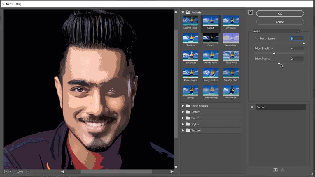
Found in the Filter Gallery, Cutout functions like an advanced version of the Posterize filter with three sliders: Number of Levels, Edge Simplicity, and Edge Fidelity. These dictate the amount of detail and the smoothness of your edges.
Step 1: Smart Objects
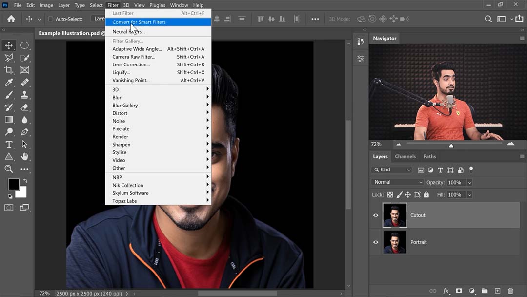
After opening the source image, the first thing Dinda does is duplicate the image’s layer, then go to the Filter menu and select “Convert for Smart Filters,” changing the new layer into a Smart Object. For those less familiar with Adobe Photoshop, this converts the layer into a “file within a file:” In order to edit it, you open it in a new window, then save and close it when you’re done just as if it were a different project. This allows you to create more complex compositions that include multiple smaller images, while keeping them all editable. Any filter put on a Smart Object is naturally applied as a Smart Filter, meaning it too can be adjusted at any time.

Step 2: Applying the Cutout filter
Key Tip: If the Filter Gallery option is grayed out, that’s because your image is in 16 or 32-bit, but the Filter Gallery can only be applied to images in 8-bit. You can convert your image to 8-bit by going to Image > Mode in the menu bar and selecting 8-bit.
On opening Filter Gallery, you’ll find Cutout under the first tab, Artistic. A guide to its sliders:
- Number of Levels is the closest direct equivalent to Posterize; it cuts your image into sections of flat colors.
- Edge Simplicity is exactly what it sounds like. Dinda describes this one as “the main game,” making it his primary tool for controlling the output illustration.
- Edge Fidelity, the third slider, is mostly a supplement to Edge Simplicity, controlling exactly how much of the image’s fine details the filter tries to preserve while still reducing the number of colors. This makes the cutout’s lines more complex and jagged, though, so Dinda advises keeping it at minimum for a cartoony look.

Step 3: Layering Cutouts
Dinda goes on to make multiple duplicates of the image with Cutout filters applied at different intensities, from a highly abstract first version, which he emphasizes you should keep as minimal as possible while still capturing the resemblance, to more detailed second and third variants.
Then he creates a layer mask on the latter ones, clears them so none of the layers are showing, and with his Wacom Intuos Pro pen tablet, carefully paints on the masks so that the more detailed images will only show through on the parts of the face he wants to be more defined.
Step 4: Painting corrections and highlights
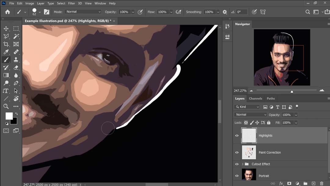
Finally, he creates a new Normal layer and uses a Hard Round Pressure Size brush to paint highlights in white to take the illustration to the next level.

The end result is a composite of multiple versions of the same image with different Cutout filter settings applied, and an extra layer to add hand-painted highlights — but it coheres flawlessly:

He also uses this technique extensively in a related tutorial, Transform Portraits to GTA Characters in Photoshop, which demonstrates a very similar process, but with more detail and extra steps. So check that out if you want to go further in depth.
Extra Tip: If you have a little digital painting experience and want your shapes to be neater, you can also eyedropper a color and then use a Hard Round Brush to fill in the lines’ jagged edges.

About the author
Cameron “C.S.” Jones is a West-Philly-based writer and illustrator who’s been contributing to Wacom for three years now. You can see more of his work, including most of his contributions to this blog, at thecsjones.com, or follow him on Instagram or Twitter.


