

Part two in a two-part series. Read the first article here.
Oh boy, here’s some color theory.
My first article dealt more with the (dumbed-down) physics of how light forms color in the real world, and on palette use in the abstract. This one will be strictly about colors in digital space.
If you did the last article’s homework (or have a passing familiarity with color theory), you’ll know the eight different types of color schemes. If you didn’t—which I don’t blame you for—here’s a decent guide.
This, and many like it, do a much better job summarizing the types of color schemes than I could trying to reiterate them. So I won’t. Instead, I’ll lay out the basics of how they’re put together, taking you a step closer to being able to make your own palettes from scratch.
First, a little behind-the-scenes:
The Two Acronyms
Out of the ~16,000,000 colors a monitor can display, ~15,999,997 are formed by mixing others. Digital painting is like traditional in that way, except when dealing with pixels, which are pure light, the actual process is the total opposite.
There are two most common ways colors are categorized in digital spaces, and aside from picking one at random or typing in a hex code, they’re also the two most common ways you can “make a color from scratch” in most image editors.
RGB
This is based on the ratios of three primary colors: the colors that can’t be formed by any others, but that when mixed in different proportions, form all others. There are two possible sets, depending on your medium.
In the digital space, it’s these particular shades of red, green, and blue:

“It’s not pretty, but it gets the job done.”
These are called the additive primaries.
Traditional artists use red, yellow, and blue. These are called the subtractive primaries, and might be what you learned as “the primaries” in art class. That’s because of the physical differences between the two media: Paint grows darker the more colors you mix into it, eventually turning black, where pixels don’t; they just grow closer to the last color you mixed in. So each set of primaries would make an incomplete range of colors for the other medium: You can’t get yellow paint with any mixture of red, green, and blue paints, and you can’t get most shades of green with just red, yellow, and blue pixels.
* You can also make any color out of cyan, magenta, yellow, and black – A.K.A. CMYK – but that’s the long way around and was developed so printers had more control over ink values.
HSV
The other three variables you can use to identify or make a color are hue, saturation, and value. This is known as the Munsell Color System, although it’s been modified and expanded for digital use.
Hue
Hue is your color’s place in the rainbow:

When you describe a color with a ROYGBIV word—red, green, blue—you’re identifying its hue. In a way, this is the simplest trait, since it’s just a position on a slider.
Picture a color wheel. You’ll probably think of something like this:
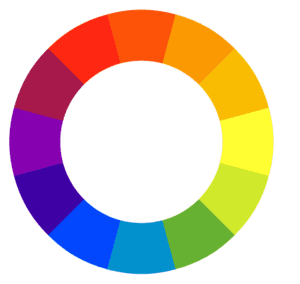
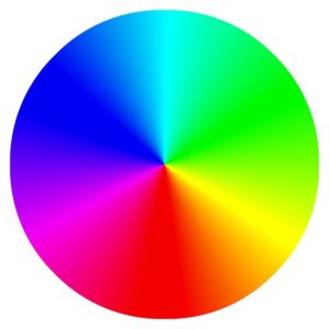
Which, for our purposes, we’ll expand to the more comprehensive this:
Rainbow Spectrum Color Wheel
Image from Max Pixel
This would more accurately be called a “hue wheel” since that’s the only color property it represents. It’s just the spectrum from above, bent into a circle. That’s why in image editors, hue is expressed in degrees, noting where on the circle that shade would be found.
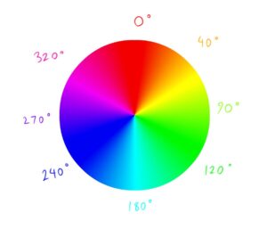
The color schemes I advised you look up in the last article (did you?) are based on the colors’ relative positions on a hue wheel. If you draw a straight line across the middle, it’s a complimentary scheme. If you draw an equilateral triangle, across it, it’s a triadic scheme – no matter where on the wheel it points. And so on.
If you’re picking a palette off a color wheel with these methods, that will give you your base hues. Once you’ve got those, the saturation and values of can be adjusted freely to give you your individual colors, but there are rules to help…
Saturation
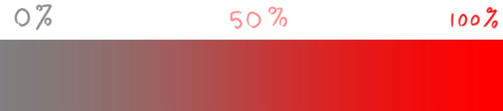
Also known as chroma*. The intensity of your color. If, continuing to describe your color, you mention its strength—reddish-gray, neon green, pale blue—you’re introducing saturation.
*There’s a difference but only in technical terms, like the difference between speed and velocity.
A fully desaturated color is gray, a fully-saturated color is the color at its ‘coloriest’.
Black, white, and shades of gray are achromatic. They’re pure value, colors in name only, and are therefore considered mixers to either accentuate or water down other colors within a digital painting. And they can be used with any color scheme, if you’re wondering: in fact, whenever you’re selecting a palette and limiting yourself to a few colors, consider them freebies. There’s a reason they say black goes with everything.
Achromatics are also used as mixers—they both linearly lower a color’s saturation and modulate its value. A color mixed with white is called a tint or a pastel. A color mixed with black is a shade. A color mixed with gray is a tone.
Using Saturation
When we call a piece colorful, what we usually mean is that its colors are very saturated. …But maybe not as much as they seem. The most common newbie coloring mistake, bar none, is oversaturating your primaries. Reds are fire truck* red. Blues are hyperlink blue. It’s what creates the “kindergarten coloring” effect you often see in amateur digital art.
*No, this motif will not stop.
Less saturated colors are subtler and therefore easy to mix without clashing, even if you pair up ones that “shouldn’t” go together.
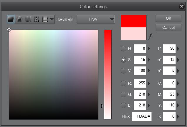
Clip Studio Paint’s color picker at 100% vs. 15% saturation, Compare how much less dramatic the second chart is. It might seem less interesting, but it’s way more practical in an actual painting.
Patches of different saturation can and should be used deliberately to guide the viewer’s eye. We’ll be drawn to a bright and colorful element on a darker, more muted background, or vice-versa. For example, one way CG goes wrong in movies is when the saturation of the computer-generated effect is far higher than the part that was shot on film, making it stick out like a glowing light. We’ll cover more of this in the keys section.
Don’t take this as an anti-saturation rant, but bear in mind that the thicker you lay it on, the more work you’ll have to coordinating colors to they work together.
Good for flags, bad for blending.
Value
Last but not least, there’s value, the lightness or darkness of the color. When you add a brightness modifier to a color—pink, medium green, dark blue—you’re introducing its value.
Oh, by the way, this is the most important one. If you convert your image to grayscale, you’re viewing only its value, but note the whole image is still present. Value is the only thing that can define forms besides lines, and the only thing period that can define where lights and shadows fall.
This is why some artists will do their entire digital painting in grayscale, then go back and color it with overlay, soft light, adjustment, and… well, color layers. I do this myself whenever I know what I want the image to look like overall, but not the specific colors I want to use.
When value meets the other two variables, that’s when we get exact colors. If you describe one by its most specific name—firetruck red, British racing green, Tiffany blue—you’re combining all three.
Important note: Value balances out saturation, which is why the perceived saturation between two colors can be totally different than the numbers on the scale. Generally, the lower the value of your color, the higher the saturation you can get away with—in fact, the higher saturation you might need to keep the perception the same.

In this complimentary Palette from Seeder on Colrd, value is inversely proportional to saturation.
Keys
In modifying your hues, you want to achieve contrast without sacrificing balance. This can be done via saturation and value keys: ranges you confine certain parts of the image to, only going them being outliers. 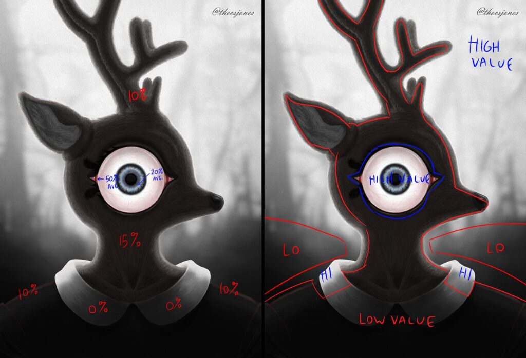
Saturation key to the left, value Key to the right. Sorry to creep you out, this is just the best example from my own work. Original character design belongs to Olive Brinker.
In a darker piece like the one above, the values start out low at the bottom and gradient to high at the top, with the deer’s silhouette being a peninsula of black that sticks into the high value area, blocking out the light. However, within that black, the eye stands out as a dramatically high value-keyed part that draws attention straight to it. There are also some splotches of high value on the shoulders to draw attention to the character’s trademark dress collar.
The entire piece is saturation-keyed very low, with only the parts that stand out the most being keyed higher. And even then, even in the highest saturation part, it only averages out to 50%.
Harmonies, Part II
As mentioned in the last article, achieving color harmony is the goal when putting together a palette. And a good way to create it is to limit your palette and cut down on the number of unnecessary colors you use in a piece. But how do you know which colors you can limit it to?
Fashion writer Anuschka Rees offers some of the simplest but most effective color pairing advice I’ve ever heard: The fastest way to achieve cohesion within a color palette is to change two of those variables between your colors, but not all three.
You can change hue and saturation, but not value, pairing a medium-value, highly saturated red with a medium value, low-saturated green. Or saturation and value but not hue, creating a monochrome palette. Or… you get it.

Desert Spice Palette by Lacebutterfly on Colrd
“That one almost constant property … gives the palette a cohesive overall feel,” says Rees, and “this mix of contrast [and] cohesion is the one thing all colour rules have in common and also the most important principle to keep in mind when you build your own colour palettes from scratch.”
If you’re anything like me, this might answer another question you had about picking color schemes from a hue wheel: How important is it I stick to the specific hues of each color the shape dictates? And the answer is you’ll have much more room to play within them if you follow Rees’s rule.
Homework
- Go to r/ImaginaryColorscapes and analyze the hues, saturations, and values of the colors in various pieces. You can do the same with colorful images you’ve found anywhere online, but this sub in particular is a great gallery of images from various different artists who all have different approaches to color – the only criterion being that they use a lot of them.
New Sources:
(Most of the references are the same as the last one were used, but here are the ones unique to this article.)
- Becky Koenig — Color Workbook, Second Edition
- Anuschka Rees — How to Pair Colours: A Short Intro to Colour Theory
- Flow Graphics — Color Theory for Noobs | Beginner Guide
About the Author: CS Jones
CS Jones is a Philadelphia-based freelance writer, illustrator, and occasional photographer. He spends his spare time listening to Spotify and waiting for trains. Someday, he’ll finish that graphic novel. In the meantime, his work is best seen at thecsjones.com or @thecsjones on Instagram.


