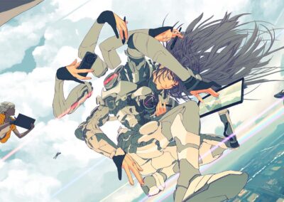
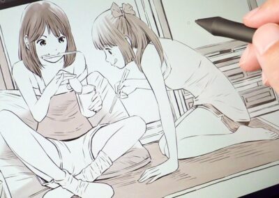
Eunbi Kang is a Korean visual development artist and illustrator who recently graduated from the highly renowned Art Center College of Design in Pasadena, CA. In the last video and blog post, Kang explained why character design sheets are so important and showed off how she created hers using a Wacom Cintiq 16 pen display.
In the below video, she discusses using photo references in her digital painting, and walks you through her process. There is also a transcript of her video below as well.
Today I will show you how I use photo references for my digital painting process. I always heard from my instructors in college about using references, but at the time I didn’t understand what it meant. I thought it meant copying every element in the photo, but that was not the case. So I will show you how I understood how to use references by analyzing a photo. Here is a photo I took.

What I like about this photo is the shape language. I love how the sharp shadows are pointing towards the same area, and the rock in the front of the photo makes a big V shape with the other rock in the back. I also love the trees on the middle mountain that lead to eyes to the same area. The little bumps from the far mountains are interesting, too.

One of the key scenes that I wanted to draw with the character from the first video was her being guided by magical flying manta rays in the middle of a mountain. So, using the reference photo, I
incorporated the original big shapes, the guiding lines from the tree shadows, and the V shape into the composition. In doing so, the guiding lines lead the eyes naturally towards the character.

Next, I move to color blocking. Instead of daylight, I decided to make it a sunset scene. I like the shapes from the photo, but I wanted to make it more warm and saturated. When you use a reference, you don’t need to follow every single thing from the photo. If you don’t like the colors, you can
just change them. Also, what I was focusing on was separating the light and shadow.
Sometimes paintings have lots of elements going on and you don’t want to lose them, right? So I made the foreground element have more contrast compared to the other parts of the background.

Since I separated the light and shadow, all I need to think about is how the colors react with the light and shadow. Since it has a warm light from sunset, the warm colors will be warmer and the cool colors will be less cool. It is important to think about color theory, but what is also important is
harmonizing the colors together so it won’t be questionable to the audience. It is just like tasting your food when cooking to make it taste right.

Before I move further to finish rendering, I tried to fix some of the values and shapes. It is better to make a decision before moving on to detailed rendering, because when you start the rendering it is harder to fix things later. Since I chose to make my painting more stylized, I didn’t follow how the trees and the mountains looked like in the photo. Instead, I put simple shapes or some graphing marks to make them look more stylized in my painting. And here’s my final piece!

I’m glad that I could show you guys one of the important lessons that I wanted to share. Thank you so much for watching this video. When I was in college, I actually used a lot of art tutorial videos and learned a lot through them. I hope that my video was helpful to you.


