Kirk Wallace, also known as Bone Haus, is a freelance illustrator, animator, art director, and much more who has created designs, animations, campaigns, and much more for clients such as Adobe, Apple, Disney/Pixar, McDonalds, Rocket League, Uber, and many more. He’s known for his bold, hyper-stylized, detailed, yet simple style. Follow Bone Haus on Instagram, YouTube, or take one of his classes on Skillshare.
He presented at Wacom’s Creativity Camp 2024 — watch a recording of that workshop here — and we interviewed him about his work and career — read that interview here.
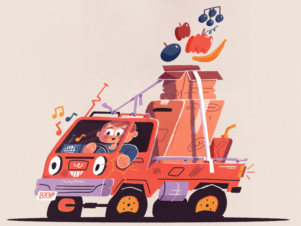
Inspired by a recent trip to Amsterdam, he created a super cute, hyper-stylized illustration of a mini truck in his signature frenetic, colorful style. In this video, he walks in detail through his process — collecting inspiration and reference, sketching in Adobe Photoshop, his signature Adobe Illustrator illustration process, and then finalizing color and texture back in Photoshop. He does everything on his Wacom Cintiq Pro 27 pen display!
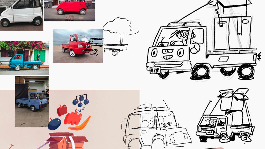
Ideation
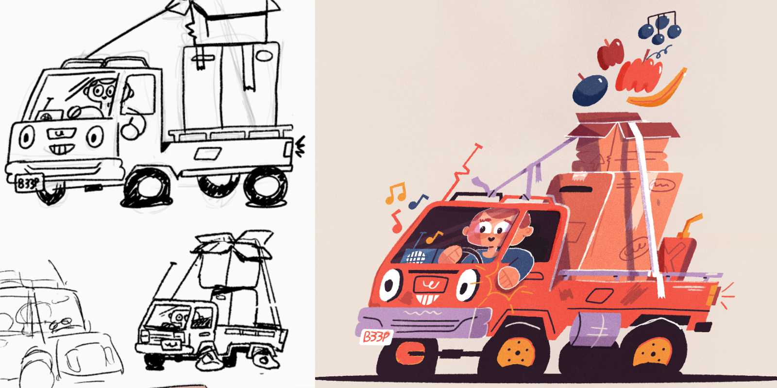
“I start really simply with just drawing cars in general,” Wallace begins. “I just need to figure out what a car looks like. You can figure out the tires, doing little tires, big tires, big windshield, small. How do I want to make a character out of this basic shape and kind of instill life into it?”
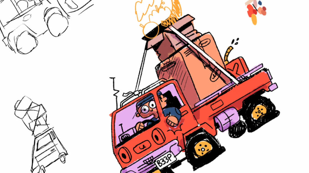
Sketching
He sketches a bunch of different ideas before settling on the basic idea for his design. “I probably started getting serious down around here when I started realizing I want to have a person in the car, like patting the door … I liked the idea of cardboard boxes being in the back, because that kind of helps show how small the truck is.”
When he’s got a basic sketch of something he likes, he’ll try out some rough colors in Photoshop to get a sense of the palette and lighting. “I get, you know, three or four colors, maybe a shade up, a tint down, or rather a tint down and a shade up,” he says. “This is not a scientific or really in-depth process, I’m just trying to lay in basic color.”
“Then I will take that sketch and bring it into Illustrator, where I will trace out all of my shapes and group things so that I can move them around easily. Then I bring in that same color palette.”
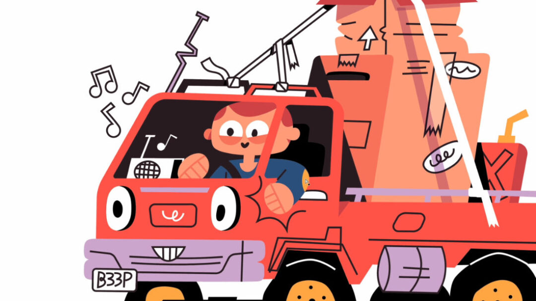
Illustration
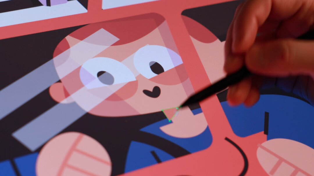
Once he’s in Illustrator, Wallace usually starts with an outline and has traces the major shapes of his sketch. But then removes the lines and focuses instead on shapes and shadows. “Once I’ve outlined all of my shapes, I will give them a white fill just so that I can know what’s in front and what’s in back. And just like cut pieces of paper, I’m basically just grouping things that I know I’m going to be selecting often. And I’m just moving things in front and back so that it starts making sense in its sort of hierarchy or order.”
After getting the basic shapes together, it’s time for color. “I bring in that color sample that I did in Photoshop. I will just use the ink dropper and grab color and plop it in. I’m always trying to limit my colors as much as I can.” He likes to keep everything as simple as possible, including with outlines. “I start building in more shadows and more details to help separate any of the shapes that are struggling without that outline. I like my art without a ton of outline, so I prefer the challenge of using some shadows and highlights and stuff to separate them.”
Finalizing texture
“Now this is maybe a little bit of a backward process,” Wallace says, “but it’s one of my favorites … what I do now is I bring the artwork into Photoshop. I use smart objects to pop back in and out of Illustrator, so I’m bouncing between Illustrator and Photoshop.” In Photoshop, he adds details and textures to take the illustration to the next level. “I brush in some basic textures to give the whole thing a little bit of a more organic feel,” he says.
The final product:
