Eunbi Kang is a Korean-born, Los Angeles-based visual development artist, concept artist, and illustrator who primarily works in the entertainment industry in video games, animation, and more. She has a diverse and wide-ranging style that takes many forms – from anime-inspired lineart to 3D video game cuteness to Pixar-esque color blocking and cel shading – but no matter which style she’s exploring, it’s always whimsical, vibrant, and colorful. Kang creates her work on her trusty Wacom Cintiq 16 and uses Photoshop, Blender, Procreate, and more, but is always exploring and learning new techniques and methods to keep pushing her creative imagination further.
In the last video and blog post featuring Kang, she discussed how she uses photo references in her digital painting. In a another video and blog post, she explained why character design sheets are so important. In the below video, she walks you through her illustration process, including color blocking without doing lineart first, and using Blender software to work with light. There is also a transcript of her video below as well.
Hello again everyone! I am Eunbi Kang, a visual development artist and illustrator working in the entertainment industry. This is my third collaboration video with Wacom, and today I will show you how I paint with Wacom’s Cintiq 16.
There are lots of different ways to do paintings. There is no right or wrong answer, as long as you allow your creativeness to guide you! You can start with fun scribbles, or just go straight into colors on one layer. One of my favorite methods that I want to introduce today is blocking the shape first without the line sketch.
What I like about this method is that It allows me to see the shape language clearly in the early stages of my painting. The composition of the elements, the proportion of the character, and the shapes of each object can be easily described with this method.
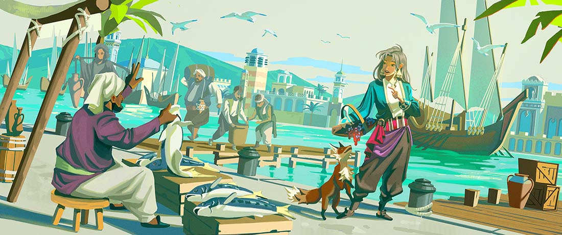
Since the weather is getting hotter, one thing that reminds me of summer the most is a harbor. I used to go to the fish market near a harbor a lot in South Korea in the summer. And I always loved the blue ocean, salty breeze and loud noises from sellers. A harbor has lots of interesting shapes which blend nature and man made structures together, so I wanted to paint a harbor scene for one of my characters when summer comes.
In this process, I decide the direction of light because shadows and light also make composition in painting. This is what I like the most about this method because I can see the relationship of each object and how they respond to the direction of light at the same time.
A harbor has lots of interesting shapes but it can be busy so I tried to make eye flow going into the main character on the right but still putting descriptive objects. So I put wooden decks, mountains and paddles directed towards her.
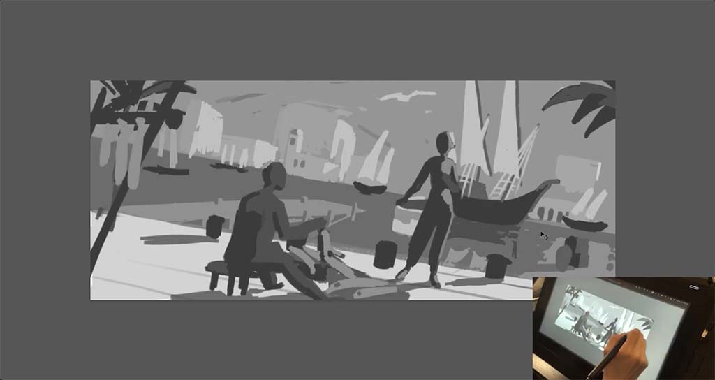
References are super helpful for your painting. It can be photos you took, random objects that inspire you, or old master’s paintings, but sometimes I need to make my own reference to get a clear vision. Usually what I use is Blender. After I am done with the block of shape, I quickly build very simple modelings to get better ideas and go back and forth with my painting to get a more clear composition. With this process, I recognize something that I may have not realized during my sketch process or even get better ideas.
After the modeling, I tighten the shapes more based on the blender model and check if the overall shape reads well.

Now it is the most fun part, making color comp! Since I have been grouping the shapes and also settled down on the values, It became a grayscale version of my painting. So based on this grayscale comp, I decided the colors. I do not expect my colors to be exactly the same as my grayscale comp, but I’m still aiming for it to read as clearly as my sketch does. I have been zooming in and out of my screen to see if this reads clearly. If you are not sure if your composition reads well, I recommend to zoom out or look at your piece from a far distance.
After the color comp, I simply put the color that I decided on my grayscale. I grabbed the painting bucket tool and clicked the area that I wanted to put colors in. Since I did not do line drawing, I could skip the color blocking step.
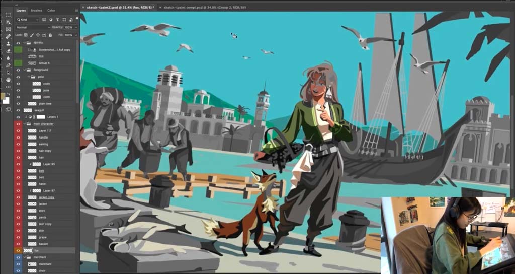
I wanted to make the green colors pop out more so I decided to change the sky color into a more desaturated warm color. Since I was done with putting colors for each element, I started to blend the hard edges of the shadows to describe the form. And Here is my final piece!
Thank you for watching my tutorial and thanks to Wacom for this opportunity!

About Eunbi Kang
Eunbi Kang is a South Korean-born visual development artist and illustrator for games, animation, and more. She recently graduated from the illustration department at the Art Center College of Design in Pasadena, California.
While pursuing her career, she won the independent Environment category at the 2022 Concept Art Awards, and the Japanese illustration Award. She has a fascination for vibrant color palettes and fantasy themes. Follow her on Instagram.


