

Rafael Chies has been working hard for the last two months producing a beautiful 3D render of the Weasley’s home ‘The Burrow’ from the Harry Potter books and films, on his Wacom MobileStudio Pro.
Not only has Rafael created something far beyond our expectations, but he is also willing to share his secrets through a three-part tutorial produced especially for Wacom. Check out his tips, tricks and how-to instructions for creating a 3D model house below, from blocking to adding details to deciding on the final composition.
Tutorial summary
Video 1 – Blocking, modeling, sculpting
Blocking (01:30)
Modeling (06:04)
Sculpting (10:54)
Video 2 – Materials and layout
Materials (00:01)
Layout (14:33)
Video 3 – Lighting and composition
Lighting (00:01)
Composition (06:08)
We hope you will enjoy watching and learning from this 3D sculpting tutorial.
Video 1. – Blocking, modeling, sculpting
01. Blocking (01:30)
Concept design
Your sources are very important! Use reference images to get an idea for what you are creating and to use as inspiration. It’s a good idea to choose an image and use it as the plan for how you will build a 3D model, as it’s quite hard and frustrating to start on a 3D space without any references or guides.
Research and understand what key aspects make your subject recognisable and aim to capture those aspects, but balance with it your individual style and ‘touch’ and what you aim to show with the image. You want to make something recognisable, but still unique and ‘new’. Don’t make a remake of a concept but create your own version.
First steps
Your blocking step is not modeling, so work only with primitives, maybe moving some Vortex, but don’t go deeper than that. Define the bigger shapes first and then do the smaller ones when you’re happy with them.
Blocking is one of most important steps as you define the design and shapes. Don’t rush towards the ’exciting’ parts before you’ve done this. You need a good solid foundation or it won’t matter how hard you work in the following steps – there will always be something not quite right with the image, even if you can’t tell what.
You have to take it seriously even if it’s not fun or you’ll be dissatisfied with the work.
You should more or less define your canvas in this step.
02. Modeling (06:04)
Use everything you made in the blocking stage as a base to start to model.
Start with really simple modelling to see how it looks – don’t worry too much about corners at first.
However, later on you should pay particular attention to the corners in any part of the model. When you first add parts to your model, all the corners will be 90 degrees. You should 100% avoid this in 3D because in the real world we never have perfect 90 degree corners, even of it looks like it. After modelling all the base shapes, go back to all the elements and bevel all the corners, making them rounder. In the lighting step, you’ll see that the light reacts in a much better way due to this.
Trick to make the model look much more appealing or complex:
When you have repetitive patterns e.g. roof tiles, bricks or wooden planks, break the pattern by changing the position of a few of the pieces to make it look more less perfect and therefore more realistic. You can do this by using a variety of tools, e.g. the sculpting tool in Maya, the move tool, and the rotating tool. This gives the image a more organic feel. It can take 1-2 hours of work to break the patterns, but this is what makes all the difference between an interesting and a boring element.
There are many ways to do things in 3D, so you should do what makes you most comfortable. Rafael doesn’t mind placing all patterns by hand if he has time, but there are other options if you need a recurring pattern, such as using plug-ins or Mash from Maya.
03. Sculpting (10:54)
Rafael’s main rule of using Zbrush is only subdivide if you really need to. You don’t want to work with really high resolution models if you don’t need to, as this makes the image very heavy and hard to work with.
Creating wooden effect on planks
For tasks such as adding detail to wooden planks, subdivide to create the patterns and knots on the wood because with higher resolution, you get more defined strokes.
Use the Dam standard brush, and get a really nice effect by changing the pen pressure during the stroke.
Then use ClayTubes to define the shape further and build up the shape of the plank, following the lines you’ve already created. Go over and break up the edges, because in real life you never have 90 degree angles or edges. These smaller details matter a lot. Always keep your references in mind and don’t rush it.
Use the Polish brush to flatten the plank, then the ClayBuildup brush, and again the Dam standard to draw the deeper details back into the wood. Then use the Slash3 brush – it’s great for adding little cracks. It’s great to experiment with this to achieve the look you want.
Video 2. – Materials and Layout
04. Materials (00:01)
How to create materials inside Substance Painter
Try to work on lower resolutions and raise them later or only at the time of export. Constantly working on 4k is really heavy and the computer will struggle. Rafael worked and exported in 4k, although in Substance Painter, you can export up to 8k.
You can try various types of HDRI. Add a background map to the image to see whether it’s the shape / size /etc., as you want it to be.
Always do textures on 2k and then raise on export.
Using Substance Painter
Substance needs lots of info to work well.
Load the normal map. Select the normal map in AO. Then Substance will calculate the other maps based on the info you give to it – it’s very fast. You can then work with masks. There’s a lot of materials you can use as part of the program, but there’s also the ‘Substance share website’ where many artists share their materials so you can download them and mix with yours to create new variations.
Wood and peeling paint – Wood
Put directional noise on the base colour. Then add a filter with a gradient to control the colour of the noise. Create the base wood colour. Then add another layer, controlling it in levels to control the height or thickness of the colour to make it as subtle (or not) as you want. You can add another layer for roughness to control the amount of highlight and ‘shininess’.
You can add lots of layers on top of each other to get the effect you want.
Paint
Add a layer to be the ‘paint’ on top of the wood. Then create a mask.
You can raise the height or thickness of the paint, change the amount of ‘shininess’ of the paint, and control the roughness.
You can also add multiple layers of paint to the same part to make it seem like the building has been repainted several times, and play around with the balances – create a layer in one colour, and choose a slightly darker colour to be the newer paint., Using mask ‘paint old’ will give it a peeling paint effect. Again, play around with the balances to control the extent of peeling paint and make it look realistic.
Finally, can add another layer as ‘dirt’ to make the image look realistic.
05. Layout (14:33)
Look at the overall scene. Always consider lowering the display percentage because otherwise, the scene will be really heavy due to all the small details everywhere.
Making the background items
Clouds: These are not a flat image. He found the 3D clouds as a VDB preset free from Travis Davis on Gumroad.
Carpet: Xgen from Maya,
Roof: He exported maps of moss from Substance Painter and then scattered it across the roof in Onatrix.
Ropes: Ornatrix
Distant hills: These are made from really simple random textures. They are blurred and in the distance due to a depth of field, so don’t waste time making it more detailed.
Flour sacks: Ornatrix
Logs: Plugin called DebrisMaker 2 made by Aaron Dabelow.
Wood planks: Exported from Zbrush
On Megascans there’s lots of content, even free stuff e.g. the mushrooms.
Tips:
Always put your effort on what appears in the image – there’s no point wasting lots of time on something that will never be seen.
Think about composition when making the image – e.g- using the plants to frame the image.
You don’t have to keep everything perfectly to scale in your image, e.g. you can have slightly larger trees or flowers if it helps the composition and keeps the focus on the main part of the image. Don’t go too over the top though, and try to keep it believable.
Making of the ground:
Gravel: spPaint 3D plugin from Creative Crash. Select your target surface, in this case, the ground. Always remember to turn on the ‘Instance’ option as you don’t want to duplicate the proxies. The scene would be too heavy. Always work with proxies and instances to stop it getting too heavy. For this part, Rafael loaded some proxies that he’d previously created for the project, e.g. bluebells.
To make them individual, use randomization in rotation, scale and transform attributes. This will stop them all looking the same.
There are two options to scatter the elements
- You can use the ‘paint’ button and click and drag, and paint the elements where you want them.
- You can use the ‘place’ button and click and drag, placing them wherever you want. This gives you a lot of elements in one stroke so that when you draw, you place randomized items down. This gives you the possibility to set it as several different types of flowers and therefore have a more ‘realistically’ randomized set of flowers in an area.
On Vortex Library YouTube channel, you can find some really good tutorials for learning how to use blender material and blender displacement, which is how I learned to blend displacement. Never underestimate the importance of a good ground. It can make all the difference.
Video 3. – Lighting and Composition
06. Lighting (00:01)
Tips for using Maya for lighting
First, do the lighting for the focus of the image – the house. Show only this part of the image and hide all other aspects to avoid distractions – you should only be looking at the sky, no background. Later, we can turn the environment back on and then make some smaller adjustments.
Always work with 32 bits within the workflow, so you can have a lot of control and info for the post-production.
To light The Burrow, he used an HDRI that he downloaded from HDRIHAVEN, a free Lighting site. Check your lighting with no distractions to see how it looks.
Mix the Maya sun with the HDRI to get the best end result.
Work with a few elements as possible to reduce lag time.
07. Composition (06:08)
Tips:
Always export renders in EXR 32 bits, then later convert into 16 bits
Look at your final render, and decide whether the colour scheme works, whether it expresses the mood you like, whether it fits in with the situation/ location/ season you were aiming for. It’s not too late to change it.
Paint over some tests in Photoshop to try out different colouring, lighting, and styles, then you can change it after in 3D – it’s good to mess around in Photoshop first to see how it looks before you change anything in 3D. It gives you a chance to test out some ideas without lots of effort, and it can be inspiring. It’s much easier to do in PS than in 3D., especially with lots of textures.
After Photoshop, go back to Substance painter.
Look at your composition – is your desired main subject obviously the main subject? How can you change the composition to prioritize the main focus of the image? For example, you could use clouds to frame the house more, change the light, change the saturation, be selective about colours, vibrancy… For this image, he selected reds and made them brighter, and corrected the blue a little.
Try to see as much of the image on the screen as you can – it helps to stay focused on what the overall image looks like.
Make sure none of the other elements in the image detract away from the main focus. Make sure that the colours don’t distract or ‘fight’ in the image – you want the overall image to work well together.
Never post your work when your eyes are tired – take a break away from the work and come back to it before making any decisions.
If there’s something bothering you, take a break, take a walk, relax, and then come back to it. It will make the problems easier to see more clearly.
And that’s it! Thank you for sticking with us this far.
If you’d like to see more of Rafael’s work, check out his sites below.

The Weasley home “The Burrow” final 3D artwork by Rafael Chies
About Rafael Z. Chies
Rafael Chies is a freelance 3D artist who specializes in look development, lighting, and environment/ asset modeling, and is strongly influenced by what he sees on long walks.
Born and raised in Brazil, Rafael currently lives in Florence, Italy. He started to appreciate art when he was young. It became very clear that his curiosity in this field surpassed any other interest. “At school, for example, both the purchase of painting and drawing materials and the time dedicated to these activities were the events I looked forward to the most.” All that enthusiasm for drawing, painting, modeling with clay – in short, all these ways of creation – started to interest him so much that they became the focus of his free time.

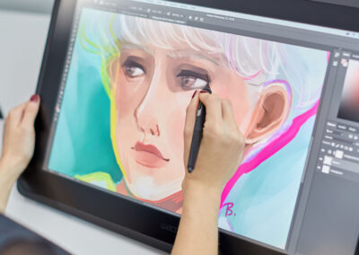
Rafael at his desk, working on his Wacom MobileStudio Pro
Follow Rafael on social media:
ArtStation – Behance – Vimeo – Instagram – Twitter – Facebook
Rafael at his desk, working on his Wacom MobileStudio Pro

