Animation is a complex subject, and some aspects of it are better covered than others. In this fun and informative tutorial, industry veterans Brent Noll and Maximus Paulson from BaM Animation break down what you need to know to draw a background for your animation — something apparently only 4% of the viewers who send in work to them actually bother to do.
Thinking about backgrounds
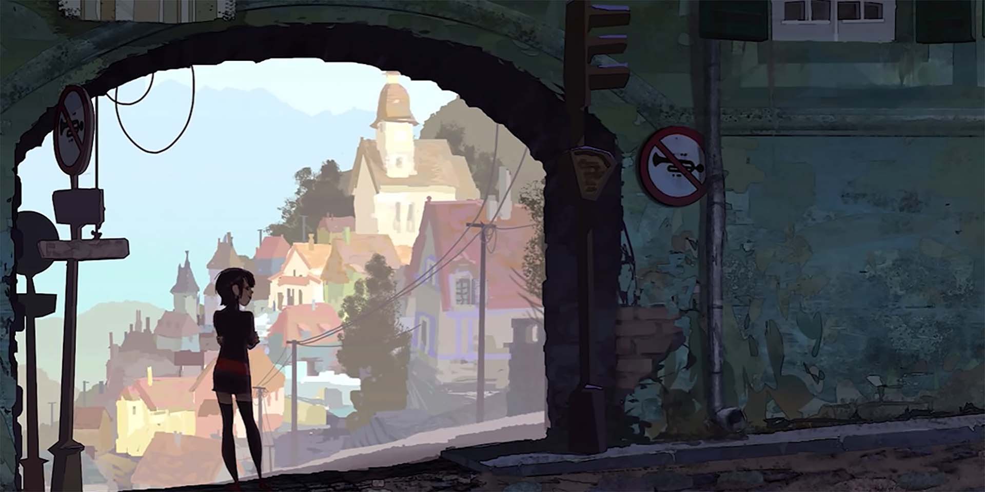
To draw a background, or any environment, you first need to stop thinking about it as something that is behind the character. Rather, an environment is a character. It makes you feel something. It could be fun, or sterile. Inviting or intimidating. Different environments convey very different feelings and contextualize your characters differently.
A simple background exercise
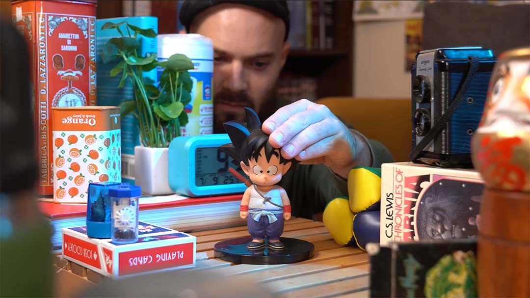
Here’s a great way to get started — practice with simpler shapes. Grab some random items from your house and place them on a table. Try to stage them in a way that creates an interesting composition — foreground, middle ground, and background, and maybe even space for a character.
Pay attention to how the objects relate to the horizon line. Draw the horizon and scene from your point of view. This will also help you with perspective. Dropping in a layer of simple shading will really help sell the forms.
Designing backgrounds for fan-submitted artwork
Donut shop background
Jedi Roman sent in an angsty-looking teenage character. He looks like he hangs around mall parking lots, not quite urban or suburban. The first step in drawing a background is gathering references. A semi-urban donut shop seems to have the perfect vibe we need.
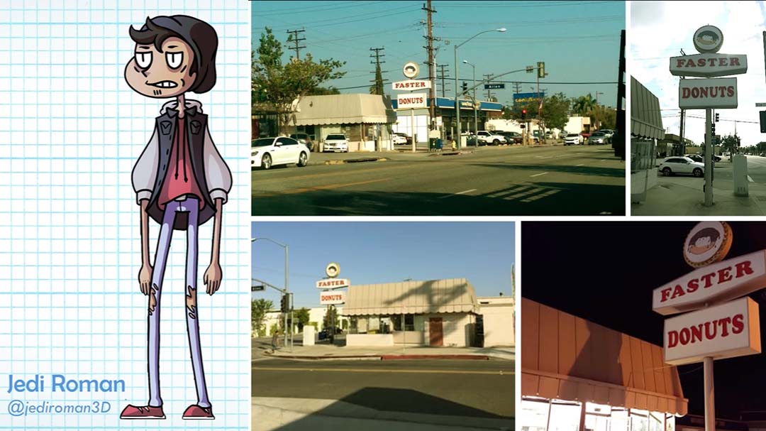
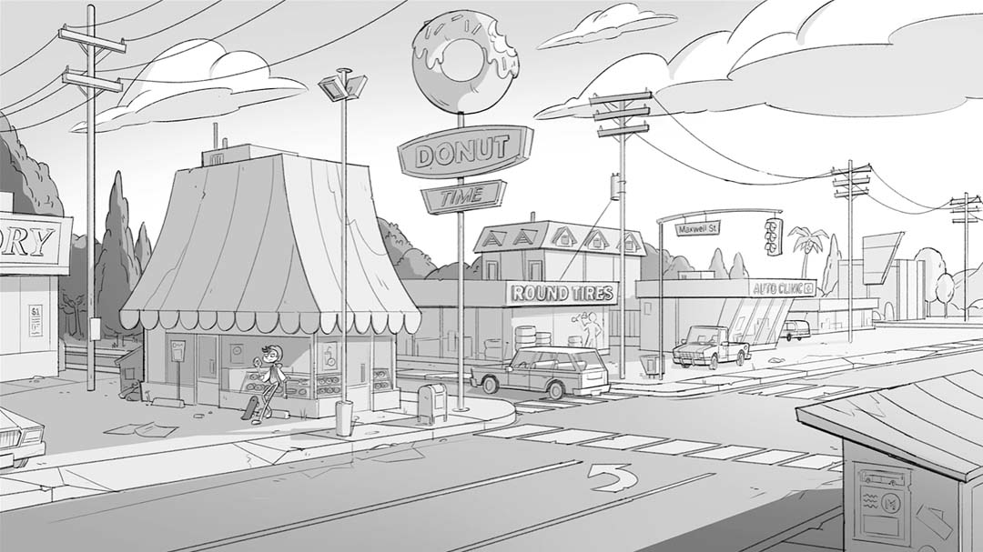
An establishing shot is an overview shot of the entire location, which gives the audience a sense of time and place. To begin, roughly block out the buildings and streets and try to find the horizon line. Starting with rough shapes is best, but eventually I’ll want to bring in a perspective grid to help nail down the buildings. Remember that even though you’re using references, you don’t have to make the proportions realistic or consistent. Go for dynamic shapes and silhouettes.
Remember to utilize plenty of detail to where you want the viewer to look, but keep things simpler the further away. This helps focus the viewer’s attention. Finally, add some value by selecting areas and adding a flat fill or gradient.
Fantasy village background
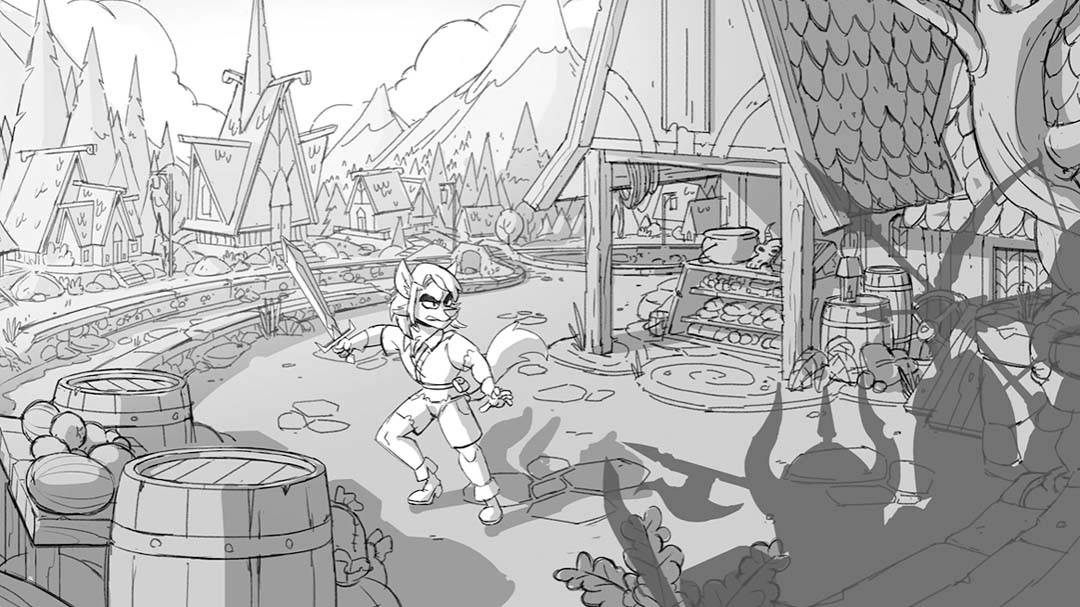
This drawing of a wolf looks like he could be in a D&D game or some sort of fantasy setting. For reference, I used the Texas Renaissance Festival and the video game Skyrim. Repeated shape elements help unify the feeling of a design. In our last background, we dealt mostly with rectangles and straight lines, but here let’s use triangles and curves.
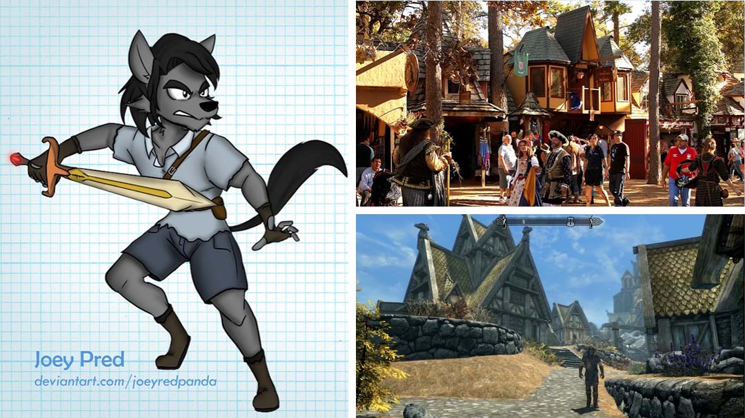
I’ll draw a curved road, because medieval villages formed more organically than modern ones. This will set the design apart from our suburban design. I tried to keep adding in more stuff to make the environment seem more lived in.
Tip: don’t leave your backgrounds empty! This is animation — we can always add more, cheat things toward the camera, etc. to make everything more interesting for the viewer. It doesn’t have to be completely realistic.
Space cadet background
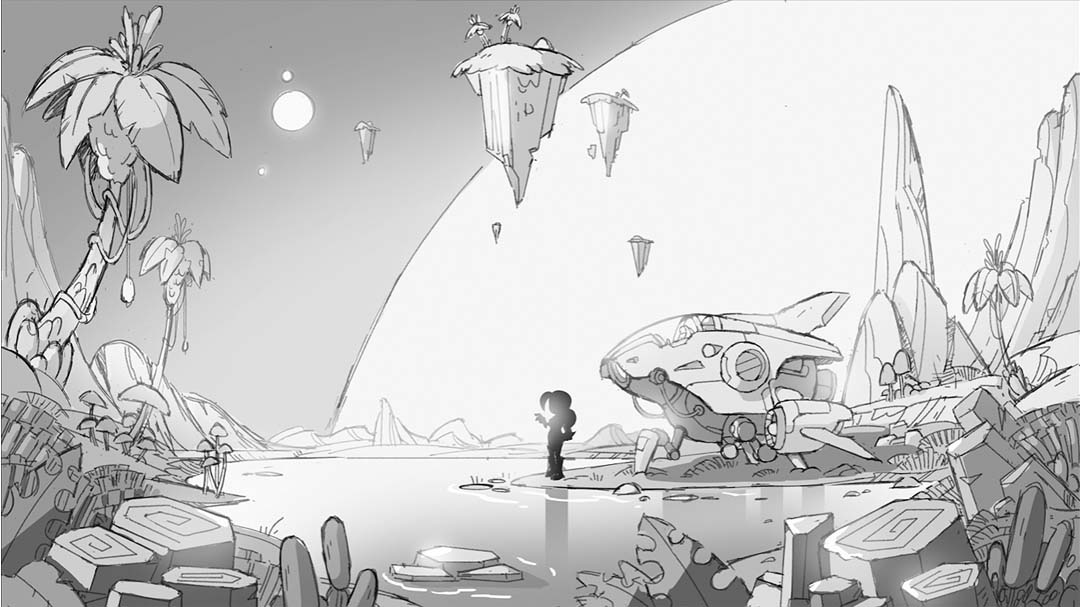
For this space cadet, I’m going to draw an alien planet. I’ll place her in a valley with a low horizon line, to emphasize the tall shapes. The pros and cons of low and high horizon lines are explained well in this Disney manual for drawing comics. High horizon lines can often make it more difficult to show shapes in perspective, and character size relationships can be more difficult. Low horizon lines, however, can be simpler because you can draw head on and get a greater feeling of depth.
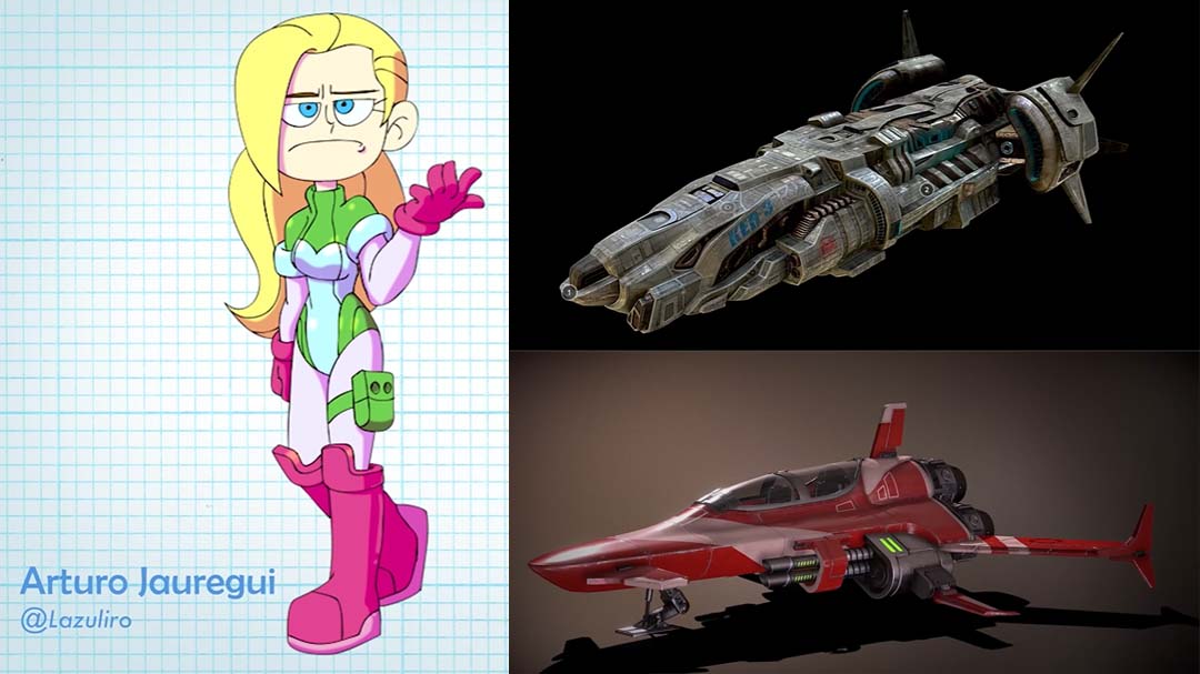
The alien landscape is completely original, so I won’t use references, but using rounded shapes is best as it’s natural rather than constructed. However, Sketchfab is a great resource for references for the spaceship. It’s a gallery for 3D artists, and people have uploaded all kinds of models you can view right from your broswer. It’s super userful when you’re drawing things like complex vehicles.
Tip: avoid tangents. A tangent is when compositional elements overlap in confusing or unsettling ways, like when two shapes overlap just barely and create confusing lines. It’s better to have your shapes and character silhouettes be clear.
Conclusion
There is a reason we don’t just trace photos or 3D models for backgrounds — primarily because we can exaggerate or otherwise design backgrounds to be more interesting when we create them ourselves. Backgrounds are characters, and the feelings they convey add important elements to your work.

BaM Animation was created by Burbank-based professional animation industry veterans Brent Noll and Maximus Pauson. They launched their popular YouTube channel in 2017 and found a unique and playful way to deliver informative and educational animation content in an engaging and memorable way.
Max draws the characters for BaM and is usually the live-action director and script supervisor. In his non-YouTube life, Max is an Emmy award-winning character designer who has worked on shows, including Rick and Morty, FutureWorm, Disenchantment, and Nico, and the Sword of Light.
Brent is in charge of backgrounds, animation, and many technical aspects of the show, including filming, audio, post-production, visual effects, and general troubleshooting. He also manages BAM’s social media presence. When he’s not working on BaM, Brent is a background and prop designer for shows including Rick and Morty, FutureWorm, Troll Hunters, and Final Space.
A popular feature of BaM is that they ask viewers to send their original art to the show so it can be featured in upcoming episodes. If you want to submit a piece for consideration, you can do so here.
For more from BaM Animation, check out BaM Animation on YouTube, their Website, their Discord, or their Instagram. Also check out Brent Noll or Maximus Pauson‘s websites, or Brent’s Twitch.

