Maybe you’ve been using Adobe Photoshop for a while, or maybe you’re just getting started. There are many ways to do every type of edit in the software, as well as all kinds of tips, tricks, and hacks to do things more simply and easily.
Unmesh Dinda, the creator behind PiXimperfect, is known for tutorials featuring some of the most dramatic and striking transformations possible with Adobe Photoshop — such as previous tutorials we’ve featured on this blog including Turning Day into Night and Cutting Out Hair From A Busy Background. In the below video and tutorial, Dinda pulls out another one of his stunning tricks: Turning summer into winter. Watch the video or read on to see how he does it.
This tutorial is short but dense, as he uses relatively few steps to completely overhaul the entire image. Similar to the turning day into night tutorial, he reverses the colors of the scene, transforming a summer scene full of greens and yellows into a white winter scene with a dusting of snowfall.
Color selection
The first thing Dinda does is select everything green in the image using the Select > Color Range tool, encapsulating all of the grass and foliage. He adds area to the selection multiple times with the Eyedropper, incorporating multiple shades of green. Then he drags up the Fuzziness slider, so almost everything surrounding the immediate areas will be included, giving him a more complete selection with edges that won’t be as sharp.
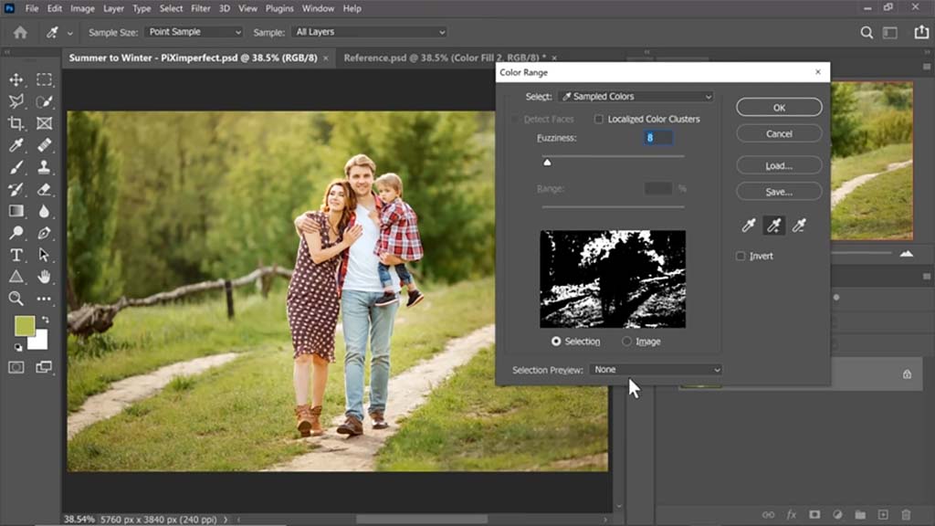
Changing the foliage
With the selection active, he creates a white Solid Color Adjustment Layer. This will turn the trees in the background white so they look like they’re coated with snow. “We only want it in the bright areas,” he says, though. “We don’t want to absolutely blow it out with snow.” So to achieve a nice balance, he uses “Blend If,” a slider in the Layer Styles panel that he often uses for various effects in his tutorials, to make some of the underlying layer — the greens of the trees — show through.
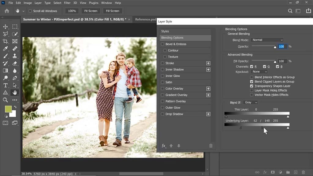
Key tip: Alt-clicking a slider will break it into two parts so that you can set a range of values instead of just one.
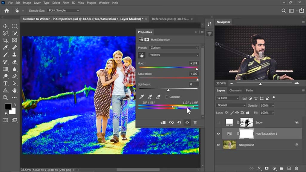
He then turns off the Solid Color Adjustment Layer and creates a Hue/Saturation Adjustment Layer on top. In order to decrease the saturation of the green areas, he has to increase it first. After using the Eyedropper on the grass to select the color range of the foliage, he cranks the Hue and Saturation sliders up to max, turning it bright blue, then turns the Saturation down and the Lightness up so it becomes more of a snowy light gray.
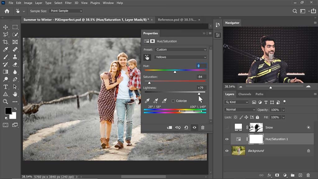
And when he turns the white Solid Color Adjustment Layer back on, it looks as if the trees are entirely coated in snow, except for a few darker areas at the bottom he intentionally leaves green.
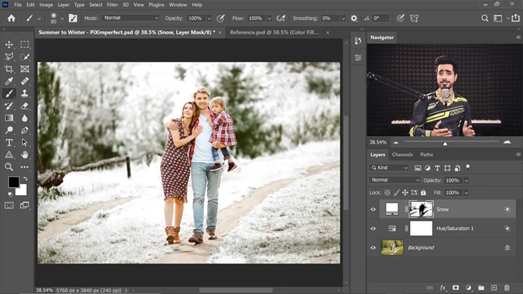
Corrections
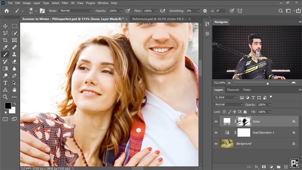
A small detail: Some of the lighting and color changes encroach onto the subjects, making them appear more exposed and paler than they should be. This is where your Wacom pen tablet or pen display comes in — Dinda uses a Wacom Intuos Pro — for these locations in the faces and hair, he subtly paints them out using a Mask. For where they encroach onto the woman’s leg, he uses the Quick Selection tool to select her calf, then paints black over the mask to erase it.
Adding Snow
This is when Dinda adds the actual snowfall we’ll see drifting in front of and behind the subjects. He divides the process into two sections: background snow and foreground snow. For the background snow, he uses two snow assets — pictures of white snow on black backgrounds — that he downloaded from Envato Elements.
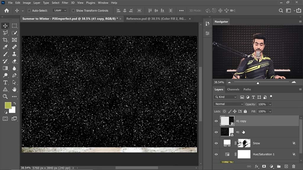
To cover the background, he converts the merged two images to a Smart Object, and sets the Blend Mode to Screen, which makes it so only the white shows through. This being for the snow behind the subject, he paints black on the Layer Mask to remove all the snow that crosses over the foreground of the subject. He also uses Gaussian Blur slightly so the snow will appear out of focus.
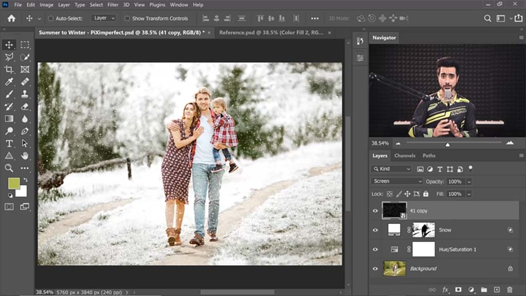
For the foreground snow, he does basically the same thing, except with an image of much larger falling snowflakes. And since the asset he uses doesn’t quite cover the entire image, he gradients the mask up from below to erase some of the bottom, creating a smooth transition into the snowflakes at the top. He also judiciously erases some of the more distracting snowflakes from overtop the subjects.
The final image:


About the Author
Cameron “C.S.” Jones is a West-Philly-based writer and illustrator who’s been contributing to Wacom for four years now. You can see more of his work, including most of his contributions to this blog, at thecsjones.com, or follow him on Instagram or Twitter.


