

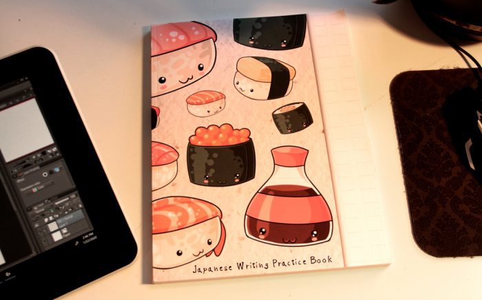
Yesterday, I got the box my editor very graciously sent me of things I could write about. Wacom accessories, educational materials—including a book of drawing exercises by our partner (and frankly, genius) artist Peter Han, that I hope to write about soon—pens compatible with the Wacom One to review… but among them was a Japanese handwriting practice book.
Inside, guidelines for side-by-side translations and proportion grids to practice kanji and kana:
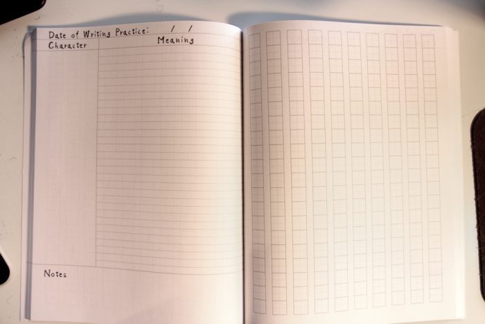
Pretty cool, but I wasn’t aware what I was supposed to do with it. Learning Japanese isn’t on my immediate to-do list, since I hear you can’t do it in an afternoon. Not to mention Wacom pens don’t work that well on paper.
But it reminded me of something you can do right now. If you have some pen-and-paper drawing ability but aren’t used to the feel of a tablet, writing on it is a good way to start adjusting.
So today, we’ll be making a font.
I’m doing this on the Wacom One with Staedtler’s Noris Digital Pencil. My first impression of the Noris is that it’s more comfortable than any tablet pen I’ve tried yet. By ratio, I’ve still spent far more of my drawing “career” using graphite than not, so it’s amazing how well this mimics a #2.
Enough product placement, on to the exercise:
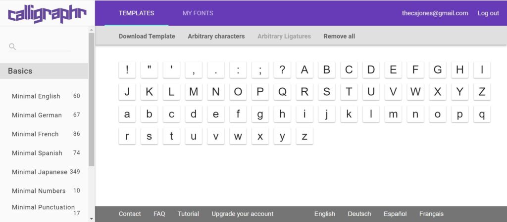
There are a few sites you can use to do this. I’ll be using Calligraphr.
Step 1: You have to register for it. Do that. You’ll have to confirm your email address. Do that too.
Step 2: Click Minimal English—and Minimal English only—to populate your blank template with letters and a few punctuation marks.
The free version limits your font to 75 characters—not enough for caps, lowercase, numbers, and symbols. So you’ll have to make one font for letters and another for numbers and punctuation. Oh well, the price is right.
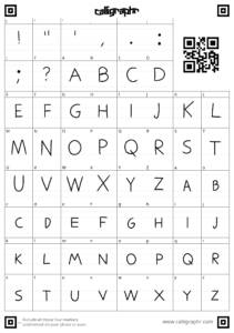
Step 3: Hit Download Template, and keep “draw helplines” checked.
Download them as PNG’s, which are much easier to work with than PDF’s when you’re drawing digitally instead of printing them out. Save one version with the Characters as Background option on—that adds faint gray characters where the letters are supposed to be, making it far easier to get the proportions right—and another with it off.
Name them 1 and 2, A and B, whatever. I’m doing Foo and Bar.
Step 4: Open your image editor. I’m using Clip Studio Paint (a trial of which comes with the Wacom One), but the process is identical in Photoshop.
Open Bar.png. (Whatever one has the gray characters on.)
Step 5: New layer. (Ctrl+N)
Step 6: Write the alphabet over your gray letters. I’m just going to be using Darker Pencil, my go-to for all clean lineart, but by all means, experiment with different brushes. Make sure your stabilization is turned up, or else drawing straight lines and smooth curves will be rough. I kept it at 100, because I keep it 💯. And because I have shaky hands.
I’m making them as neat as possible because I’m not using alternate characters for this one: Noticeable imperfections would show up the same every time I use that character, making it more obvious this is a font instead of handwritten text. If you go with letter alternates—how to do that is outside the scope of this tutorial, but it’s laid out on the website—be as free and loose as you want.
Step 7: When you’re done, select all (Ctrl+A), copy the layer, open Foo.png (the blank one) and paste it. It’ll go perfectly, they’re the same size.
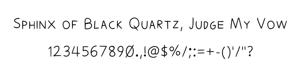
To steal a joke from a friend, I write in all caps because everything I say is important.
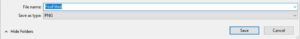
Step 8: Save or export it as a png.
Sorry.
Step 9: Submit this version to the site: MY FONTS > Upload Template. Uncheck “Automatically clean templates”—since we’re not working on paper or submitting the one with the gray outlines—and submit.
You’ll see a preview. Don’t worry, the final version won’t be anywhere near as aliased as the first render.
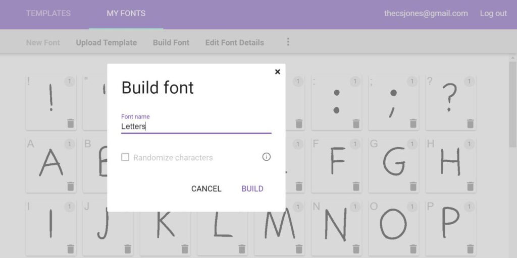
Step 10: Go to Edit Font details, name it, and make any other adjustments you want. Hit Build Font. Give it a catchy name, not something like this:
Here’s your final preview. It scales well:
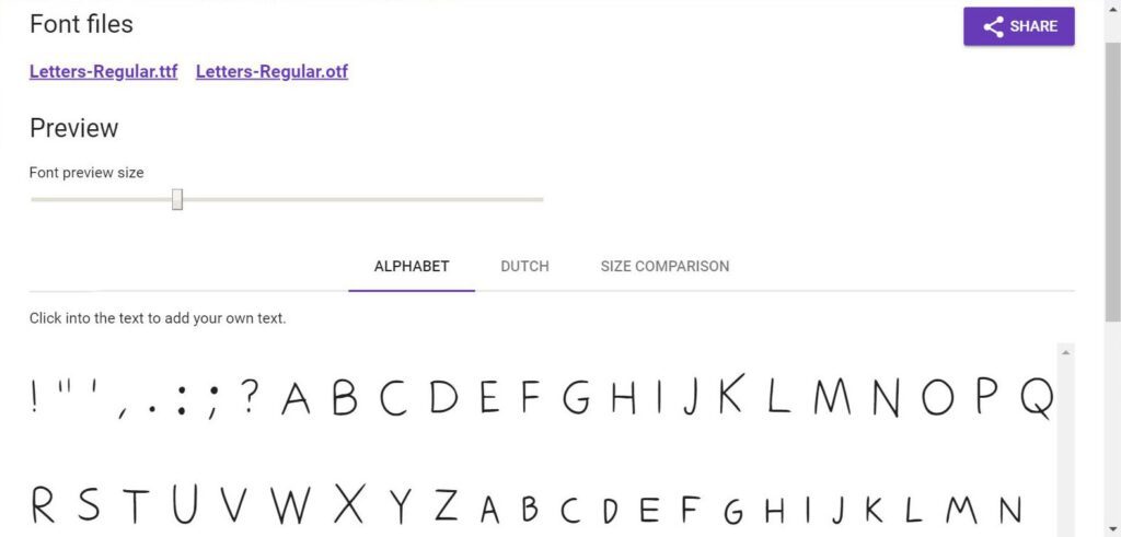
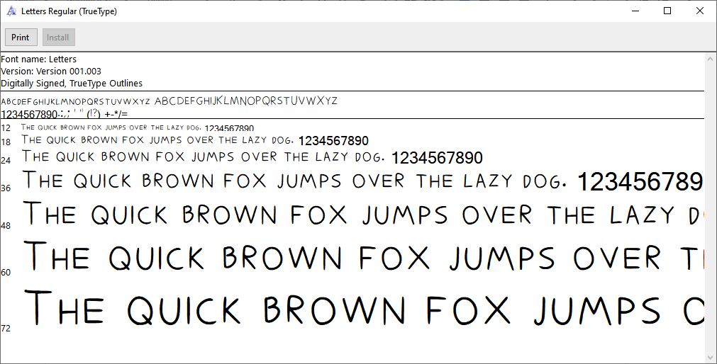
Download the TTF. Open and install it.
Bonus Step: Once you’ve downloaded it, delete it (from the site, fool), go back to templates, hit Remove All, and add “minimal numbers” and “minimal punctuation” to the blank slate. If you need any currency symbol besides the dollar, those are in miscellaneous. Repeat process.
And you have your font.
January is Month One, dedicated to the Wacom One. Released January 7th, the new version is a drawing monitor—our lowest-priced yet, offering all Wacom’s build quality for half the cost of a Cintiq.
For those of you who might be getting the One as their first screen tablet, those of you who use it for things like graphic design, or those of you who could just use a brush-up on the basics, I’ll periodically drop some one-hour, one-day, or in one upcoming case, one-minute exercises you can use to practice the fundamentals.
Since we started late (I got my One halfway through the month), I’ll be extending this theme into February, so make sure to check back.
And while you’re at it, check out the Wacom One.
About the Author
![]() CS Jones is a Philadelphia-based freelance writer and illustrator. That’s all he’ll say, because “According to graphology, all-caps writers are uncomfortable talking about their personal lives.” —WriteChoice
CS Jones is a Philadelphia-based freelance writer and illustrator. That’s all he’ll say, because “According to graphology, all-caps writers are uncomfortable talking about their personal lives.” —WriteChoice
His work is best seen at thecsjones.com or @thecsjones on Instagram.


